Hello,
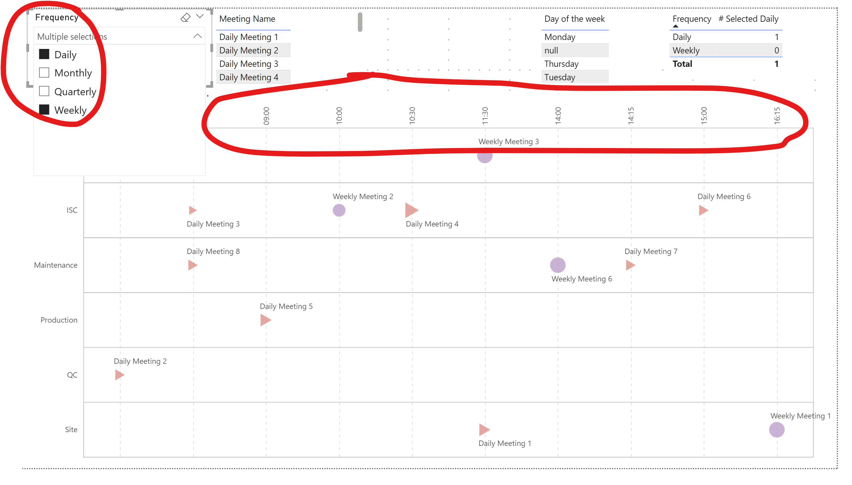
I am trying to set the x axis of the attached chart based on a measure value.
So when the Frequency “Daily” is selected, the x axis should be “Start Time” with timeunit hous/minute:
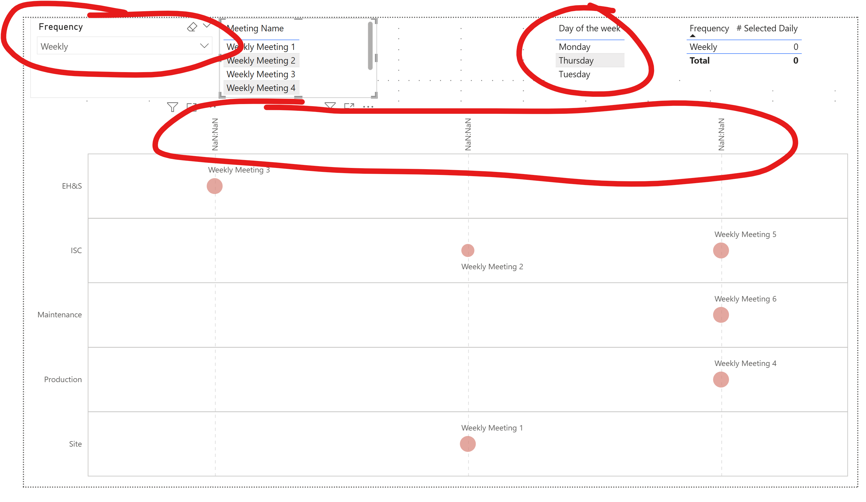
When the selected frequency does not contain “Daily”, then the x axis should show the name of the week days in the defined sort order by “DaySortOrder”. It is showing this instead:
I am trying to do this by layering, which seems to be what is causing the issue, as if I remove the layer with the x axis as temporal type, then it works correctly.
Is there another way to do this? I can define the X axis field without layers dynamically with a transform, but then I am blocked by the “type” of the axis which in Vega-lite cannot be set as dynamic (not even with a signal) as far as I know.
Attached is the example file.
Yes, there is something unaccounted-for in Vega-Lite with respect to axes when using multiple nested layers …
I’ve run across this many times, especially when sorting …
Even when I tried a vertical concatenation of 2 visuals (daily, non-daily), Vega-Lite seemed to grab the last axis definition and apply it to all visuals, so no luck there either.
I think your dataset is suffering from [null] values for [Start Time] for some records when Weekly, Monthly, or Quarterly is selected and this furthers Vega-Lite’s confusion.
Things improved for me when I created a start time for all records. Also, I’d try converting the time to a integer (quantitative) value (e.g., 4:15 PM = 1615, etc.). I didn’t try but also would create a [Frequency] dimension for the slicer and adjust the model to suit.
I’m sure it’s solvable, but after many tries nothing jumped out at me. I’ll create a small “clean” dataset and try again over the next few days … I’ll update this thread if I find anything.
Thanks @Greg ! I have tried on my side with a cleaner dataset and with a frequency dimension, but no luck so far on the layers approach.
What is funny with the layers is that even if you invert them, the temporal one always shows correctly while the other does not…
Anyway thanks again for the time reviewing this
Kind regards
Valeria
OK, I couldn’t figure out a way to handle the temporal axis issue, so I decided to avoid it altogether and instead use a quantitative X axis for both visuals. So, I computed the hours and minutes as integers, then composed decimal numbers from them as needed. Here’s what I came up with:
Also, I knew I’d used a “visual switching” technique a while ago, based on a “hack” discovered by Madison Giammaria last year:
add a parameter for an expression to retrieve the frequency selected in the Power BI slicer
add a parameter for an expression to set the “padding” of the child visuals
Vega-Lite then uses the padding values when rendering the visual.
Here’s the [params] block from my I used in this second version:
Here’s the links:
Technique found by Madison Giammaria and posted to LinkedIn in July 2024:
GP’s example from July 2024 using this technique in the Deneb Showcase section of the Enterprise DNA website:
As this was only an alternative solution, I was a bit quick-and-dirty: although I tried to use several of your code blocks, I’m sure I missed several (e.g., tooltips, yOffset, etc.). There’s probably some left over development artifacts as well. Nevertheless …
I know its not what you were looking for, but I hope it helps.
Hi @Greg and sorry for replying late - I have been travelling…
Thanks a lot for your hints, it really helps and, although I had seen the post for the padding based on parameters, I would have not thought of applying it here
What you wrote got my brain thinking further and I think I found the way of changing the axis with layers only
what I did is that I passed all axes to be strings on a single field:
{
“calculate”: “timeFormat(datum[‘Time’], ‘%H:%M’)”,
“as”: “_start_time_string”
},
{
“calculate”: “datum[‘_Daily_Selected’]==1?datum[‘_start_time_string’]:datum[‘Day of the week’]”,
“as”: “_x_axis_field”
},
so that I don’t have to worry about the type, it’s nominal for all layers. I guess this is the key…
and for the sort order:
{
“calculate”: “datum[‘_Daily_Selected’]==1?datum[‘_x_axis_time_sequence’]:datum[‘DaySortOrder’]”,
“as”: “_x_sort_order”
}
again a single field. It works
And the fact of selecting multiple frequencies at once is not an oversight - in this type of performance system you need to check the number of meetings per function and their positioning against each other, so it’s important to be able to see, for ex., both daily and weekly meetings in the same chart.
Anyway again thank you so much! And please let me know if you see anything that looks incorrect in my solution - I have just found it and wanted to answer quickly, so I have not tested it in depth yet