Hi everybody I hope you are all well,
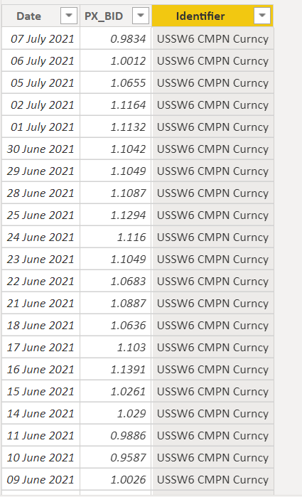
My latest post is seeking some help with SWAP curves. Attached is my excel feed from Bloomberg. There is a lot of tabs but what the focus on for me here is the 30yr to O_N SWAP tabs.
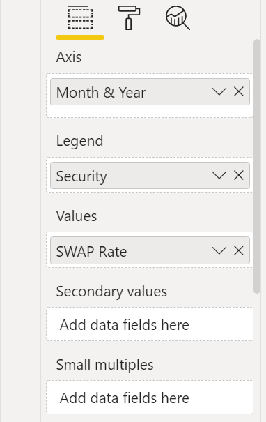
When I load this data into PowerBI I append the queries and tag each one with its identifier, i.e. 10 year SWAP, 3 Year SWAP etc. So that I end up with a table like this in BI
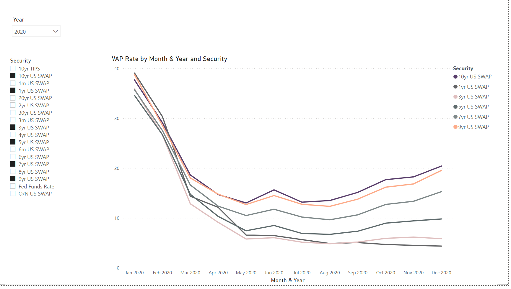
What I want to do is use the “identifier” column as the X Axis and the date as legend so that I can compare different SWAP curves at different points in time.
For Today’s Curve I just put in the following DAX = SWAP Curve Today = CALCULATE([SWAP Rate],
filter(ALLSELECTED(Dates[Date]),
Dates[Date] = max(Dates[Date])))
This is where the SWAP Rate = SWAP Rate = sum(‘US10 Year Swap’[PX_BID]).
This all works perfectly for today’s curve but the issue I have is trying to set specific dates to compare. I thought a dateadd would work but I am struggling to get it to work as I am looking for values at a date in time at different points of the curve.
I used the following SWAP Curve 1 week ago = CALCULATE([SWAP Rate],
filter(ALLSELECTED(Dates[Date]),
Dates[Date] = max(Dates[Date])-90)) to do a test and go 90 days back and this works but it is a bad way to write the formula, it will not account for weekends etc.
I also tried to create date measure for example Date last year Date last year = dateadd(‘LastDate for Data’[LastDate for Data], -1, YEAR) and then I was trying to use this measure to drop into my standard formula to get the value at this date last year.
SWAP Curve last year = CALCULATE([SWAP Rate],
filter(ALLSELECTED(Dates[Date]),
Dates[Date] = ‘Date Measures’[Date last year]))
But this D
Financial Market Report.pbix (5.0 MB)
Financial Market Data.xlsx (9.1 MB)
ax returns a nothing value.
If anyone was able to help with this it would be greatly appreciated. The workings on charts are in tab “Page 1” of the attached BI report.
Thanks all