Help with Gantt Chart

Please find attached the test pbix file that includes the dataset and deneb script for your review and help. The objective is to achieve seamless interaction of Slicer, Activity Table and the Deneb Gantt chart. While the interaction between the three widgets is accomplished, there are three main issues:

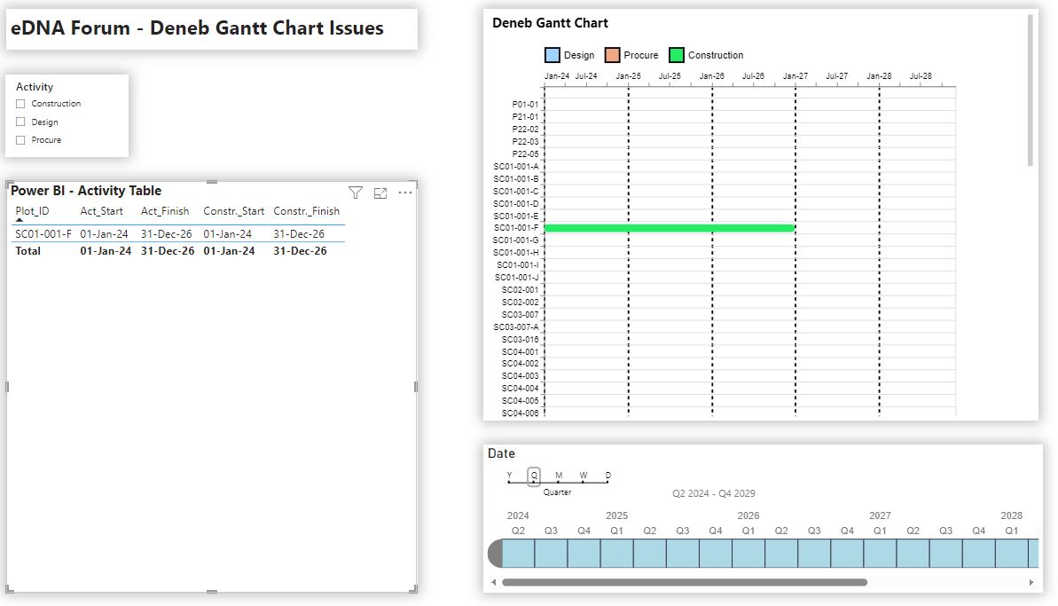
  1. Deneb chart data filter: If a Plot_ID / activity is selected from the Activity table, the Deneb chart responds by rightly highlighting the selected activity but does not hide / filter the unselected activities. However, the vice-versa works perfectly i.e. when a selection is made on the Gantt Chart the Activity table displays only the selected task.

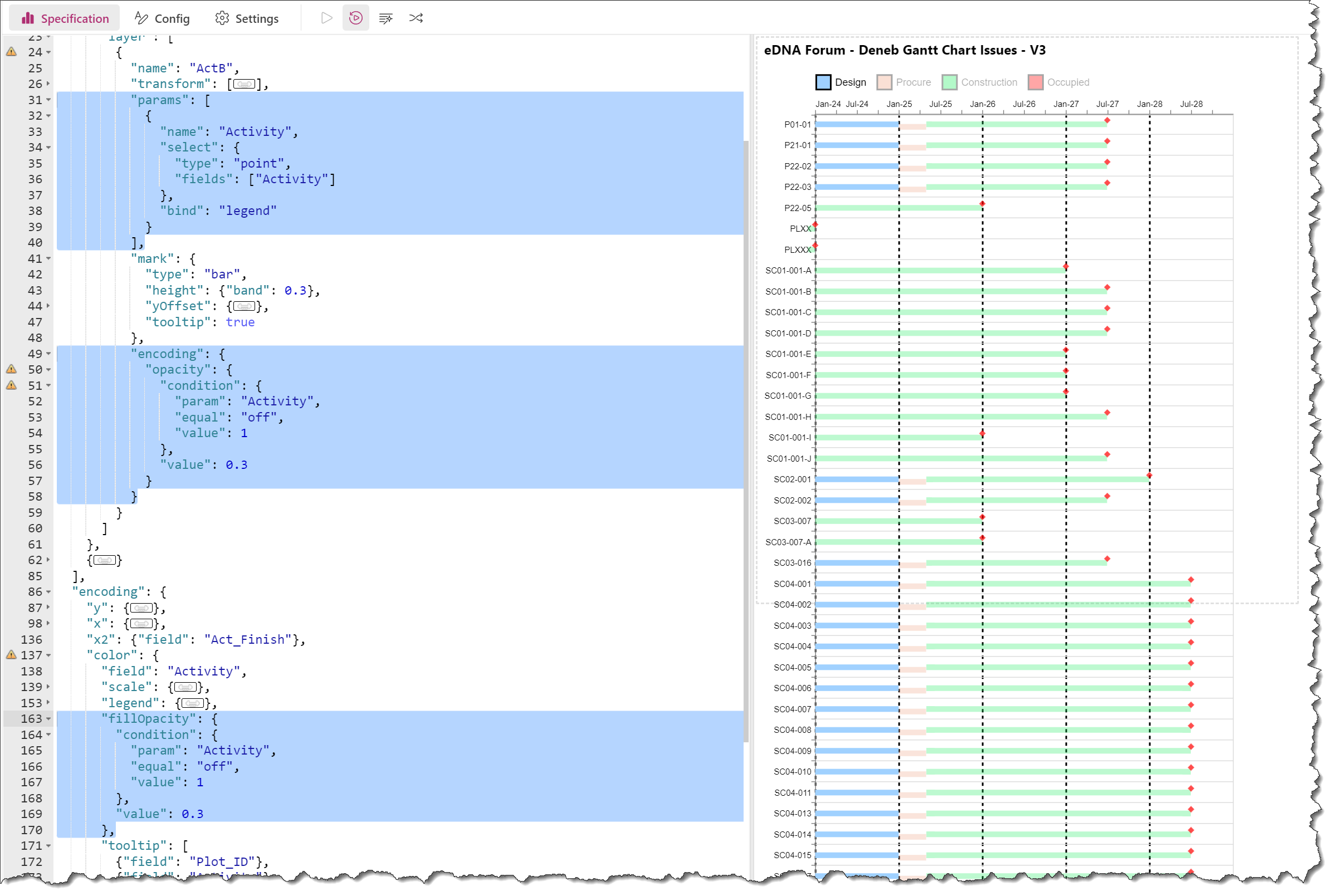
  2. Activity color: Three distinct colors have been assigned for each task as defined in the legend. However, when the activity is selected using a slicer, the Gantt chart rightly filters the selection but ignore the color coding and irrespective of the selection assigns the first color to the filtered activities.

  3. Legend: I tried to achieve the above functionality by enabling selection of activity from the legend, however i am unable to filter the activities.

Appreciate if you could help me with resolving the above issues.
Lastly is it possible to slightly offset the activity bars incase of overlapping durations without altering the presentation style.

Thanks & Best Regards

Test2.pbix (1.9 MB)

Hi @brooks65

Apologies for taking a bit to respond … previous commitments.

My comments on your Deneb Gantt Chart Issues:
1 - Filtering: I’m guessing I’m misunderstanding your issue, as both the [Power BI → Deneb] and the [Deneb → Power BI] filtering seems to be working fine; please provide a video or screenshot(s) of the issue “in action” and show/describe the desired behaviour
2 - Colours: you need both “domain” and “range” arrays in the encoding\color\scale block to match HEX codes with specific values → add a “domain” block

        "color": {
          "field": "Activity",
          "sort": [
            "Design",
            "Procure",
            "Construction"
          ],
          "scale": {
            "domain": [
              "Design",
              "Procure",
              "Construction"
            ],
            "range": [
              "#A0D1FF",
              "#F0A787",
              "#24ED64"
            ]
          },

3 - Legend: use both an “encoding\fillOpacity” block bound to the “Activity” parameter and (as you already have) an “encoding\opacity” block bound to the mouse selection to make the legend interactive → add a “fillOpacity” block

      "encoding": {
        "x": {...},
        "y": {...}
        "x2": {...},
        "color": {...},
        "fillOpacity": {
          "condition": {
            "param": "Activity",
            "equal": "off",
            "value": 1
          },
          "value": 0.3
        },
        "opacity": {
          "condition": {
            "test": {
              "field": "__selected__",
              "equal": "off"
            },
            "value": 0
          },
          "value": 1
        },
        "tooltip": [...]
      }

4 - Offset: yes, you can set the xOffset based on whatever rule you want … just add a “transform” block with a nested “window\lag” block (to get the desired value for the previous record) and a nested “calculate” block to calculate your desired offset; if you’d like to investigate further, please provide a couple of specific examples of the current and desired values.

Hope this helps.
Greg
eDNA Forum - Deneb Gantt Chart Issues.pbix (1.9 MB)

For more examples on interactive legends in Deneb, see the YouTube video posted by Ben Ferry (Power BI Guy):

Hi Greg,
Many thanks for the guidance, it simplifies user readability and interaction.

With regards to the first query apologies for not clearly framing my question. I have attached two snapshots case 1 and case 2. Case 1: Any selection on the Deneb Chart filters the data on the Activity table to just highlight the project selected. Case 2: This is an example of making a selection using the Activity table. While the Deneb Gantt Chart represents the project selected but does not filter all the other project ids that aren’t selected. The issue with this is the user has scroll down to Deneb Gantt Chart window to review the timeline. It did try using the below code under the y axis, but there is no change.
“transform”: [{
“filter”: “Plot_ID !== selected”}
]
My query regarding offset is primarily aimed at showing the full extent of the bars in case of overlapping bar lengths resulting from Start-to-Start relationships. The intent is to demonstrate high level project summary bars with granularity of key tasks. Currently all the bars in the example follow a finish-to-start relationships and so task bar length is visualized in full. However, this may not be the case always. Please refer to figure Case 3, which represents my vision for the project.


Hope the above summary helps you to understand my request.

Thanks & Best Regards,

The first figure is Case 3, second figure is Case 2 and the third figure is Case 1

Hi @brooks65

For the first issue (filtering), a possible solution is to create another DAX measure, pass it into the Deneb visual, and add a Vega-Lite filter transform to the Deneb visual.

Here’s the DAX measure:

Selected Plot_ID = 
VAR _CountOfAllPlot_IDs = COUNTROWS( ALL( RvtDump[Plot_ID] ) )
VAR _CountOfSelectedPlot_IDs = COUNTROWS( VALUES( RvtDump[Plot_ID] ) )
VAR _SelectedPlot_ID = SELECTEDVALUE( RvtDump[Plot_ID] )
VAR _Result = IF( _CountOfSelectedPlot_IDs = _CountOfAllPlot_IDs, BLANK(), _SelectedPlot_ID )

RETURN
_Result

Here’s the transform\filter block:

  "transform": [
    {
      "filter": "datum['Selected Plot_ID__highlight'] != null ? 1 : 0"
    }
  ],

With regard to your second issue (offset), I’m afraid that without representative data I can’t visualize the issue. I took a stab at a possibility, which would be to add a “yOffset” key:value pair to the "bar mark (the [value] would be an expression)

What is now apparent, though, is that it seems you’re looking for a vertical (Y) offset (when I first read your post I thought you wanted a horizontal (X) offset). If this does not help (or is not what you’re looking for), please add some representative data, and, for a specific activity (or activities) create a mock-up(s) of your desired outcome, and I can take another look.

Hope it helps.
Greg
eDNA Forum - Deneb Gantt Chart Issues - V2.pbix (1.9 MB)

I can’t thank you enough. You have resolved all my issues. Once again sincerely appreciate your timely assistance.

1 Like