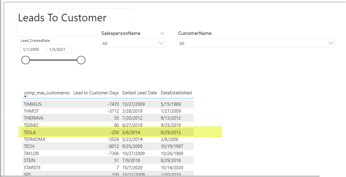
I have a report that has a table that I need to get into a bar graph. I have a field called “Lead to Customer Days” in this table, this field displays in the table just fine. But when I change the table to any type of bar graph the number of that field changes.
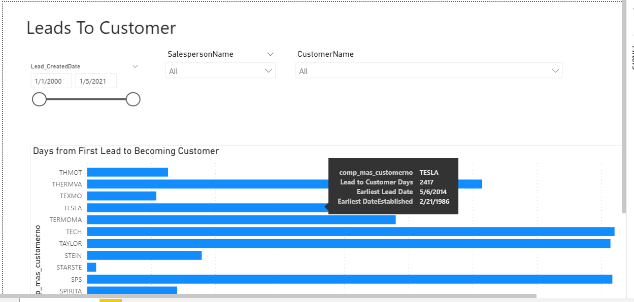
Example would be in the attached report… look at customer TESLA, this has a number of -250 which is correct. But when I change this table to a bar graph that number changes to 2417, ONLY when I have no filters selected in the slicers. If I have this graphed and I have it filtered down to only show TESLA then it properly shows -250. I am sure its an issue with my measure for “Earliest Lead Date” however I cannot figure it out. Help!
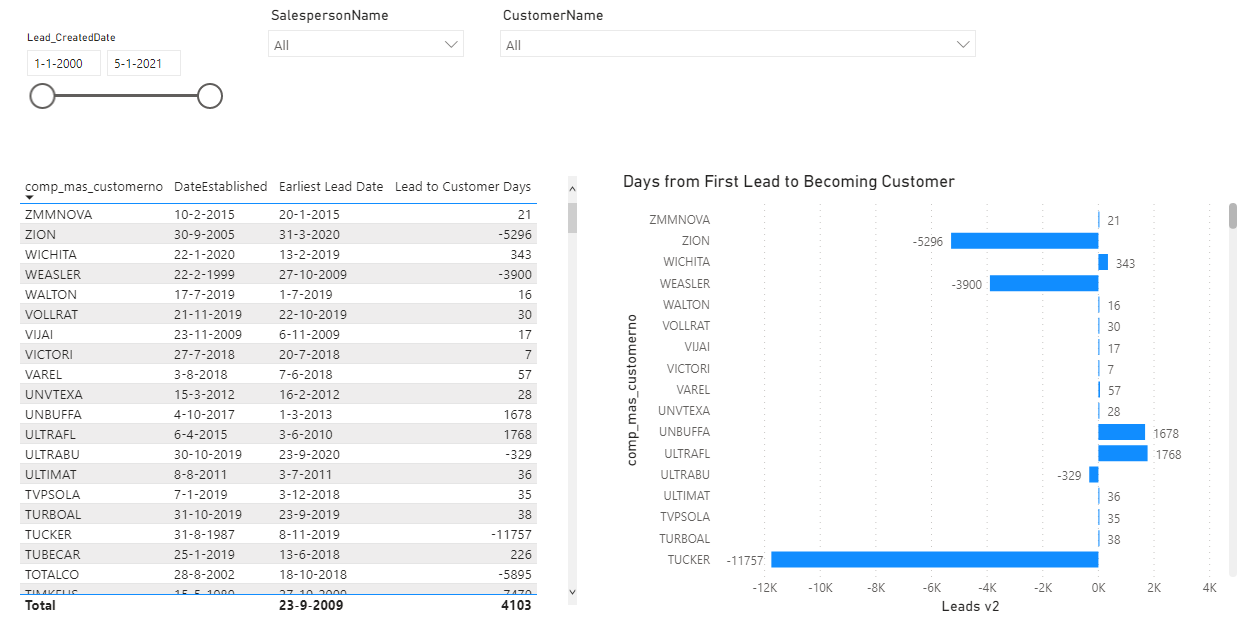
The numbers do not change because you change from Table to graph, but because you drop the date (which is necessary for the measure calculation) out of the graph. (see attachment to see the difference between a graph with and without data included).
The first graph is still not perfect, because:
(1) all customers have different colors
(2) small number seem to be omitted.
Thanks for you reply, neither of the graphs you provided solve my problem. If you look at TESLA in either of them graphs they do not have the number -250 (like they do in the table) which is the correct amount for the “Lead to Customer Days” field. Unless I am missing something entirely? Do I need to redo my measure?
Indeed, the solution is not complete. I wanted to show you that leaving the date out (graph 2) leads to
wrong data for some customers (e.g. ZION, WEASLER) but correct data for other customers (graph 1). I hereby want to conclude that changing visual (from table to graph) does not distort the data, but omitting the date does.
However, what is indeed weird is that a lot of customers are omitted.
Hi @Preston, did the response provided by @Melissa help you solve your query? If not, how far did you get and what kind of help you need further? If yes, kindly mark the thread as solved. Thanks!
Hi @Preston, did the response provided by @Melissa help you solve your query? If not, how far did you get and what kind of help you need further? If yes, kindly mark the thread as solved. Thanks!
Hi @Preston, we’ve noticed that no response has been received from you since the 18th of January. We just want to check if you still need further help with this post? In case there won’t be any activity on it in the next few days, we’ll be tagging this post as Solved. If you have a follow question or concern related to this topic, please remove the Solution tag first by clicking the three dots beside Reply and then untick the checkbox. Thanks!
 !
!