This doesn’t seem like it should be this hard, but for some reason the solution is eluding me. The data I have provided in the attached PBIX file is fictitious but represents the same way my actual data is modeled, so I hope you all can help me work through this mental block I’ve got at the moment.
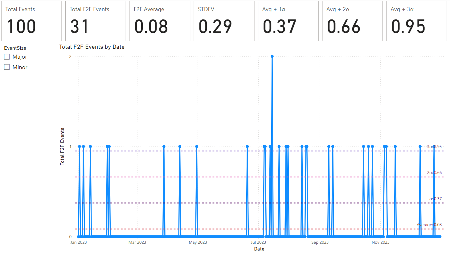
In this sample, I have a Dates table, and I have an Events table containing one row per event. Each event has an EventType that is either “Face-to-Face” or “Virtual.” In addition, the “Face-to-Face” events have an EventSize value of either “Major” or “Minor.” Virtual event have no value in the EventSize column. For this example, I am only concerned with the “Face-to-Face” rows. However, I can’t remove the other rows from the model because they are used by other measures and charts not shown in my sample PBIX file.
What I am trying to show is chart with the date on the X-Axis and the number of Face-to-Face events on the Y-Axis. That part is working. Then, on top of that, I’m trying to add horizontal lines showing the average number of F2F events per day and the standard deviation. This is where I’m struggling. The lines that I have created in the sample file are not correct. The average is showing the average of F2F events per event which is not what I need.
The last requirement is that the calculations must also be correct when filtering on EventSize using the slicer on the page. In other words, if I select “Major” in the slicer, the calculations should be based on the number of “Major” F2F events per day instead of total F2F events per day.
I hope I’m making sense. Please feel free to ask any clarifying questions that will help lead to a solution.
Thanks in advance!
eDNA Sample Data.pbix (44.2 KB)