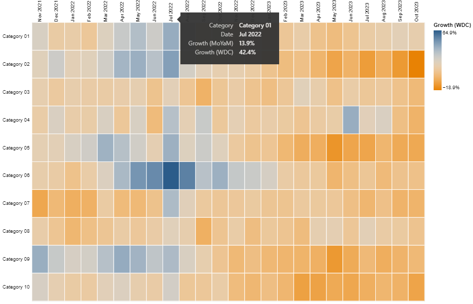
Help customize Deneb heatmap

I’m new to Deneb and haven’t been able to figure out how to color this heatmap so that it is colored by row, or category, rather than as a whole:

I want the rows to be color independently of one another, like this:

Help appreciated.

data.xlsx (16.7 KB)

Deneb heatmap.pbix (1.3 MB)

Hi @DougStanley.

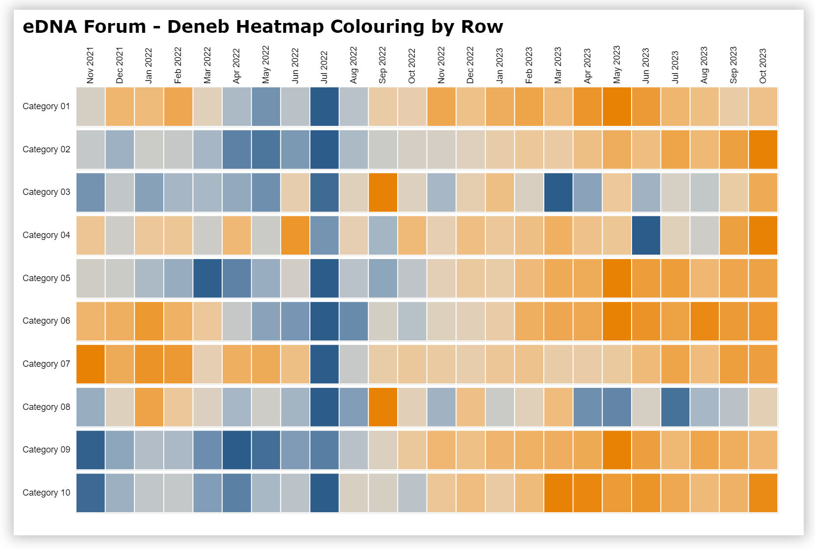
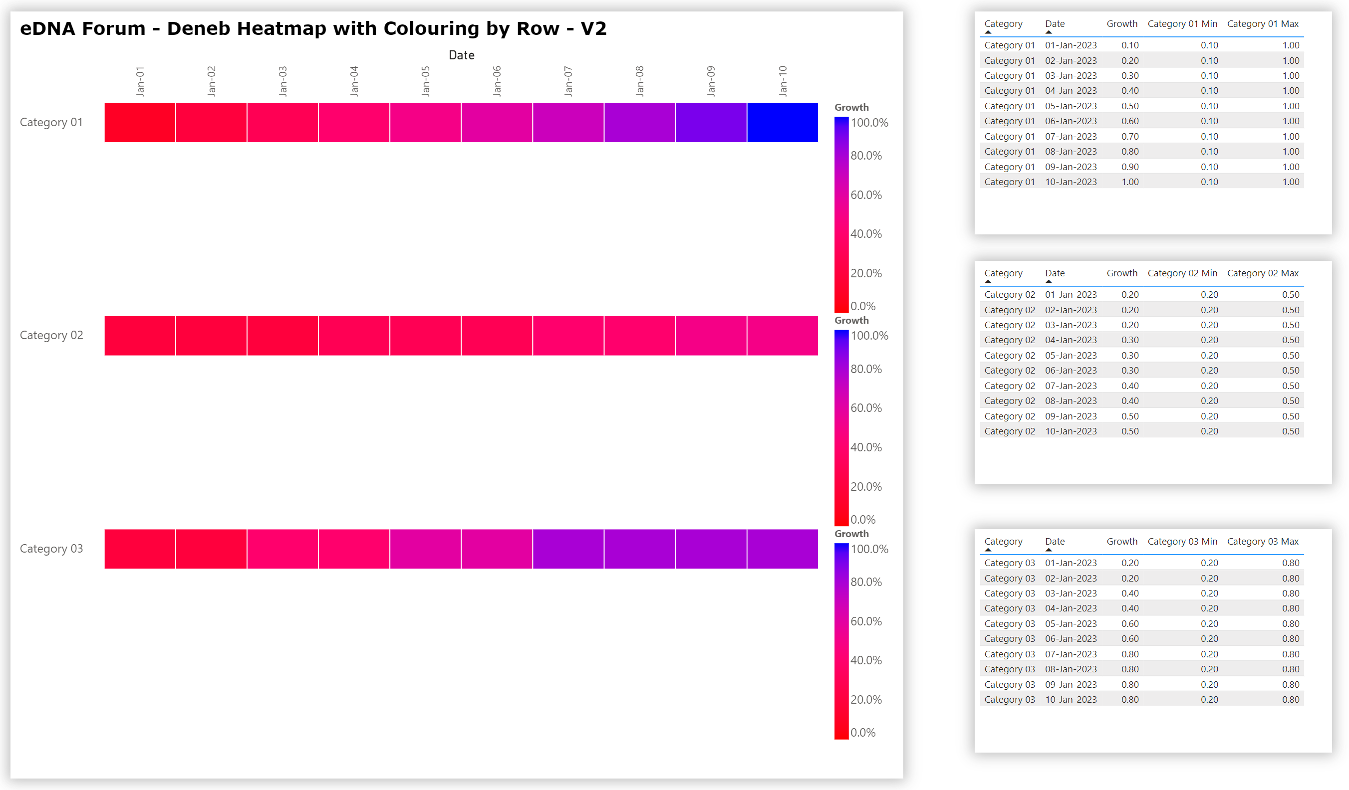
What I think in effect you are asking for is small multiples with the colour scale applied to each small multiple independently. If so, here’s a version:

To do this, you’ll need to add a row block to the encoding block and a resolve block with scale-color-independent.

{
  "title": {
    "anchor": "start",
    "align": "left",
    "offset": 10,
    "text": "eDNA Forum - Deneb Heatmap Colouring by Row",
    "font": "Verdana",
    "fontSize": 20,
    "fontWeight": "bold",
    "fontStyle": "normal"
  },
  "data": {"name": "dataset"},
  "width": 800,
  "height": 45,
  "mark": {
    "type": "rect",
    "stroke": "white",
    "tooltip": true
  },
  "encoding": {
    "row": {
      "field": "Category",
      "header": {
        "labelAngle": 0,
        "labelPadding": -50,
        "title": null
      },
      "spacing": 0
    },
    "x": {
      "field": "Date",
      "type": "ordinal",
      "title": "",
      "timeUnit": "yearmonth",
      "axis": {
        "domain": false,
        "ticks": false,
        "labels": true,
        "labelAngle": -90,
        "orient": "top"
      }
    },
    "tooltip": [
      {
        "field": "Category",
        "type": "nominal"
      },
      {
        "field": "Date",
        "type": "ordinal"
      },
      {
        "field": "Growth (MoYaM)",
        "type": "quantitative",
        "format": ".1%"
      },
      {
        "field": "Growth (WDC)",
        "type": "quantitative",
        "format": ".1%"
      }
    ],
    "color": {
      "field": "Growth (WDC)",
      "type": "quantitative",
      "title": "Growth (WDC)",
      "scale": {
        "scheme": "pbiColorDivergent"
      },
      "legend": null
    }
  },
  "resolve": {
    "scale": {"color": "independent"}
  }
}

I’m not at all sure this is your desired outcome. (For example, to get the chart to render in reasonable space, I needed to suppress the legend for each row, which decreases utility.) Nevertheless, I think a faceted plot is on the path to the solution

Hope it helps.
Greg
eDNA Forum - Deneb Heatmap with Colouring by Row.pbix (1.3 MB)

Greg,

This is great. Thanks so much for your help.This is exactly what I wanted to accomplish.

I see less blue and more orange than I expected, but that may be a differences between how Power BI and Tableau (where this chart began its life) apply color schemes. I will have to investigate that further.

The only issue I see when applying your spec to my real data is the Y axis labels (the categories) are placed randomly. One might be centered, then next flush left, then right, then just floating somewhere in between. Any idea why that would happen and where in the spec I could adjust for that?

Lastly, this version isn’t responsive to resizing. Is that to be expected?

Thanks again,
Doug

Hi @DougStanley

I’m glad you found it useful. I again note that, as per the example, the colour is applied per row, so “blue” in one row is not the same as “blue” in another row; you can visualize this by removing the legend-null line from the color block in the encoding block.

You can influence the alignment of your labels by adding a labelAlign property to the row encoding and setting the value as desired (left, center, or right):

  "encoding": {
    "row": {
      "field": "Category",
      "header": {
        "labelAngle": 0,
        "labelAlign": "right",
        "labelPadding": -50,
        "title": null
      },
      "spacing": 0
    },

Hope it helps.
Greg

@Greg,

Tremendously helpful. Thank you. The labelAlign property fixed the issue.

I’ve thought more about how the rectangles on each row are colored, and I’m wondering whether what I asked for is really what I want. The calculation the coloring is based on is Month compared to the same Month a year ago. In Tableau, using a table calculation, the same range of values is applied evenly across the rows:

I’m not sure that is the best way to color the chart, but that is the way users are used to seeing it. Is there a tweak to the spec that would result in something that looks more like the above?

Thank you,
Doug

Hi @DougStanley. None that come to mind right off the bat … I’ll need to play around with the facet view composition technique a bit more … I’ll comment if I find something. (I wouldn’t be surprised if other forum members have come across this situation before and have a solution.)
Greg

@Greg Awesome. You’ve really helped to demystify this a bit for me. What’s proper etiquette here–should I mark this as answered now or should I wait in case you and others want to comment?

Doug

Hi @DougStanley. Your choice … I side with, “…if the original question was answered, then mark as solved…” and for new (or additional) questions, start a new thread. If your original question was not answered, then leave unsolved.
Greg

Hi @DougStanley.

I just want to confirm that we’re actually talking about the same application of colour to ensure our understanding coincides for the desired colour scale for each row. To that end, I’ve created a small simple test dataset with just 3 categories and 10 rows per category, then applied a fixed colour scale.

In all 3 samples, the scale goes from “red” to “blue” (e.g., for category 01, 0.0 = “red” and 1.0 = “blue”).

So, the questions to answer are:

  • for category 02, is the colour scale applied correctly or should the scale be 0.2 = “red” and 0.5 = “blue”?
  • for category 03, is the colour scale applied correctly or should the scale be 0.2 = “red” and 0.8 = “blue”

Can you let me know if my sample is correct or should be changed?
Thanks,
Greg
data2.xlsx (18.2 KB)
eDNA Forum - Deneb Heatmap with Colouring by Row - V2.pbix (1.3 MB)

@Greg Thanks for your continued interest. So yes, the way you’ve done it where 0 and 1 is the range applied uniformly across the rows is the closest to what my users are accustomed to seeing.

I think the only difference now is that, rather than using 0 and 1 as the range, the original chart (in Tableau) automatically starts at the MIN and ends at the MAX of the data displayed. In my production data set, that range is currently -.12 to .65.

Is it possible to set the range dynamically? As is likely evident by now, I have more than a decade’s experience using Tableau, a few months in Power BI, and a few weeks with Deneb.

Doug

Hi @DougStanley.

OK, I think I’ve got it … so rather than what’s shown, what you’re looking for is:

  • for category 01, 0.0 = “red” and 1.0 = “blue”
  • for category 02, 0.2 = “red” and 0.5 = “blue”
  • for category 03, 0.2 = “red” and 0.8 = “blue”

Is this correct?
Greg

P.S. For me, zero exposure to/experience with Tableau, 4+ years of Power BI, and just under 2 years with Deneb.

@Greg Thanks for hanging in there with me as we grapple with describing things in a more Power BI/Deneb friendly way.

I don’t think that’s exactly what I’m describing. Hope a picture is worth a thousand words. Here is a screenshot from Tableau:

image

I’ve highlighted the dynamically created Start, End, and Center points. By default, the center of the spectrum is zero and the end colors are at equal distances from zero. Tableau assigns a lighter orange to -0.124 because the darkest orange would correspond to -0.648 – exactly opposite the maximum positive number. This tells the viewer that the lowest value, in orange, is not as far away from zero as the highest value.

I hope that explanation helps, not hnders.

Doug

Hi @DougStanley. No unfortunately, I think I’m more confused now. What this tells me is, rather than applying the colour scale by row, you want is a single colour scale for all rows going from the minumum of the entire dataset (-12.8 in your example) to the maximum of the entire dataset (64.8 in your example) … if that is the case, then we’re back where we started … I’m missing something.
Greg

@Greg We need an interpreter. I was afraid that might happen.

In the example above, where -12.4% and 64.8% is the range–measured as distance from zero:

  • The deepest blue will always correspond to the highest value in the data set, regardless of row.

  • The deepest orange will always correspond to the lowest value in the data set, regardless of row.

The spectrum of color is applied such that a particular shade of blue, for example, will represent the same value, no matter where it appears. Same for shades of orange and everything in between. I’ve added labels here to see if maybe that helps:

Thanks again,
Doug

Hi @DougStanley. So dataset-based colour scheme is what you want, not a row-based colour scheme … I think we had it the first time. Here’s a version of your original code with the values layered, and, instead of the pbiDivergent colour scheme, a custom colour scheme is used (orange=-0.2, blue=0.7, white=0).

Here’s the code for the custom colour scheme in the color block of the encoding block:

        "color": {
          "field": "Growth (WDC)",
          "type": "quantitative",
          "scale": {
            "range": [
              "orange",
              "white",
              "blue"
            ],
            "interpolate": "cubehelix",
            "domainMax": 0.7,
            "domainMid": -0.2,
            "domainMin": 0
          },
          "legend": {
            "direction": "vertical",
            "gradientLength": 220,
            "format": ".1%"
          }
        }

If this close to what you’re looking for, you can adjust the interpolation method and colours as desired, then delete the text mark.
Greg
eDNA Forum - Deneb Heatmap - V3.pbix (1.3 MB)

P.S.: here’s where I found an example for the custom colour scheme:

@Greg I really appreciate your patience and your knowledge. Yes, this is the closest to the original.

There are two potential “gotchas”:

  • The data changes daily but the range is declared in the spec

  • The sample data is meant to represent the total of two different business units. When filtered to one or the other, the range changes and then the spec would need to be different

Are there any options for solving those issues? (I never fully realized how easy Tableau made it to make these types of charts).

Thanks,
Doug

Not to my knowledge … you’d have to pursue with the authors of Vega-Lite, not Deneb I guess…
Greg