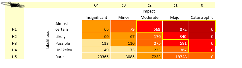
Now I got a table, which already contains column that has value H1,H2,…H5 and a column that contains C1,C2,C3,C4. In the matrix, its simple count of H and C values and categorised into different categories such as “Almost Insignificant”, “Almost Minor” etc. I am thinking to create measure for each type of categories. However, I am not how should I show measures in the same format as shown in the picutre.
I am not sure whether my approach is right or not. Could anyone help me how can I represent my calculated measures into the same was as shown in the picture
Hi @leo_89. Is your question on how to present the numbers, or how to colour the values, or both? Regardless, please upload your work-in-progress PBIX, your dataset, and the business rules that govern how a value is coloured.
Greg
Totally agree with @Greg that this question is not answerable without seeing your data, data model and business rules. I strongly suspect that this will be accomplished via a SWITCH(TRUE() ) construct that returns a hex code value based on application of the business rules, and that measure will then be applied via Field Value within the conditional formatting options.
@BrianJ, @Greg, Sorry guys forgot to attached the sample file. I have shared the link of the sample file. @Greg, I have calculated the number for each cell, the problem I have is that I dont know how to represent in the matrix form and color them accordingly.
If I understand this correctly, I think you can accomplish this with two simple measures – one for count (COUNTROWS( fact table )) and one for conditional format color. Is this generally what you’re after?
If so, if you can please provide the data file, we can use Column by Examples in Power Query to easily label the H scores and the C scores with the appropriate category labels.
Then if you can provide the appropriate cutoff points for each color, we can build a SWITCH (TRUE ()) construct to do the conditional formatting of the background colors for the heat map.