I am making an Account Receivable Aging report in Power BI. The customer has requested a similar table to what SAP can produce. It groups the amount owed in 10 day buckets past due like the attached image:
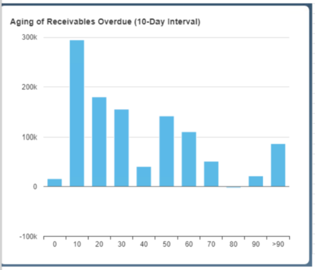
Does anyone know how to mimic this in PBI?
I am making an Account Receivable Aging report in Power BI. The customer has requested a similar table to what SAP can produce. It groups the amount owed in 10 day buckets past due like the attached image:
Does anyone know how to mimic this in PBI?
I test Data Mentor (Tool Advisor) - and here is the answer to your question:
It need to shape it a little bit, but hope this is what are you looking for. If not please let us know.
The link is not going to a solution but a general description of Data Mentor page.
Apologize - try this one: