Hi all. I’ve done a bit of exploration over the past couple of weeks into the upcoming Deneb custom visual for Power BI. This custom visual has been written by Daniel Marsh-Patrick and is currently in public preview at version 0.4.
Deneb allows one to use the Vega or Vega-Lite JSON languages to fully code visuals within Power BI, giving the developer enhanced control over many of the aspects of the visual rendering.
Here’s a video where Daniel describes and demonstrates the visual:
Here’s a link for further information about this visual:
https://deneb-viz.github.io/installation
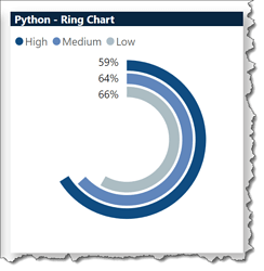
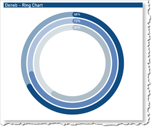
To explore Deneb, I decided to try to re-create the Python Ring Chart that I included in my Enterprise DNA Challenge #8 submission, and note the benefits and limitations of Deneb vs. Python. Here are screenshots of the original Python visual followed by the exploration Deneb visual:
Some of the characteristics of my exploration Ring Chart Deneb visual are:
- the visual uses Power BI measures as normal to set the values, colours, and labels
- the visual uses 9 overlapping layers to present the 3 rings, with each ring using 3 layers: a background “arc” mark (50% opaque colour), a middle “arc” mark (full-colour with tooltip), and a foreground “text” mark (white percentage value)
A few of the shortcomings (that I’ve found) of the Python visual within Power BI and benefits of the Deneb custom visual within Power BI are:
- Deneb is fast; Python is (can be) slow
- Deneb doesn’t require additional installations on the development machine; Python does
- Deneb will work on publish-to-web; Python doesn’t
- Deneb supports tooltips; Python doesn’t
- Deneb legends are formatted differently to “standard” Power BI ones; (at this time, for consistency, and until I further explore the correct Vega-Lite syntax, I’ll refrain from using the Deneb [Vega, Vega-Lite] legends and instead overlay a Power BI visual with just the legend visible)
The Vega-Lite language is new to me, but I’m gaining familiarity with JSON syntax and through research and trial-and-error was able to produce a (to me anyway) promising start. Of note, I decided to explore Visual Studio Code to see if there’s a Vega-Lite extension and there are in fact many; I used the “Vega Viewer” extension to be able to iteratively develop the visual in VS Code, preview the results, and then cut-and-paste the working code into Power BI (where only dataset changes were necessary), which greatly eased my exploration.
I’ll look forward to the 1.0 release of the Deneb visual from AppSource later this year and will explore further at that time.
In the meantime, I thought it might be of interest to others and was encouraged to post to the forum.
If you’d like to explore further, here’s a Publish-to-Web link showcasing my exploration on top of the C8 dataset:
Greg
P.S.: I didn’t go far in choosing the best colours or opacity for the ring background as I was just trying to see what worked; again, I’ll explore further once v1.0 is released
