Forecasting Asset Utilisation Through Time!?

Hi All,

Please excuse the length of this post. I thought some explanation and background might be helpful

Background
I’m trying to replicate something I often do in excel for clients. For one client, (a scaffolding company), I have built a connection to the API of their job management software and I am now pulling their data out and warehousing it in a database where from where I can build PBI reports and dashboards for them that automatically update daily. Spreadsheets can therefore be done away with. What I am wanting to do is build a scaffold utilisation forecast that predicts when each job is going to end thus telling them when scaffold is likely to return to their yard.

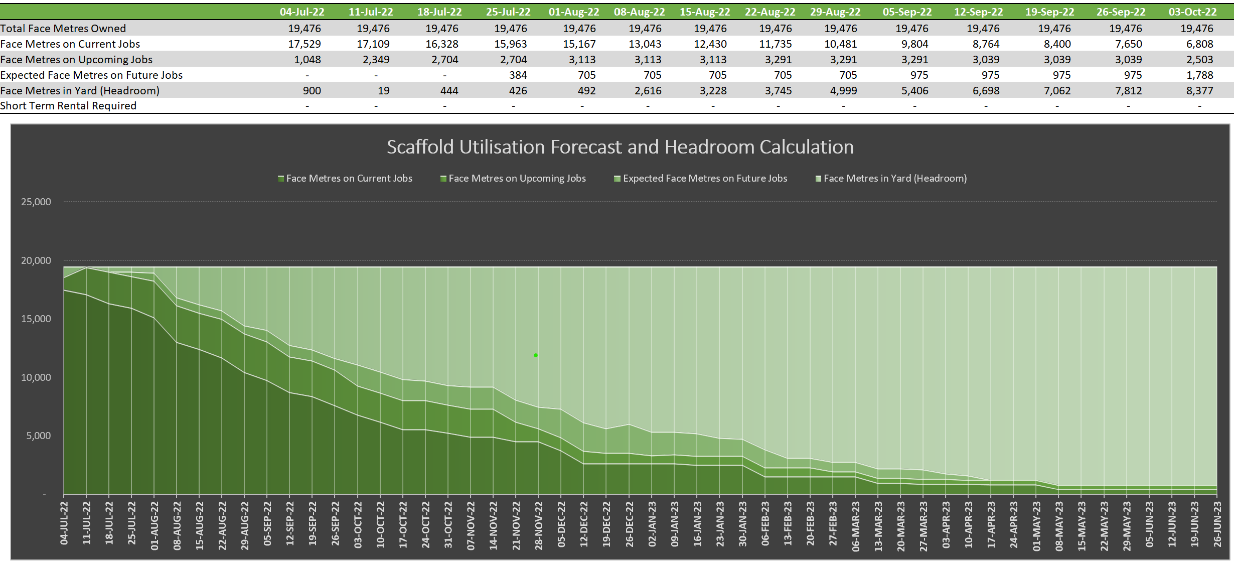
Scaffold can be ‘counted’ in a number of different ways. A common way that this client uses is called Face Metres which is similar to square metres. The client knows how many Face Metres of scaffold they hold in total and they also know how much scaffold is on each current job as well as how much scaffold will go on pending jobs that have been won but not yet built.

By looking at the historic job length of each individual customer we can build up an estimate of when each job will likely end by taking the job start date and then adding their average historic job duration to that date to arrive at an estimated end date. For new customers where there is no historic averages, we use the average historic job duration of the Customer Group that the new customer fits into (commerical construction, residential house builder, maintenance company, painter, private home owner etc).

What I want to Achieve
The best way to display the forecast is on an area graph which allows the company to quickly and easily see how much scaffold they have remaining in their yard throughout the year so that they can make decisions around buying more/renting for short term lack of scaffold/hunting more jobs due to gaps in the future pipeline of work. The below image is an example of that:

The Problem
I am struggling to find the right DAX that will allow me to create a chart similar to the one above. All videos and examples I’ve seen never refer to how to continually include something (the face metres on current jobs) beyond its start date up until its estimated end date. In excel I do it with a series of “IF(AND(” statements for example for current jobs it would be “if the date in the table is within the start date and the estimated end date of each job, then add up the face metres of that job and add it to total scaffold out on current jobs for that date.”

Whilst the above is straightforward enough in Excel, I am not sure where to start in PBI with the DAX. There’s also the issue of more than one date. I have a date table in my model and I have established a relationship between that and the start date in my jobs table. The estimated end date is a DAX calculation Forecast End Date = SUM(‘Job Details’[Start Date]) + [Customer Avg Job Duration]

The model is still at the very beginning of its development. I haven’t brought in other tables like Customer Groups to establish average customer job lengths etc yet. But I am desperate to learn how I might be able to replicate a graph like this in PBI given the need to count the face metres over a range of dates between their start and estimated end dates and I have yet to find anything that might do this for me.

Any help would be gratefully received.

The early stage pbix file is attached.

Many thanks
Paul
Scaffold Utilisation Forecast.pbix (302.0 KB)

Would you be able to share an excel file with the “IF(AND)” statements that you mentioned? I’ll try my best to re-create it with DAX from there.

Sure,

Attached is a file that contains a few of the tabs of the larger model.

I think I’ve been able to get PBI to do what I want using calculated columns but I’d love so see some DAX which might be easier and more versatile to use.

Here’s a bit of a tour of the attached file:

  • Utilisation Summary tab: This page grabs the relevant data from the other tabs and summarises it. The Short Term Rental graph only shows data on it if the scaffold needed exceeds the quantity that the company owns. It’s designed to be an gauge for whether a company should buy more scaffold or rent it (if it exceeds owned quantities for only a short time)

  • Current Job tab: All the jobs that are currently up. You’ll see the IF/AND formulas I was referring to kicking in here from cell O30

  • Upcoming Jobs tab: Similar to the previous tab but these are jobs that are pending i.e. they have been won but they have not yet started. The same formulas on this tab kick in from cell R30

  • Future Jobs tab: This tab is designed for management/owners to plan out the next year of their work i.e. they can choose the type of client, the face metres on the job and the start date. The model then uses known average durations for that client type to forecast the useage. Relevant formulas kick in from cell M35

  • Scaff Purchases tab: This tab factors in future purchases of scaffold which raises the scaffold quantities from that point on. I’ve loaded a purchase of 1,000 face metres on 5 September and you can see the headroom quantities kick up from that point on the Utilisation tab

In terms of calculating the total scaffold quantities that is simply the sum of the face metres on current jobs in the first week (currently 17,529). Management then estimate the % of scaffold in the yard e.g. 10% so the model then calculates the total beginning face metres. This happens in cell B6 of the Scaff Purchases tab.

Hope that helps. Feel free to ask any other questions!
Example Data for EDNA Forum.xlsx (279.7 KB)

Time intelligence is by far my weakest area with DAX - I’ll keep at it though unless someone else can help.

I’m wondering if Calculated Columns in the date table are the solution? Take a look at the attached pbix which I did yesterday. I’ve had no time to continue working on it, but it is looking like it’s going to work which is making me very excited as I have some really big plans for this model.

I’d create a calculated column for each set of jobs i.e. current, progress and future and then a 4th for the scaffold headroom. The model attached only has the current jobs in it, but you can see how it works and how I’d do the rest.

After that I’d also layer in a revenue forecast in it as well where the formula would add the fees for erecting and dismantling the scaffold on the dates that that occurred and in between it would add the rental revenue per job between the dates that the scaffold is on hire.
Scaffold.pbix (305.3 KB)

It likely is - I don’t know of a way (doesn’t mean there isn’t a way) to check the date difference line by line in DAX without doing what you’ve already done.

If this process slows down the model in the future (or visuals can’t display everything) there are options to create these columns in power query editor or directly from the source of the data.

Hi @5thGreen, we just want to check if you still need further help with this post?

In case there won’t be any activity on it in the next few days, we’ll be tagging this post as Solved.

Hi @5thGreen, due to inactivity, a response on this post has been tagged as “Solution”. If you have a follow question or concern related to this topic, please remove the Solution tag first by clicking the three dots beside Reply and then untick the check box.