Hi there,
I am plotting power consumption across 24 hours of the day as shown in the picture.
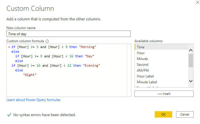
On the left-hand side of the picture, I have few filters. The time of day filter has four values: Morning (from 5 am to 8.59 am), Day (from 9 am to 15:59 ), Evening (16:00 to 21:59), and night (from 22:00 to 4:59). I have coded Time of day values into Time table with the following code:

When I select the value from time of day filter the line chart visual updates and line chart shows only hours that come into that value as shown in the following picture. For example, if I select the day from time of day filter, line chart shows hour from 9 am to 15.
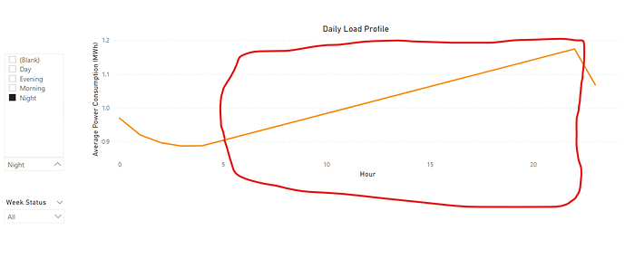
The problem comes in when I select the night value from the time of day filter, it shows all hours of the day as shown in the following picture:
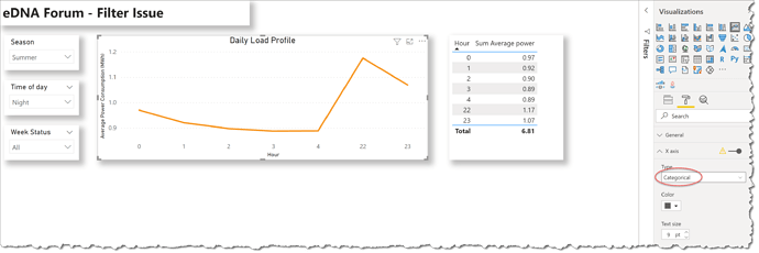
The red marked area should not appear. Ideally, it should not show, or at least it does not show the orange line showed in the red marked area. I am not sure how to get rid away from the line or show only selected hours. Any help would be really appreicated.
Sample here


