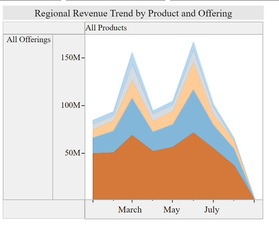
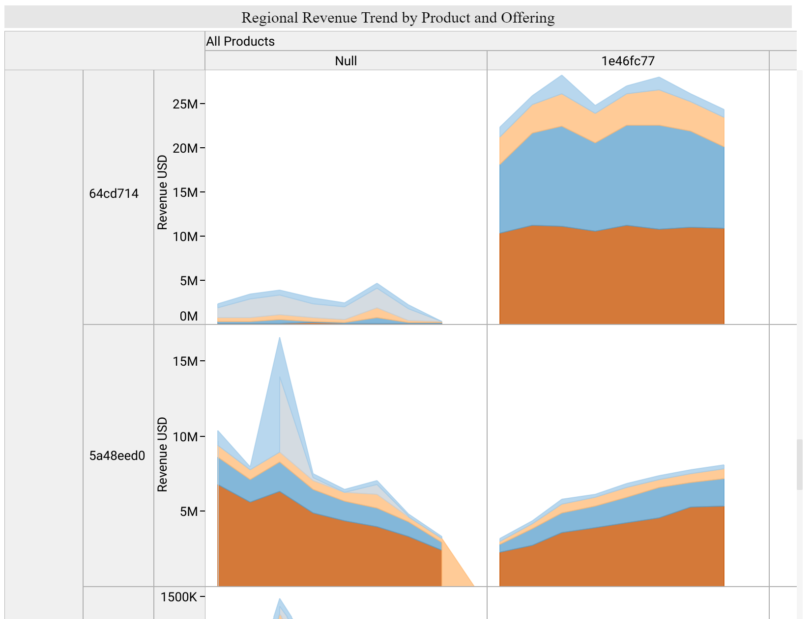
Attached are pictures of a visual from Tableau. I want to re-create this in Power BI. It’s like a matrix plot but x-axis and y-axis can be expanded out to a more granular level and each “cell” is a plot instead of a number which we usually see in an actual matrix plot.
I try to create a tooltip visual but the matrix visual in power bi does not take tooltip field. Any idea how to re-create this or create a visual similar to this in power bi?
I’ve had a look around and I unfortunately don’t believe there is a custom visual that enable a visual exactly like this.
My recommendation is to use filters and slicer to enable users to see this information. I’m not really sure you need to take up as much real estate maybe.
Or you can always just create seperate visual and stack them manually next to each other and use text boxes etc to elaborate on what you’re showcasing. This is a really simple and easy option I think that will get you a good results.
Have you taken a look at the Zebra BI custom visual for creating multi-dimensional small multiples?:
It’s extremely customizable and may be just what you’re looking for. The video I posted above is just a 30 second overview, but on their YouTube channel they have a number of long, deep-dive videos that go extensively into different use cases, customizations and capabilities.