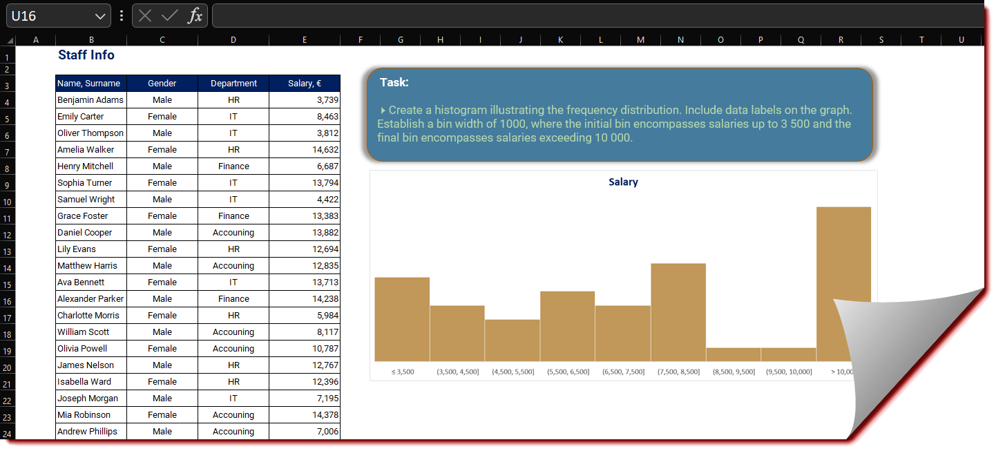
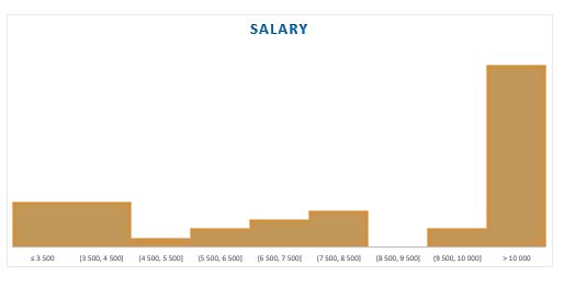
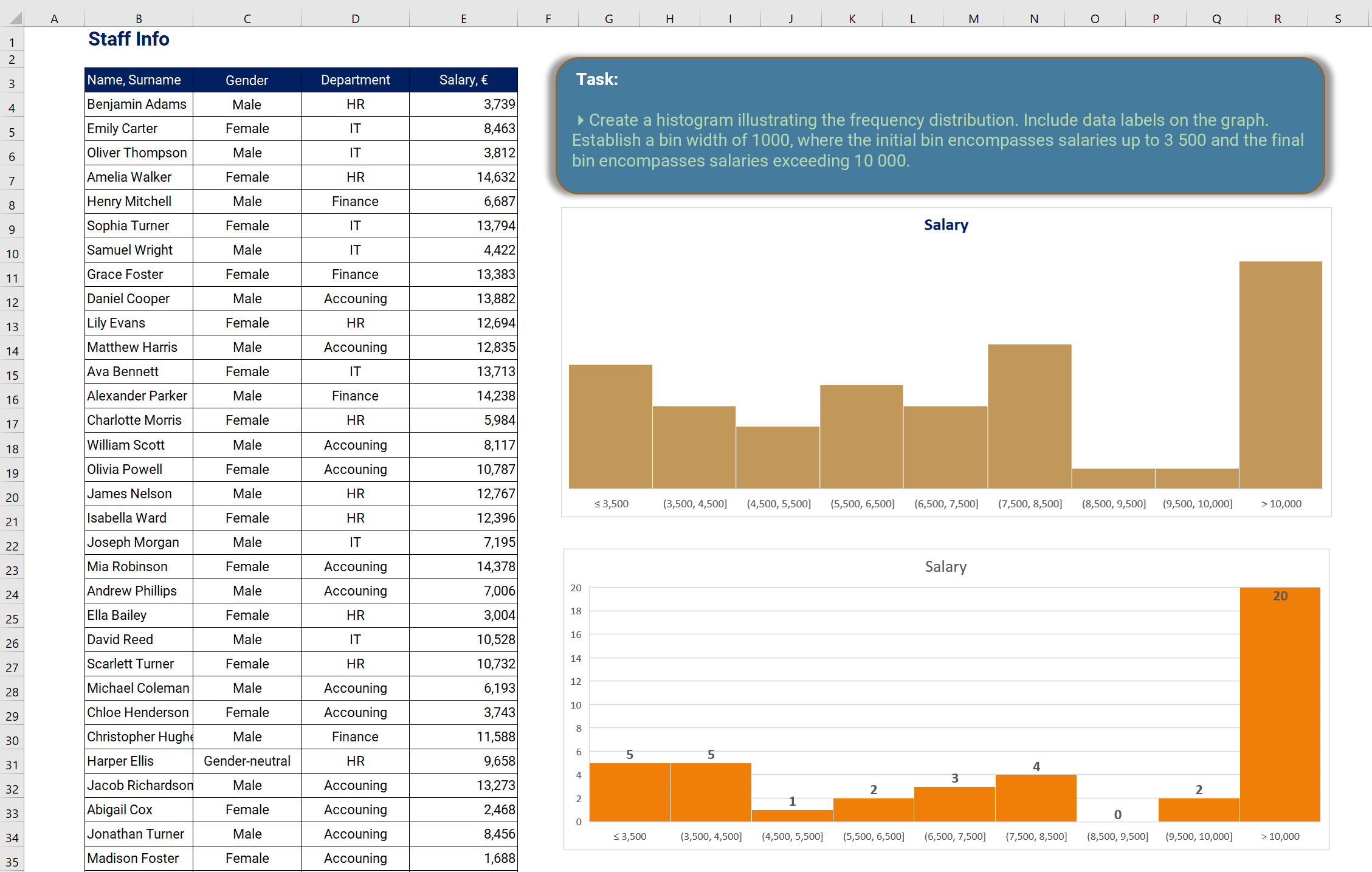
HISTOGRAM Chart
A histogram chart in Excel is a graphical representation of data that displays the distribution of a continuous variable. It is commonly used to analyze and visualize the frequency distribution of data points within specified ranges or bins.
Task
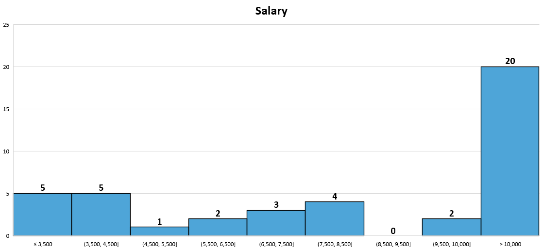
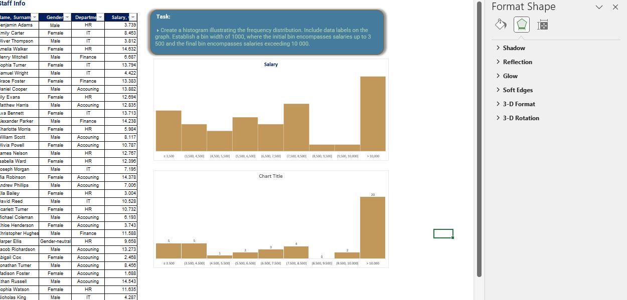
Create a histogram illustrating the frequency distribution. Include data labels on the graph. Establish a bin width of 1000, where the initial bin encompasses salaries up to 3 500 and the final bin encompasses salaries exceeding 10 000.
Submission
Reply to this post with your formula code and solution file. Please be sure to blur or hide your formula code.
Thank you for participating in the Excel Challenge related to Histogram Chart!
I hope you found this challenge to be a fun and engaging way to improve your Excel skills and learn more about how to work with Histogram Chart! in Excel.
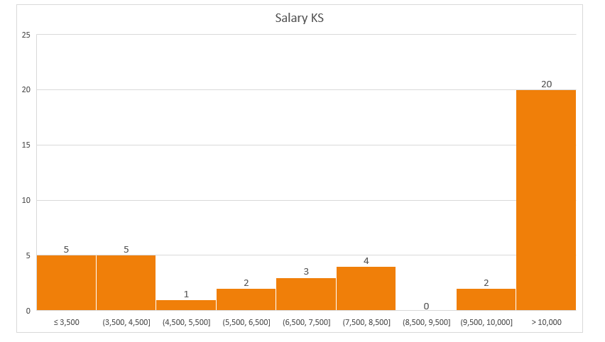
Thank you for providing the solution for the workout. I noticed however, that the dataset you provided for the workout is different from the dataset you used for your solution. The values of the Salary, € are different, so my chart is different from your chart solution.
Could you kindly confirm this?
Thank you.
Thank you for your message, @ToyinTaiwo
You are right.
The key to solving this example was the path followed by the participants.
Everyone has followed the right path.
Thank you for that.
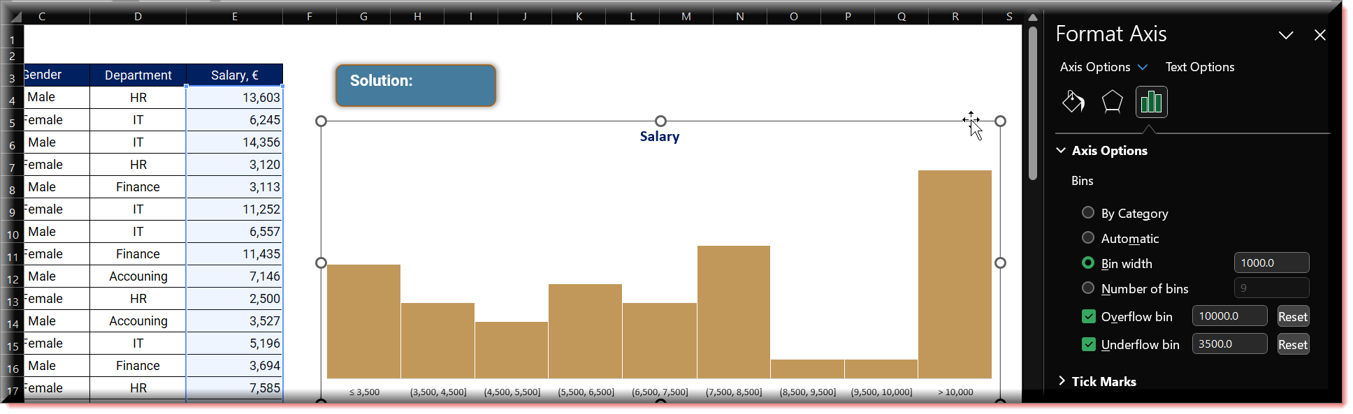
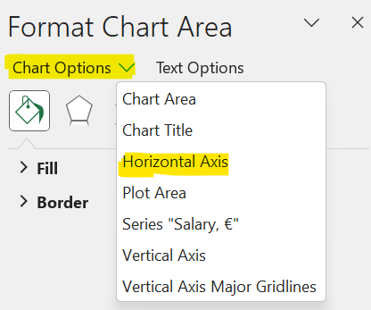
But this chart doesn’t shows us the desired output that we want. To modify the chart please follow these steps:
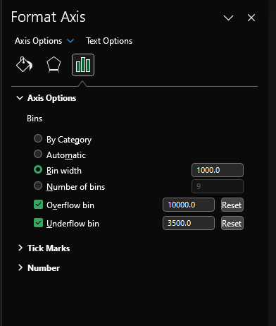
right-click on the chart, select “Format Chart Area,” and a window pane will appear on the right side. From the dropdown menu labeled “Chart Options,” choose “Horizontal Axis.”
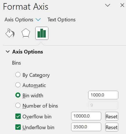
Under Axis Options (header) set.
Bin Width : 1000
Overflow bin : 10000
Underflow bin : 3500
After some customization here’s my final histogram chart-