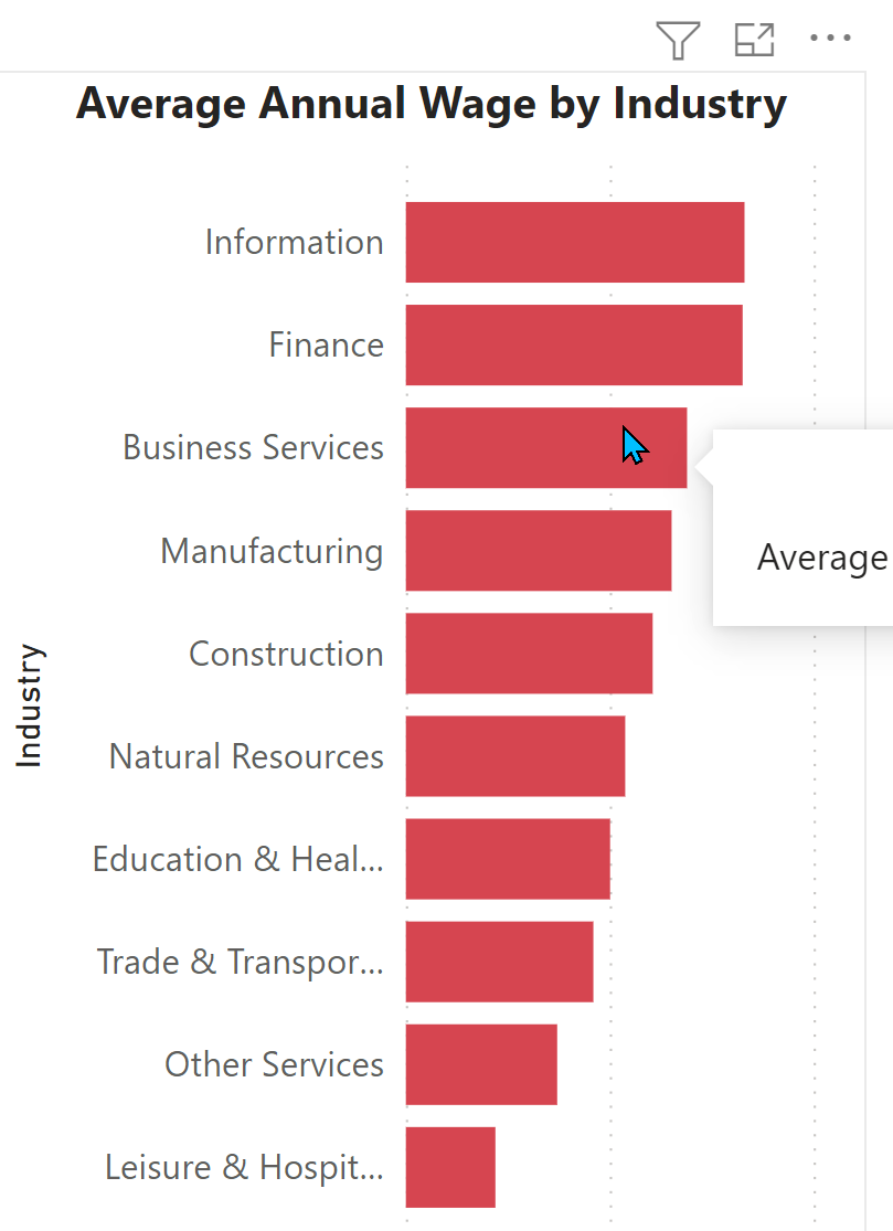
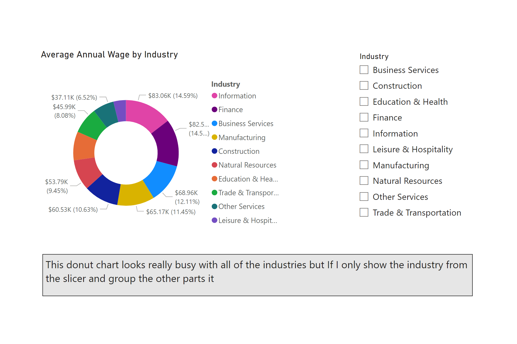
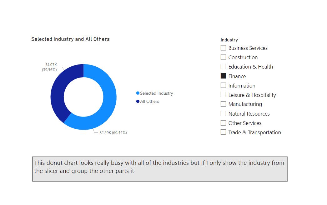
I have a list of industries. I want to be able to select one industry from the slicer and create a donut chart that shows the one industry and dynamically groups the reminder. When I select a different industry the donut chart regroups the data? I include the base .PBIX that I am working on. Not a lot of data.
@mbraun - not sure if this is what you are looking for, but I put together two measures. One to calculated the average for the selected industry and then a second showing the average for all others. Now - the legend isn’t dynamic. But - one way you could address this is simply turn off the standard legend and create one using some additional DAX to display the selected one (or a custom title).
Just following up if the response above help you solve your inquiry?
We’ve noticed that no response was received from you on the post above. In case there won’t be any activity on it in the next few days, we’ll be tagging this post as Solved.
Due to inactivity, a response on this post has been tagged as “Solution”.
If you have a follow question or concern related to this topic, please remove the Solution tag first by clicking the three dots beside Reply and then untick the check box.