Been a while since i’ve been here, but i’m a little bit stuck and need a fresh perspective.
I’m creating a report where the user can select a time period and i want a chart to group people into categories of hours worked, theres 1000’s of people. ie, Low, Medium & High. Obviously you cannot precalculate this as you do not know the exact time period the user will select, it might be 1 week or 6 months.
I can easily calculate the median and work out the category each person should be in as a measure, but not sure how to get this into a chart. I feel like i’m missing something super obvious.
I’ve googled Dynamic X Axis and Power BI is not capable of that as yet, is there a visual that can?
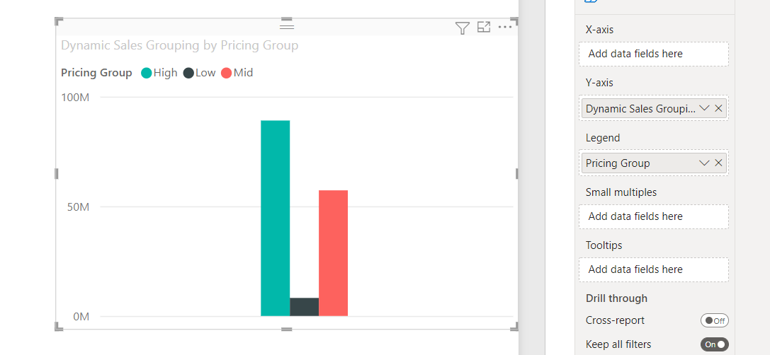
Thanks, I’m using analysis services so thats no use to me. I ended up pre-calculating a std devision score in the database, and only allowing the user to pick 1 month period, i did get the chart to work in the above example, but it didn’t look that good imo, instead of the XAxis i dropped the Pricing Group into the legend and the chart sucks a bit… too narrow etc.
While our users and experts do as much as reasonable to help you with your inquiries, not all concerns can be attended to especially if there are some learnings to be done. Thank you!