Hi everyone,
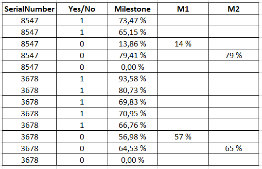
I have the following table :
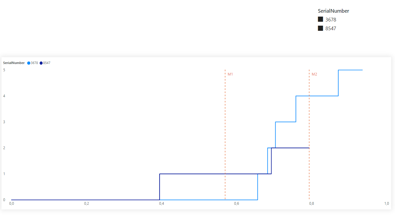
I want to create a line chart using :
-
X axis : column “Milestone”
-
Y axis : Measure “Total Yes/No” (cumulative sum of column “Yes/No”)
-
Legend : column “SerialNumber”
-
Slicer : column “SerialNumber”
I want that my graph shows a vertical line for each milestone (M1, M2) for each SerialNumber.
I tried many solutions but nothing worked.
If I use the “X ais constant line” in the analytics pane, it works for one SerialNumber but if I select multiple values in the slicer (2 or more SerialNumbers), I don’t get the result that I want.
Here is what I have now :
And this is the expected result :
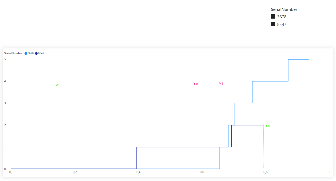
I hope there is a way to make it work as expected.
Thank you ![]()
BI.pbix (500.2 KB)
dataset.xlsx (11.1 KB)