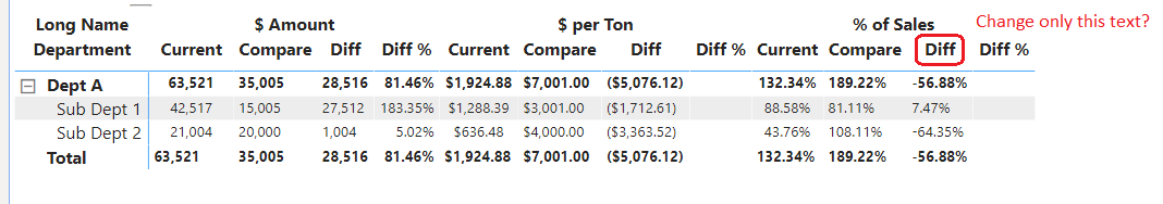
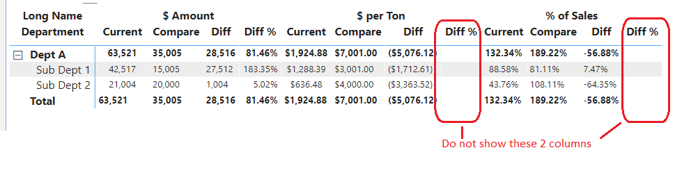
Using this approach, is it possible to not show the 2 columns circled below? I’ve made them blank, but the user has asked if they can just not be shown. If not, what other approach would you suggest?
Well, with regards to the first question, I’m afraid to say but I guess that’s not possible. We cannot change only one of the column name because if we do it will just simply reflect under other categories as well.
For second question, yes, that absolutely doable. You can hide the blank columns as you mentioned. Just go to the “Format” option >> Under that go to the “Column Headers” option >> Under that disable the “Word Wrap” option. Now, just go to right-side of the edge of header of the “Diff %” column (It will get converted into double-pointer arrow) and drag it towards the left side of it. The column will simply get hidden. Below is the screenshot provided of the result.
Well, there’s one hack/trick which you can implement in order to show different the column name for that particular category.
Step 1: Insert a “Text Box” and place it over a particular column name which you want to replace.
Step 2: Write the column name of your choice into the text box that you want to represent.
Step 3: Apply the same text formatting which is applicable to other column headers as well so that they’re in sync.
Step 4: (Most Important Step) Insert a “Rectangle” shape and place it over the “Table” visualization and remove all the formatting of that shape. Now, you might be wondering why did I do this? (Inserting a shape and placing it over a visualization). The reason behind this is, if someone by mistake clicks over the table, the table will simply get activated and shape which we have placed over the column name will get hidden. So in order to prevent this situation, I’ve inserted the “Rectangle” shape and removed the formatting so that if someone by mistake also clicks onto that visual the rectangle shape will get activated. And the main advantage is they’ll not recognize that they’ve activated the rectangle shape since we’ve removed the formatting of that shape.
Below is the screenshot provided for the reference of the end result -
Harsh,
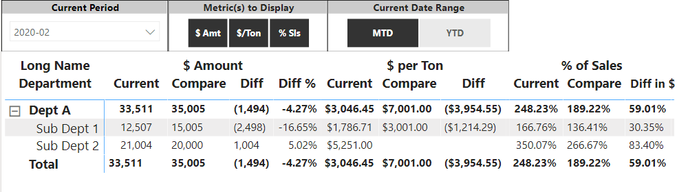
Thanks for your reply. I don’t think this will work in this particular instance, since the # of columns can be changed by the filter selection. However, I will definitely keep this technique in mind for future use!
Thanks,
Dean