Hi all,
In our Stock table, we have 2 different Ageing values, we’ll call them X Days and Y Days. We then group these into ageing bands: 0 - 30, 31 - 60, 61 - 90, 91 - 120 and 121+.
The business is interested in both X Days ageing and Y Days ageing and want to see a bar chart showing the number of units in each category. However we only want to display one chart and let the user toggle between analyzing X Days and Y Days. The user then needs the ability to drill down to a Detail report to see the stock units in each age band.
Please see attached which I have created to demonstrate my problem, along with the 2 attempts I’ve made.
Stock by Age Band.pbix (127.5 KB)
Standard
This shows 2 bar charts, simply reporting over the Age Bands columns that I added to my Stock fact table. The first groups by X Days and the second by Y Days. The users can drill through to Stock Detail and the numbers are correct, however the sort of the age bands is incorrect:
I suppose I could create a bookmark to toggle between these two charts and create 2 connected tables to handle the sorting but it wouldn’t be very dynamic and as much as possible I prefer to try and do things in DAX rather than end of with lots of bookmarks!
I would also prefer a solution which would allow for the removal of the Age Band columns from the fact table.
Dynamic Attempt 1
I thought I would have a go at dynamically grouping and segmenting the data using Sam’s example in this video
I created a new table Day Option with the values ‘X Days’ and ‘Y Days’ and created a slicer to allow the user to toggle between both.
I created another table, Age Band Groups which would dynamically group the units into an Age Band , based on the age landing between the From and To values:
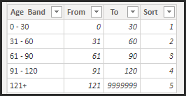
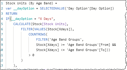
I then created measure [Stock Units (By Age Band)] and depending on the selected value of the slicer, calculated the number of units in each group based on From and To:
I then created a new bar chart, based on the Age Band from this disconnected table and added my toggle and the functionality worked great…
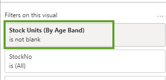
HOWEVER the drill through to Stock Detail did not work and returned all units ![]()
Related Table Attempt 2
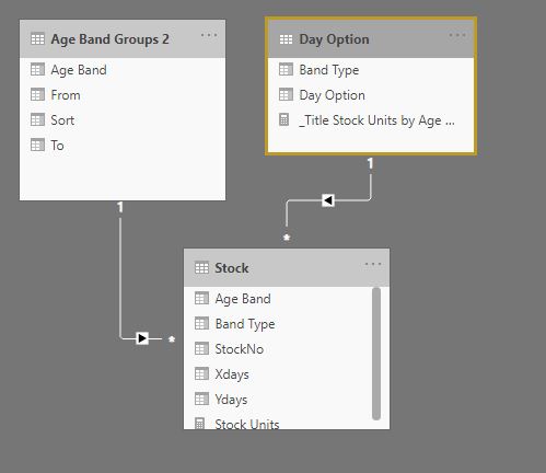
So I figured that for a drill though to work we need a physical relationship between my Age Band table and my Stock table. So I created a duplicate of the table Age Band Group and this time connected it to my Stock fact table - twice. Once on X Age Band and then again on Y Age Band:
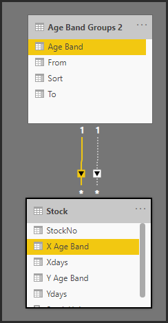
I then created new measures [Stock Units (By Age Band X Days)] and [Stock Units (By Age Band Y Days)] which used USERELATIONSHIP to manage the joins.

I then created a final measure [Stock Units (By Age Band v2)], which returned on or the other based on my slicer option.

This approach worked fine in the chart and replicated the functionality of Attempt 1, but again the drill through was the stumbling point and it only worked on X Days, but not Y Days.
SO!
I am hoping someone can help suggest a way that I can toggle between the two charts, have the X Axis correctly sorted and most importantly have the Drill Through work. As said, I would prefer to avoid bookmarks, but if that it is the only option then so be it!
Many thanks as always,
Mark


