Dynamic grouping into quadrants

Hi,
In the file attached, I have created a grouping based on margins and created a scatter chart. But, if i need to split the figures into 4 groups as below; how do i modify my dax formula?
i. High margin High volume
ii. High margin Low volume
iii. Low margin High Volume
iv. Low margin Low volume

Regards,
Jack

Just found this comment on the link below. Currently Power BI does not support 4 quadrants.

Here is the link to the website were you can click on the link to submit your vote for Power BI to make this change.

Thanks
Enterprise%20DNA%20Expert%20-%20Small

Also check out this video here, you will see how to showcase outliers.

This is very similar to what you need, you’ll likely just need to extend the secondary table and formula logic a little to get the four quadrants

Thanks
Sam

Thanks @sam.mckay… This could work :slight_smile:

Hi Sam. Is it possible to have a showcase example of outlier detection in combination with pareto? For example, in the tutorial video Min and Max sales are static numbers but can we put a percentage e.g. 0.8 - 1 to represent to 20% products and 0 - 0.8 to represent bottom 80% products by rank of sales? Then compare these with profit margins to classify “Outlier” v “Non-Outlier” products? In this case, the best performing quadrant will be the intersect of products which make up top 20% and have margins of 35% + etc. Keen to know how one can implement such a setup. Thanks!

@Harvey,

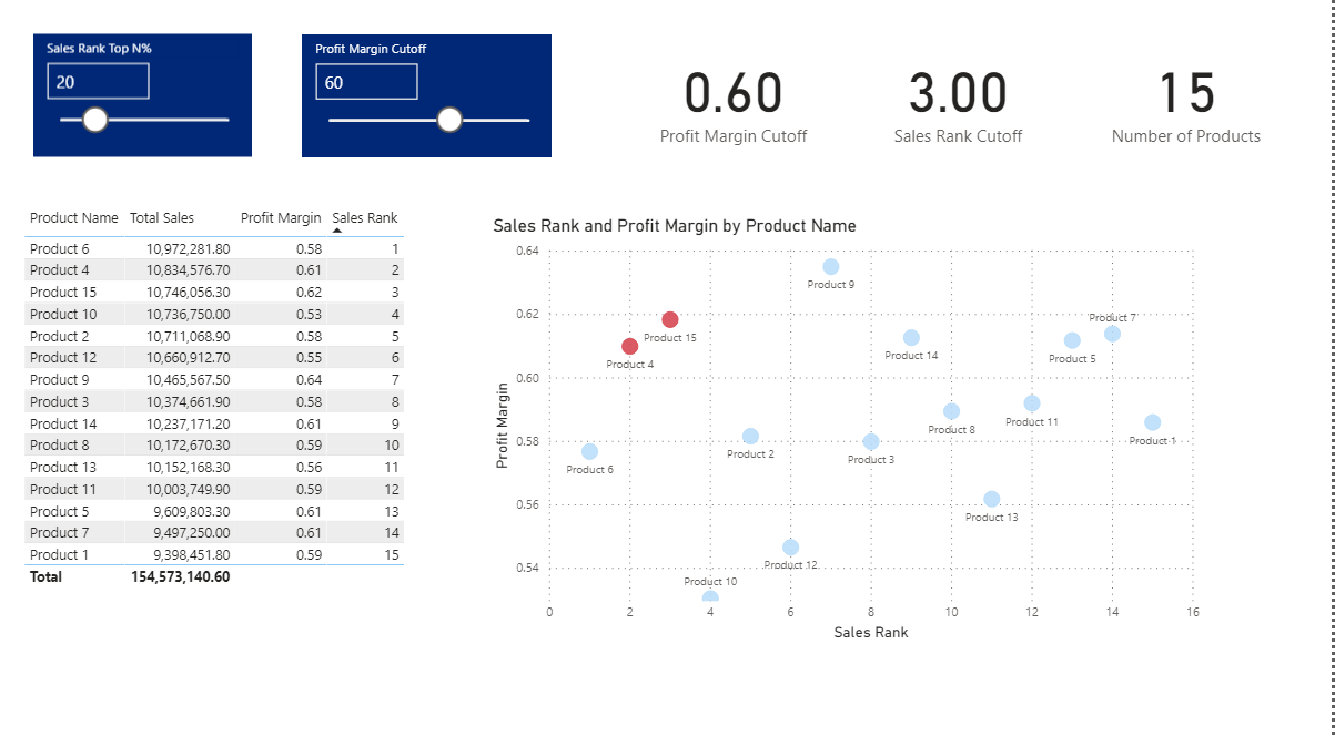
This question sparked my interest, so I built out a full sample application based on External Tools Practice Dataset. By adjusting the two sliders associated with the what-if parameters, you can define dynamically what constitutes an “outlier”. Those products that meet the outlier criteria will be colored red in the scatter chart. Below is a publish to web link, where you can play with the application.

I’ve also attached the solution file so you can explore how I put this together. Just give a shout if you have any questions. I hope this is helpful.

– Brian

E DNA Forum – ParetoMultiple Filter Solutions.pbix (428.1 KB)

1 Like

This is perfect! Great stuff and thank you Brian.

1 Like

@Harvey,

Thanks again for a great question. Even after I completed the solution on this one, it kept my wheels spinning and I did the following YouTube video based on an extension to your original query.

Hope you find this interesting and helpful.

– Brian

2 Likes

Wow! This is amazing Brian. We can now view not only the top 20% with highest margins cutoff but also view worst performing items on the same grid plus the average performers in the middle.

@Harvey,

Absolutely - and once you’ve got the general structure down, it only takes a minute or two to add those additional conditions. With just a shade more effort to distinguish between these two conditions:

you could create a fully dynamic 4-color 2x2 quadrant scatterplot, which I think would be a knockout visual.

  • Brian
1 Like

Knockout visual for sure! I just think that this is a great DAX pattern that can be re-used over and over again in so many different applications. Amazing work, Brian! Thanks for this.

1 Like

@Brian,

So we have the 2, 1, 1, 0 matrix compared against the 1, 0, 0, 0 matrix. The former solves a lot of our problem except distinguishing between the 1’s. What if you just use the 1, 0, 0, 0 format and have four variables instead, as shown below. Will this work?

Outlier Color =
VAR Rnk1 = IF( [Sales Rank] <= [Sales Rank Cutoff], 1, 0 )
VAR Marg1 = IF( [Profit Margin] >= [Profit Margin Cutoff], 1, 0 )

VAR Rnk2 = IF( [Sales Rank] >= [Sales Rank Cutoff], 1, 0 )
VAR Marg2 = IF( [Profit Margin] <= [Profit Margin Cutoff], 1, 0 )

VAR Rnk3 = IF( [Sales Rank] >= [Sales Rank Cutoff], 1, 0 )
VAR Marg3 = IF( [Profit Margin] >= [Profit Margin Cutoff], 1, 0 )

VAR Rnk4 = IF( [Sales Rank] <= [Sales Rank Cutoff], 1, 0 )
VAR Marg4 = IF( [Profit Margin] <= [Profit Margin Cutoff], 1, 0 )

VAR Combined1 = Rnk1 * Marg1
VAR Combined2 = Rnk2 * Marg2
VAR Combined3 = Rnk3 * Marg3
VAR Combined4 = Rnk4 * Marg4

RETURN
SWITCH( TRUE(),
Combined1 > 0, “#FF0000”, // red
Combined2 > 0, “#FFFF00”, // yellow
Combined3 > 0, “#0000FF”, // blue
Combined4 > 0, “#FF6600”) // orange

You could also change the TRUE and FALSE values for one dimension to 2 and 1 instead of 1 and 0. Then you add them together and you will have four possible outcomes: 0, 1,2, or 3. And if you are strategic in how you assign your initial values to each dimension, you can add 1 to the final calculation, and the result could match the corresponding quadrant number. :wink:

1 Like

matrix

@ Dave,
Like that?

1 Like

Yes, that’s even better. I had originally imagined A having possible values of 0 and 1, and then adding one to the sum of A and B, but this is even cleaner. Then, using @BrianJ’s measure, just assign different colors to 1, 2, 3, and 4 like you did in your post above.

Sounds great! Thanks Dave.

@harvey, @DaveC,

Very clever approach. Great point that while typically dummy variables are coded 0/1, there’s absolutely no reason why you can’t relax that assumption for cases like this one. Shows the flexibility of expressing them as numbers, rather than T/F. :+1:

  • Brian
1 Like

Any ideas of how we could bring in a legend? For example, using a classification from the BCG Matrix:

1 would be the intersect of high sales rank and high margin products, more like “Stars”
2 would be the intersect of low sales rank and high margin products, say “Question Marks”
3 would be the intersect of high sales rank but low margin products, which are “Cash Cows”
4 would be the low sales rank and low margin products, “Dogs”

Harvey

Indeed, I do. Check out the custom legend @MudassirAli built for his redesign of my Where in the World is Enterprise DNA report:

This is actually composed of four separate one cell tables, each one tied to a separate condition in the filter pane ( [Quartile] = 1, [Quartile] = 2, etc.).

It’s a bit fiddly getting all the table visuals lined up and looking like a single visual, but I think the final effect is great. Looping in @MudassirAli to see if he has any additional advice.

  • Brian
2 Likes

This is the only way I could think of building Dynamic Custom Legends. The other way would be to use bookmarks but still not better than the trick I used in this map. The solution which @Harvey is looking for can be best achieved with the Table Visual trick used to build the custom legend. You can surely let us know if you need help.

Thanks,
Mudassir

2 Likes