Dynamic column header / field selection in published report

Hello,

I’m asking if there is: a) native feature of PBI, b) downloadable visual, or c) some technique based on a DAX expression, that will allow a user to switch dimension and attributes used in visual.

By user I’m referring to someone accessing a report published to the PBI service – so not able to change layout via PBI Desktop.

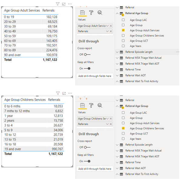
The screenshot below gives an idea of what I’d like to be able to achieve. In desktop I envisage an additional part of the table definition where (in this example) several dimensions could be added to the values area and then made available (in combo/dropdown) to be used for grouping on the measure/value.

So, in the example both Age Grp Adult and Age Grp Children are added to the visual and one is set as default dimension the other(s) as optional but available. The when published the user will be able to select (maybe via dropdown list in column header in table) which dimension they would like to use to display and aggregate by in the table.

Any suggestions appreciated.


Stephen

Hi @stephen.carr,

Welcome to the Forum!

Have you looked into the Personalize visuals feature?

.

I hope this is helpful.

The short answer to this - is I would recommend setting one (or possibly a few) visuals to personalize, as Melissa has suggested. It would mean the least impact to your data.

The second method I would suggest would involve using buttons (example on second tab of attached) to show/hide tables that are stacked on top of each other.

But, there is a sort of hack method to achieve what you are looking for. I will add that it is not without cost - in a large data model, this will slow you down. Particularly if you intend to let the user choose between too many dimensions.

In the attached example, I wanted to let my user choose to see quantity by Account, Product or Salesperson. On each of those dimension tables, I added an Index column in the Power Query (M code) area, and I built a table that had all of the possible index values I would need.

image image

My report visual was built using the Index Table [IDX] value, and some SWITCH trickery to return the proper information as related to the IDX value.

Quantity =
VAR SelectAccount = CALCULATE( [Qty Purchased], TREATAS( VALUES( ‘Multi Table Index’[IDX] ), ACCOUNT[Index] ))
VAR SelectItem = CALCULATE( [Qty Purchased], TREATAS( VALUES( ‘Multi Table Index’[IDX] ), ‘PRODUCT’[Index] ))
VAR SelectRep = CALCULATE( [Qty Purchased], TREATAS( VALUES( ‘Multi Table Index’[IDX] ), SALESPERSON[Index] ))
RETURN
SWITCH( TRUE(),
[Slicer Selection] = “ACCOUNT”, SelectAccount,
[Slicer Selection] = “PRODUCT”, SelectItem,
[Slicer Selection] = “SALESPERSON”, SelectRep,
SelectAccount)

Variable Table (by item, by rep, by account) based on slicer selection.pbix (108.9 KB)

Many thank for your response. I was unaware of the new/trial personal visualisation interaction and, now having checked it out, can see it’s a massive addition to PBI.

I had a DAX-based approach but it was not as elegant as your proposal and did take some time to process and a little sluggish when in use.

Stephen

Melissa - have missed this in the PBI announcements but now have investigated and it seems to be ideal for purpose I require and also goes way beyond !

Stephen

1 Like

My DAX solution may be different than yours, but believe me, it will be sluggish on a large dataset.
In fact, the only reason that I worked out this solution at all is because I had someone in management insist it was necessary (this was before the personal visual option).

Needless to say, when I ran the bloated report side-by-side with another using buttons to change the table view - it was obvious which one we should be using.