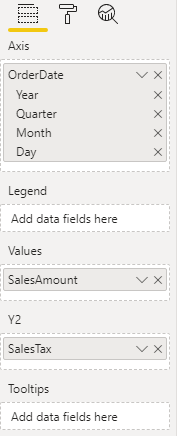
Dual axis for line chart
You can now include a second Y-axis on your line charts, enabling you to plot two trends with different ranges along the same X-axis progression.
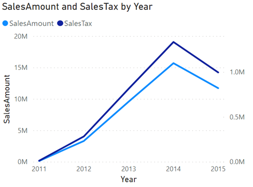
To use the second axis, drag fields into the new secondary Y-axis field well, and they will be drawn into the visual against a Y-axis on the right side of the chart. You can format these lines and this axis in the associated card of the formatting pane. Otherwise, the formatting will mirror that of your primary Y-axis.