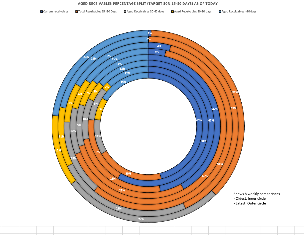
I would like to inquire if anyone knows how to create a specific chart in Power BI. In Excel, this chart was represented as a donut chart. However, my attempts to replicate it in Power BI have been unsuccessful. If anyone has any insights or suggestions, I would greatly appreciate your input.
Absolutely you can do pretty-much anything you want with Deneb … looks like it could perhaps easily be rendered with a series of 8 overlapping (and concentric) donut charts.
Greg
Due to inactivity, we’d like to conclude that you no longer require assistance to solve your inquiry.
If you have a follow question or concern related to this topic, please remove the Solution tag first by clicking the three dots beside Reply and then untick the check box.