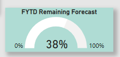
My client wants to show the fiscal year end forecast that’s remaining. Normally in a donut chart I would show what’s been consumed.
In this case I use the measure to reflect what’ been consumed, then i simply add ( 1 - ) to the measure is it gives me the remaining value. I then hide the actual call out value that represents the forecast consumed and add a visual card ontop of it to represent the “remaining” value.
The issue is that i can only change the color of the consumed part of the donut, i can’t change the color of what’s left (the right side of the donut).
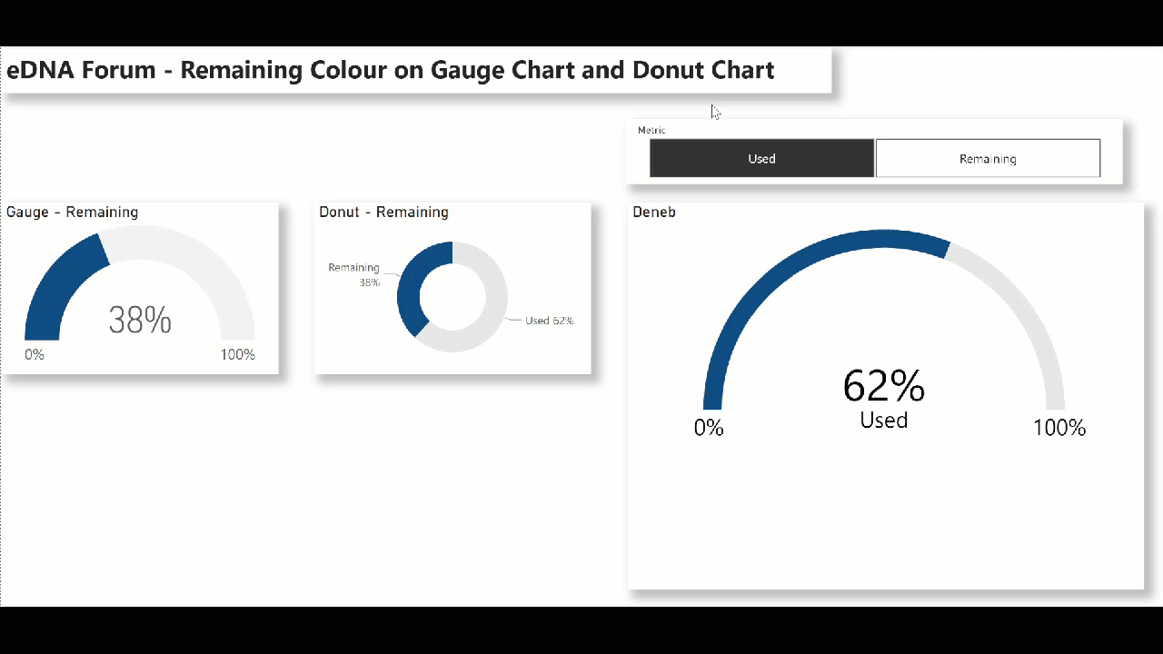
Hi @chad.sharpe. I don’t think the gauge visual allows the setting of both colours, but the standard donut chart does. If you need to/are determined to use a gauge, then you can create whatever you want with the Deneb custom visual and Vega-Lite JSON code.
I hadn’t explored conditionals in Deneb yet, so took your “… change the colour of Remaining …” issue as an opportunity, and this is my quick-and-dirty result:
This is what I did:
added a standard Power BI gauge visual
added a standard Power BI donut chart visual
added a Deneb visual and used the Speedometer Deneb template as a base
deleted the “Average” ARC
renamed the “Poor” ARC to “Used”
renamed the “Good” ARC to “Remaining”
added a standard Power BI single-select slicer for “Metric” (Used; Remaining)
added conditional colour to the Used and Remaining ARCs based on metric selected
added a conditional transformation for the display value based on the metric selected
(In all, about one hour of Deneb work including about 1/2 hour of exploration and trial-and-error work to discover the correct syntax for conditionals.)