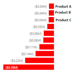
I would like to know if it’s possible to do this type of chart on deneb where the y axis start on the right instead of the left as usual. (like on image below)
Yes, its possible.
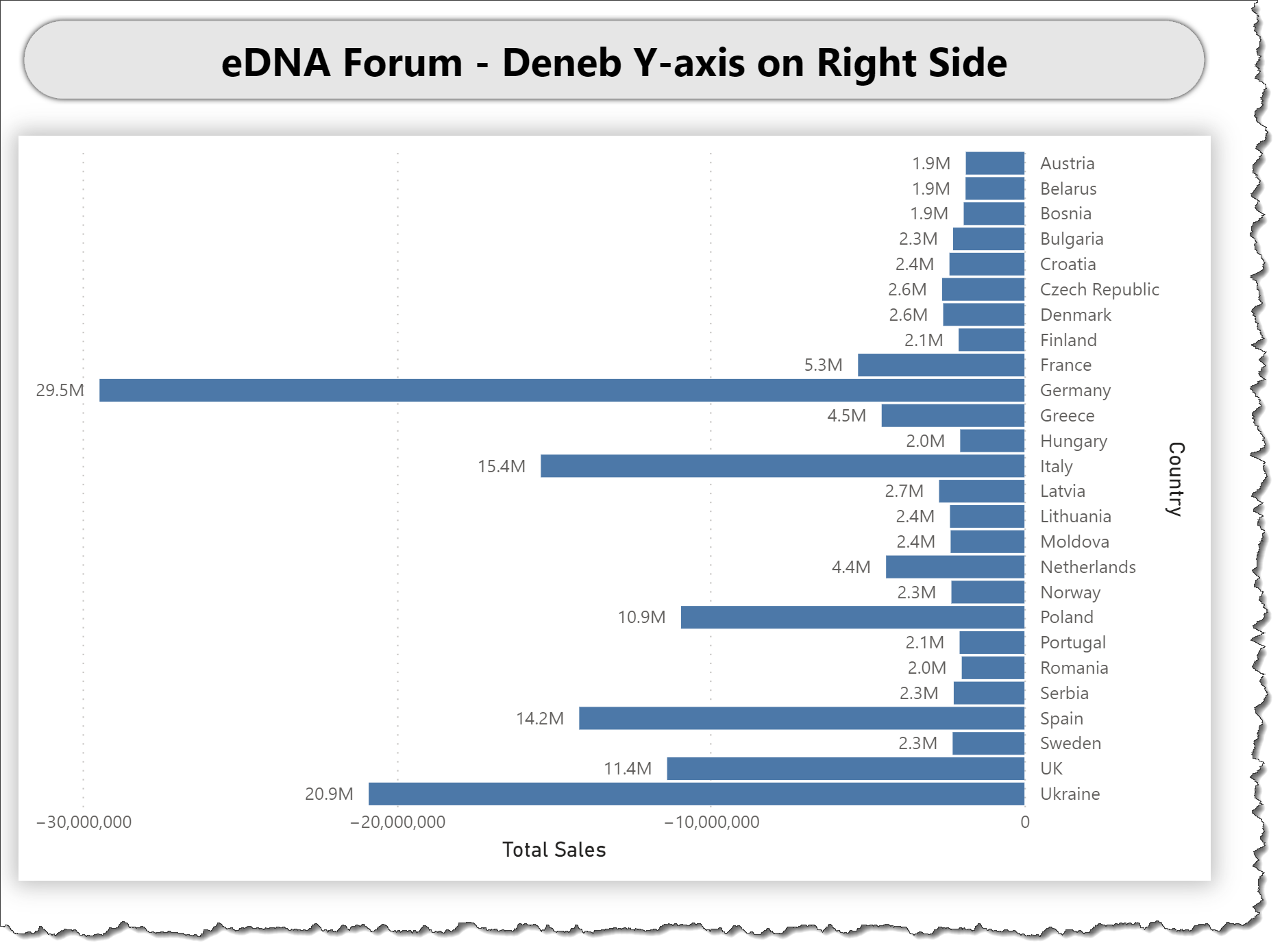
Here’s what I did in my test case:
- add a transform block to create a negative value
- set the y-axis orient to “right”
- use the negative value from your transform for the bar x-axis
Hope this helps.
Greg
eDNA Forum - Deneb Y-axis on Right Side.pbix (1.7 MB)
Thank you for you quick solution. I already try in my case and it’s work.
But, unfortunately I can’t solve my first difficult and the reason why I’m trying Deneb.
Let me explain:
I want to do this kind of final result:
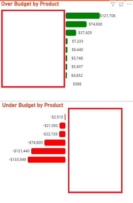
They are two different charts but because the product names are longer than allowed, the charts are perfectly aligned. However, when I have customer names I don’t get the same result, because some customer names have a shorter length and the graphic adapts by the maximum length. I think I need to control when the label starts to be written and how big the x-axis should be to get the same result every time.
I sent the json file i’m using.
Under.json (3.8 KB)
Over.json (3.7 KB)
Hi @AlexandreAndrade. Can you please post a PBIX containing the data? I’ve rarely used JSON data sources and have spent over 1/2 an hour and can’t get more than 3 rows, which I know is wrong.
That being said, check-out the truncate function in Vega Expressions and see if it can help.
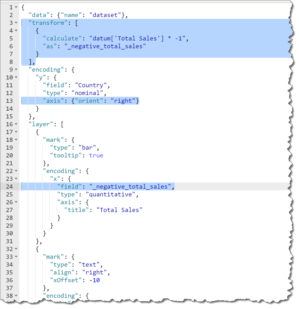
Here’s my use of it adding a “labelExpr” key:value pair to the axis block in my test file:
      "axis": {
        "orient": "right",
        "labelExpr": "truncate( datum.value, 10 )"
      }
which let me get this:

Greg
eDNA Forum - Deneb Y-axis on Right Side - V2.pbix (1.7 MB)
Hi, I sent in attachment one pbix with one example of my charts.
Deneb Share AA.pbix (1.7 MB)
Hi @AlexandreAndrade. I got your sample PBIX … thanks. I’m not sure I understand your issue, but I’m guessing you want to horizontally-align the Y-axes of the two visuals in a column. I’m not aware of an axis width property that would “force” the Y-axis labels to be a certain size, even if they were shorter or longer, and my first thought would be to let Vega-Lite calculate the axis position automatically by using a single visual in each column (using a “vconcat” perhaps to display the “Over” and “Under”). Rather than 2 different sets of data and filter criteria for the 2 visuals in a column, perhaps try to create a single Power BI table that contains all the data you’d like to show in a column, then filter the first spec of the “vconcat” for the “over” and the second spec for the “under”.
I’m not able to go further at this time as I have many commitments today and tomorrow, but would be happy to take another look later this week if you can create a single dataset for each “column”.
Hopefully this helps.
Greg
Hi @AlexandreAndrade and @Greg,
I hope this message finds you well. I’m writing regarding the thread on Deneb - Y Axis on right side. I was wondering if it would be possible for us to temporarily close this thread while Greg looks for a possible solution.
Once a solution is available, we can reopen the thread and post the solution for @AlexandreAndrade to try it out.
Thank you both for your time and effort on this matter. I appreciate your understanding, and I look forward to assisting you further in the future.
Thank you
Hi. OK, you can close
Thank you @AlexandreAndrade