Deneb Workout 09 - Linked Charts with Highlight Selection Brush

Difficulty Rating: 5 out of 5

Deneb Workout 09 - Linked Charts with Highlight Selection Brush

One of the main interactivity features of Deneb/Vega-Lite is the brush. A brush can be used to link multiple charts in a composite visual and enable additional analysis insights.

Goals

Using the simple supplied dataset, produce a Deneb visual in Power BI that:

  • • includes a scatter chart on the right for fuel ecomnomy vs. power
  • • includes a column of 3 column charts on the left for acceleration, displacement, and weight (all 3 column charts should be identically sized and respond to the selection brush in the scatter chart)
  • • uses the country of origin to select the marker colour, and uses the colour scheme defined in the current Power BI theme for the scatter chart markers
  • • uses the country of origin to select the marker shape
  • • uses the first colour defined in the current Power BI theme for the columns (bars) main colour and light grey for the “selected” colour
  • • includes a custom tooltip for year, make/model, region of origin, power, acceleration, engine size, and fuel economy
  • • includes an area brush in the scatter chart to highlight the selected points and to control the display of the column charts

Submission

Load the supplied data file into a new Power BI file, create your solution, and reply to this post. Upload a screenshot of your solution along with the Deneb/Vega-Lite JSON code used. Please format your JSON code and blur it or place it in a hidden section.

Period

This workout will be released on Monday June 5, 2023, will run for 2 weeks, and the author’s solution will be posted on Sunday June 18, 2023.

Greg
Deneb Workout 09 - Data - Cars.json (102.5 KB)

2 Likes

Hi @Greg,

That was challenging. I may not have written an efficient specification. I think I could remove some redundancies.

I ended up hconcat-ing the bar charts with the scatterplot. The bar charts were vconcat-ed layers.

For highlighting of the bars, I layered two charts, one with all the data and another filtered by the “brush”. It seems like I could have instead highlighted the selected portion of the bars with a conditional color or something. I wasn’t sure how to go about that one.

Here’s a gif of the submission:

gif

Thanks for putting this together. I learned quite a bit just from trying to replicate your original. I was going to make the legend interactive, but I wasn’t able to do that. I thought, too, that since origin is encoded by color and shape I should encode another field in either one or the other. But I tried to stay as close to your visualization as I could.

Hello,
I tried to do my best! It was extremely interesting, I learned a lot. What I still cannot achieve is to have the bar charts revert to the “unfiltered” color when nothing is selected.
So what happens with my code is that, when you have nothing in the brush, the bar charts turn grey… as logically in the last layer present, which is the filtered one.

I tried to compare the “selected” rows: I used joinaggregate to count the total number of rows in the dataset, and for one of the charts started to set the opacity of the filtered layer with a criteria to see if the number of datapoints (which I see are expressed as “__count”) correspond to the total rows. If yes, then opacity should be 0, if not, it should be 1.
Well… it does not work, I had to set both to 1 to revert to the original behaviour :face_with_raised_eyebrow:

Anyway here is a snapshot of the chart and my code. Thanks!

Specification

{
“data”: {“name”: “dataset”},
“transform”: [
{
“joinaggregate”: [
{
“op”: “count”,
“field”: “row”,
“as”: “rows_agg”
}
]
}
],
“hconcat”: [
{
“vconcat”: [
{
“layer”: [
{
“height”: 100,
“mark”: {“type”: “bar”},
“encoding”: {
“x”: {
“field”: “Acceleration (sec)”,
“bin”: true
},
“y”: {
“aggregate”: “count”
},
“color”: {
“value”: {
“expr”: “pbiColor(0)”
}
}
}
},
{
“transform”: [
{
“filter”: {
“param”: “brush”
}
},
{
“joinaggregate”: [
{
“op”: “sum”,
“field”: “__count”,
“as”: “rows_sel”
}
]
}
],
“height”: 100,
“mark”: {“type”: “bar”},
“encoding”: {
“x”: {
“field”: “Acceleration (sec)”,
“bin”: true
},
“y”: {
“aggregate”: “count”
},
“color”: {
“value”: “#d2d2d4
},
“opacity”: {
“condition”: [
{
“test”: "datum[‘rows_sel’] == datum[‘rows_agg’] ",
“value”: 1
}
],
“value”: 1
}
}
}
]
},
{
“layer”: [
{
“height”: 100,
“mark”: {“type”: “bar”},
“encoding”: {
“x”: {
“field”: “Displacement (L)”,
“bin”: true
},
“y”: {
“aggregate”: “count”
},
“color”: {
“value”: {
“expr”: “pbiColor(0)”
}
}
}
},
{
“transform”: [
{
“filter”: {
“param”: “brush”
}
}
],
“height”: 100,
“mark”: {“type”: “bar”},
“encoding”: {
“x”: {
“field”: “Displacement (L)”,
“bin”: true
},
“y”: {
“aggregate”: “count”
},
“color”: {
“value”: “#d2d2d4
}
}
}
]
},
{
“layer”: [
{
“height”: 100,
“mark”: {“type”: “bar”},
“encoding”: {
“x”: {
“field”: “Weight (lbs)”,
“bin”: true
},
“y”: {
“aggregate”: “count”
},
“color”: {
“value”: {
“expr”: “pbiColor(0)”
}
}
}
},
{
“transform”: [
{
“filter”: {
“param”: “brush”
}
}
],
“height”: 100,
“mark”: {“type”: “bar”},
“encoding”: {
“x”: {
“field”: “Weight (lbs)”,
“bin”: true
},
“y”: {
“aggregate”: “count”
},
“color”: {
“value”: “#d2d2d4
}
}
}
]
}
]
},
{
“params”: [
{
“name”: “brush”,
“select”: “interval”
}
],
“height”: 428,
“width”: 300,
“mark”: {“type”: “point”},
“encoding”: {
“x”: {
“field”: “Fuel Economy (mpg)”,
“type”: “quantitative”
},
“y”: {
“field”: “Power (hp)”,
“type”: “quantitative”
},
“color”: {
“field”: “Origin”,
“type”: “nominal”,
“scale”: {
“scheme”: “pbiColorNominal”
}
},
“shape”: {
“field”: “Origin”,
“type”: “nominal”
},
“tooltip”: [
{
“field”: “Year”,
“type”: “temporal”,
“format”: “%Y”
},
{
“field”: “Name”,
“type”: “nominal”
},
{
“field”: “Origin”,
“type”: “nominal”
},
{
“field”: “Power (hp)”,
“type”: “quantitative”
},
{
“field”: “Acceleration (sec)”,
“type”: “quantitative”
},
{
“field”: “Cylinders”,
“type”: “quantitative”
},
{
“field”: “Fuel Economy (mpg)”,
“type”: “quantitative”
}
]
}
}
]
}

This new code works, what I cannot understand is that it only works if I have the tooltip on for the bar charts…can you please share if you have an explanation for this?
Anyway here it is, I played on color value.
Thanks!

Summary

{
“data”: {“name”: “dataset”},
“transform”: [
{
“joinaggregate”: [
{
“op”: “count”,
“field”: “row”,
“as”: “rows_agg”
}
]
}
],
“hconcat”: [
{
“vconcat”: [
{
“layer”: [
{
“height”: 100,
“mark”: {“type”: “bar”},
“encoding”: {
“x”: {
“field”: “Acceleration (sec)”,
“bin”: true
},
“y”: {
“aggregate”: “count”
},
“color”: {
“value”: {
“expr”: “pbiColor(0)”
}
}
}
},
{
“transform”: [
{
“filter”: {
“param”: “brush”
}
},
{
“joinaggregate”: [
{
“op”: “count”,
“field”: “row”,
“as”: “rows_sel”
}
]
}
],
“height”: 100,
“mark”: {“type”: “bar”},
“encoding”: {
“tooltip”: [
{“field”: “rows_sel”},
{“field”: “rows_agg”}
],
“x”: {
“field”: “Acceleration (sec)”,
“bin”: true
},
“y”: {
“aggregate”: “count”
},
“color”: {
“condition”: [
{
“test”: "datum[‘rows_sel’] == datum[‘rows_agg’] ",
“value”: “transparent”
}
],
“value”: “#d2d2d4
}
}
}
]
},
{
“layer”: [
{
“height”: 100,
“mark”: {“type”: “bar”},
“encoding”: {
“x”: {
“field”: “Displacement (L)”,
“bin”: true
},
“y”: {
“aggregate”: “count”
},
“color”: {
“value”: {
“expr”: “pbiColor(0)”
}
}
}
},
{
“transform”: [
{
“filter”: {
“param”: “brush”
}
},
{
“joinaggregate”: [
{
“op”: “count”,
“field”: “row”,
“as”: “rows_sel1”
}
]
}
],
“height”: 100,
“mark”: {“type”: “bar”},
“encoding”: {
“tooltip”: [
{
“field”: “rows_sel1”
},
{“field”: “rows_agg”}
],
“x”: {
“field”: “Displacement (L)”,
“bin”: true
},
“y”: {
“aggregate”: “count”
},
“color”: {
“condition”: [
{
“test”: "datum[‘rows_sel1’] == datum[‘rows_agg’] ",
“value”: “transparent”
}
],
“value”: “#d2d2d4
}
}
}
]
},
{
“layer”: [
{
“height”: 100,
“mark”: {“type”: “bar”},
“encoding”: {
“x”: {
“field”: “Weight (lbs)”,
“bin”: true
},
“y”: {
“aggregate”: “count”
},
“color”: {
“value”: {
“expr”: “pbiColor(0)”
}
}
}
},
{
“transform”: [
{
“filter”: {
“param”: “brush”
}
},
{
“joinaggregate”: [
{
“op”: “count”,
“field”: “row”,
“as”: “rows_sel2”
}
]
}
],
“height”: 100,
“mark”: {“type”: “bar”},
“encoding”: {
“tooltip”: [
{
“field”: “rows_sel2”
},
{“field”: “rows_agg”}
],
“x”: {
“field”: “Weight (lbs)”,
“bin”: true
},
“y”: {
“aggregate”: “count”
},
“color”: {
“condition”: [
{
“test”: "datum[‘rows_sel2’] == datum[‘rows_agg’] ",
“value”: “transparent”
}
],
“value”: “#d2d2d4
}
}
}
]
}
]
},
{
“params”: [
{
“name”: “brush”,
“select”: “interval”
}
],
“height”: 428,
“width”: 300,
“mark”: {“type”: “point”},
“encoding”: {
“x”: {
“field”: “Fuel Economy (mpg)”,
“type”: “quantitative”
},
“y”: {
“field”: “Power (hp)”,
“type”: “quantitative”
},
“color”: {
“field”: “Origin”,
“type”: “nominal”,
“scale”: {
“scheme”: “pbiColorNominal”
}
},
“shape”: {
“field”: “Origin”,
“type”: “nominal”
},
“tooltip”: [
{
“field”: “Year”,
“type”: “temporal”,
“format”: “%Y”
},
{
“field”: “Name”,
“type”: “nominal”
},
{
“field”: “Origin”,
“type”: “nominal”
},
{
“field”: “Power (hp)”,
“type”: “quantitative”
},
{
“field”: “Acceleration (sec)”,
“type”: “quantitative”
},
{
“field”: “Cylinders”,
“type”: “quantitative”
},
{
“field”: “Fuel Economy (mpg)”,
“type”: “quantitative”
}
]
}
}
]
}

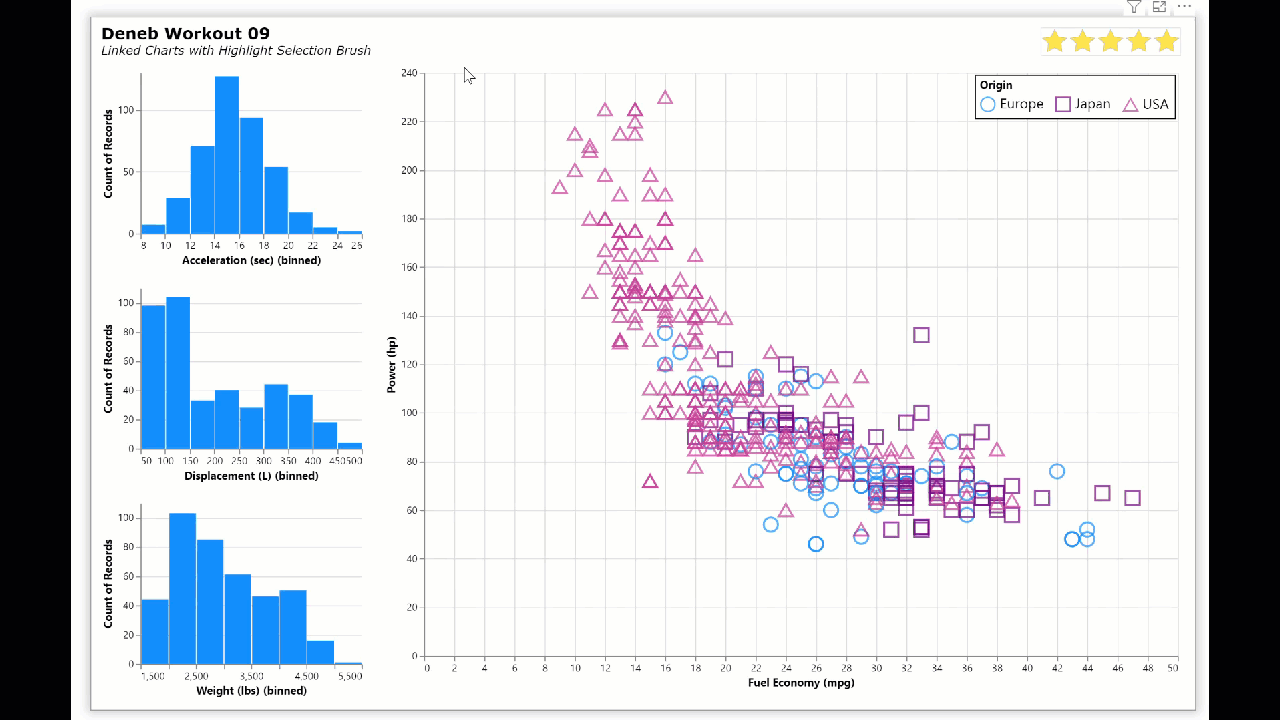
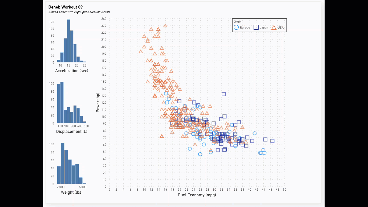
Here’s my solution to this workout, where I used several Deneb/Vega-Lite features, including:

General:

  • • title block complete with subtitle
  • • used a horizontal concatenation (hconcat) block to display the 2 separate visual areas as a single composite Deneb visual (3 column charts [left] and scatter chart [right])

Column Charts:

  • • used the repeat / spec format to create a composite visual of 3 vertically-concatenated columns charts (one each for acceleration, displacement, and weight)
  • • used 2 separate bar marks in a layer, both with the X-axis as the repeat and the Y-axis as the aggregated count
  • • 1st bar mark for the full dataset (using the 1st colour of the current Power BI theme [in this case, blue])
  • • 2nd bar mark for the records filtered by the scatter chart selection brush (grey)
    (Note: both bar marks use similar colour encoding, even though only one condition will be valid for each; this illustrates that a simple filter transform based on interactivity can greatly enhance the effectiveness of a visual)
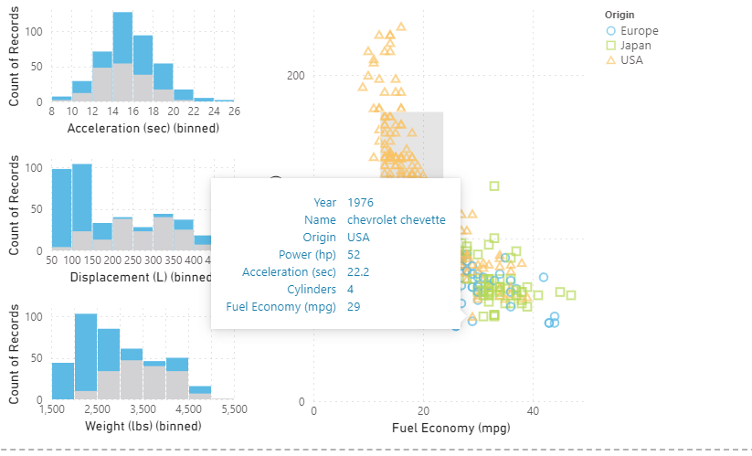
Scatter Chart:

  • • used a point mark of fuel economy vs. power with conditional colour (using the current Power BI theme) and shape (both by “origin”)
  • • used a params block to implement a selection brush on both axes (using the interval selection)
  • • used a custom tooltip to display multiple record values (year, name, origin, power, acceleration, displacement, fuel economy)
  • • used a custom legend in a horizontal layout with hard-coded coordinates and separate border and fill colours

Here’s the code:

{
  "title": {
    "anchor": "start",
    "align": "left",
    "offset": 10,
    "text": "Deneb Workout 09",
    "font": "Verdana",
    "fontSize": 16,
    "fontWeight": "bold",
    "fontStyle": "normal",
    "subtitle": "Linked Charts with Highlight Selection Brush",
    "subtitleFont": "Verdana",
    "subtitleFontSize": 12,
    "subtitleFontWeight": "normal",
    "subtitleFontStyle": "italic"
  },
  "data": {"name": "dataset"},
  "hconcat": [
    {
      "name": "COLUMN_CHARTS",
      "repeat": {
        "row": [
          "Acceleration (sec)",
          "Displacement (L)",
          "Weight (lbs)"
        ]
      },
      "spec": {
        "layer": [
          {
            "height": 160,
            "width": 220,
            "mark": {
              "type": "bar",
              "color": {
                "expr": "pbiColor(0)"
              }
            },
            "encoding": {
              "x": {
                "field": {
                  "repeat": "row"
                },
                "type": "quantitative",
                "bin": {"maxbins": 10},
                "axis": {
                  "labelAngle": 0
                }
              },
              "y": {
                "aggregate": "count"
              },
              "color": {
                "condition": [
                  {
                    "test": {
                      "param": "_scatter_brush"
                    },
                    "value": "lightgrey"
                  }
                ],
                "value": {
                  "expr": "pbiColor(0)"
                }
              }
            }
          },
          {
            "height": 160,
            "width": 220,
            "transform": [
              {
                "filter": {
                  "param": "_scatter_brush"
                }
              }
            ],
            "mark": {
              "type": "bar",
              "color": {
                "expr": "pbiColor(0)"
              }
            },
            "encoding": {
              "x": {
                "field": {
                  "repeat": "row"
                },
                "type": "quantitative",
                "bin": {"maxbins": 10},
                "axis": {
                  "labelAngle": 0
                }
              },
              "y": {
                "aggregate": "count"
              },
              "color": {
                "condition": {
                  "test": {
                    "not": {
                      "param": "_scatter_brush"
                    }
                  },
                  "value": "lightgrey"
                }
              }
            }
          }
        ]
      }
    },
    {
      "name": "SCATTER_CHART",
      "height": 580,
      "width": 750,
      "params": [
        {
          "name": "_scatter_brush",
          "select": "interval"
        }
      ],
      "mark": {
        "type": "point",
        "tooltip": true,
        "size": 200
      },
      "encoding": {
        "x": {
          "field": "Fuel Economy (mpg)",
          "type": "quantitative"
        },
        "y": {
          "field": "Power (hp)",
          "type": "quantitative"
        },
        "color": {
          "field": "Origin",
          "scale": {
            "scheme": "pbiColorNominal"
          },
          "legend": {
            "direction": "horizontal",
            "orient": "none",
            "legendX": 830,
            "legendY": 2,
            "strokeColor": "black",
            "fillColor": "white",
            "padding": 5,
            "type": "symbol",
            "symbolSize": 200,
            "labelFontSize": 14,
            "zindex": 1
          }
        },
        "shape": {
          "field": "Origin",
          "type": "nominal"
        },
        "tooltip": [
          {
            "field": "Year",
            "type": "temporal",
            "timeUnit": "year",
            "title": "Year"
          },
          {
            "field": "Name",
            "type": "nominal"
          },
          {
            "field": "Origin",
            "type": "nominal"
          },
          {
            "field": "Power (hp)",
            "type": "quantitative"
          },
          {
            "field": "Acceleration (sec)",
            "type": "quantitative"
          },
          {
            "field": "Displacement (L)",
            "type": "quantitative"
          },
          {
            "field": "Fuel Economy (mpg)",
            "type": "quantitative"
          }
        ]
      }
    }
  ]
}

Congratulations to all who participated, and good luck.
Greg
Deneb Workout 09 - Linked Charts with Highlight Selection Brush.pbix (1.3 MB)

2 Likes

@Greg Thanks! I learned the “repeat” today :slight_smile:
I have a question on using the parameter brush in the condition for the color. Why are you using the “not” condition to specify then the colour needs to grey when data is filtered? What is the actual output of the parameter brush?

It does work beautifully but I can’t understand the logic behind it.

Thanks!
Kind regards
Valeria

"color": {
              "condition": {
                "test": {
                  "not": {
                    "param": "brush"
                  }
                },
                "value": "lightgrey"
              }
            }

Hi @valeriabreveglieri.

Thanks for your question. It’s probably not necessary at all, but I wanted to keep the 2 bar marks “aligned” (using similar code as much as possible, so positive condition in the 1st and negative condition in the 2nd).

Greg