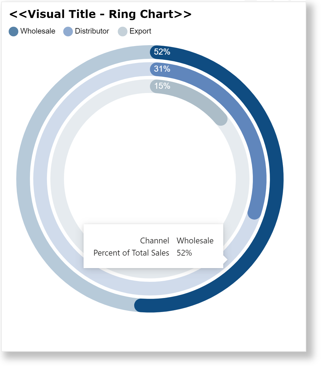
The standard donut chart in Power BI can be used to display the value and remainder of a measure as percentages of 100%, and can also be used to display multiple measures as concentric donuts when multiple donut charts are placed on top of one another. Included here is a Deneb template for creating a ring chart (or 3-donut chart).
This template illustrates a number of Deneb/Vega-Lite features, including:
- a title block setting additional display properties
- a transform block to extend the provided dataset
- a parameters block to set legend and ring characteristics (size, colour, position, etc.)
- a vertical concatenation of 2 visuals (legend, rings)
- a layered visual for the legend consisting of 3 overlayed circle marks and 3 overlayed text marks
- a nested layered visual for the rings with each inner layer consisting of a partially-opaque 100% background arc mark, a % value arc mark with end rounding, and a label mark
- custom tooltips showing the category and percent
- a configuration to set the spacing of the 2 visuals to zero
The intent of this template is not to provide a finished visual, but rather to serve as a starting point for further custom visual development.
Also included is the sample PBIX using the Enterprise DNA Practice Dataset as a demo.
NOTE: This template is provided as-is for information purposes only, and its use is solely at the discretion of the end user; no responsibility is assumed by the author.
Greg
deneb.ring_chart.0.2.json (14.8 KB)
Deneb Templates - Ring Chart.pbix (1.7 MB)


