Hi Greg,
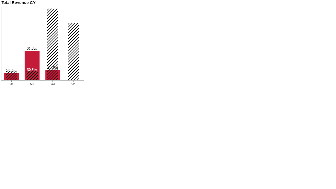
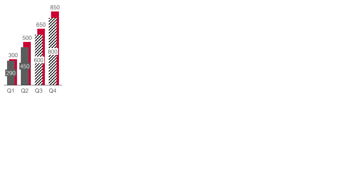
And also I would like to move red bar chart to the left side as the picture and format x axis title Q1,Q2, Q3 to Cambria font.
I have also attached my code.
{
“title”: {
“text”: “Total Revenue CY”,
“anchor”: “start”,
“align”: “left”,
“font”: “Helvetica”,
“fontSize”: 14
},
“data”: {“name”: “dataset”},
“layer”: [
{
“description”: “BACK BAR (displays the comparison value)”,
“mark”: {
“type”: “bar”,
    "width": {
      "expr": "bandwidth('x') * 0.8"
    },
    "color": "#CC0033",
    "tooltip": true
  },
  "encoding": {
    "y": {
      "field": "Value AC",
      "type": "quantitative",
       "axis": null
    }
  }
},
{
  "description": "FRONT BAR (displays the component value)",
  "mark": {
    "type": "bar",
     "fill": "url(#diagonal-stripe-2)",
    "width": {
      "expr": "bandwidth('x') * 0.6"
    },
    "color": "#0F4C81",
    "tooltip": true
  },
  "encoding": {
    "y": {
      "field": "Value BP",
      "type": "quantitative",
        "axis": {
    "format": "#0,,,,.0bn",
    "formatType": "pbiFormat"
  }
    }
  }
},
{
  "description": "BACK BAR LABEL (displays the label of the comparison value)",
  "mark": {
    "type": "text",
    "baseline": "bottom",
       "font": "Cambria body",
    "fontSize": 13,
    "color": "#000000",
    "yOffset": -2
  },
  "encoding": {
    "y": {
      "field": "Value AC",
      "type": "quantitative"
    },
    "text": {
      "field": "Value AC",

     "format": "#00",
      "formatType": "pbiFormat"
    }
  }
},
{
  "description": "FRONT BAR LABEL (displays the label of the component value)",
  "mark": {
    "type": "text",
    "baseline": "bottom",
    "font": "Cambria body",
    "fontSize": 13,
    "color": "#FFFFFF",
    "yOffset": 4
  },
  "encoding": {
    "y": {
      "field": "Value BP",
      "type": "quantitative"
    },
    "text": {
      "field": "Value BP",
      "format": "#00",
      "formatType": "pbiFormat"
    }
  }
}
],
“encoding”: {
“x”: {
“field”: “Quarter”,
“type”: “nominal”,
“axis”: {“title”: null,“labelAngle”: 0}
}
}
}