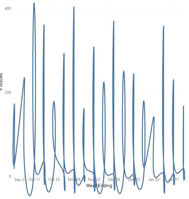
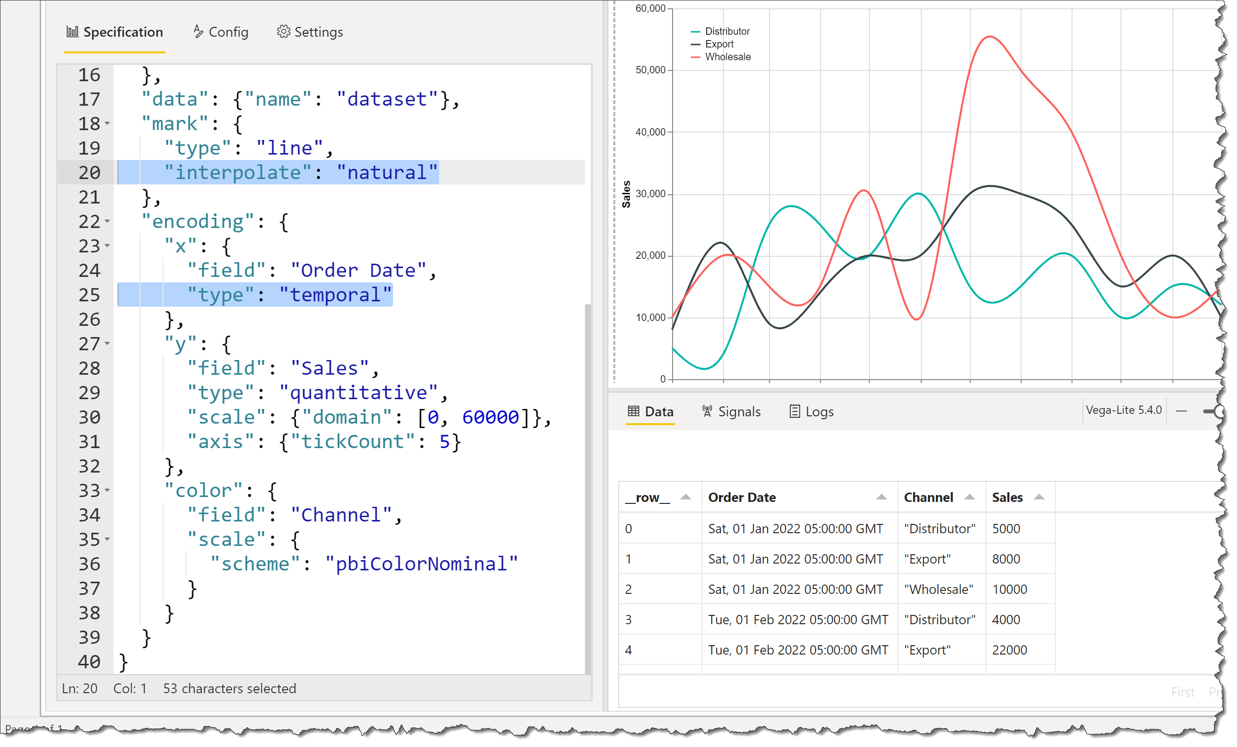
The standard line chart in Power BI can be used to display, among other things, a temporal value on the X-axis and a numerical value on the Y-axis for a set of categories. The points making-up each segment are joined by direct lines, which can lead to a “jagged” appearance. Included here is a Deneb template for a line chart that takes advantage of the curve smoothing available within Vega-Lite.
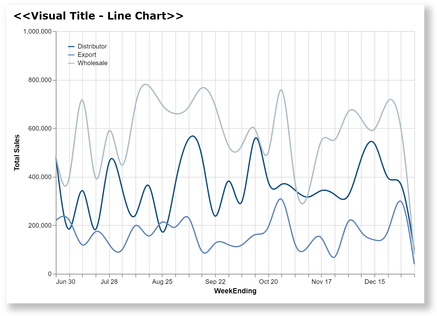
This template illustrates a number of Deneb/Vega-Lite features, including:
- a title block setting additional display properties
- configuring the line interpolation type (i.e., smoothing)
- configuring the min and max (“domain”) of the Y-axis
- configuring the approximate number of labels (“tickCount”) on the Y-axis
- configuring the line colours
- configuring characteristics of the automatically-generated legend (e.g., position, orientation, etc.)
The intent of this template is not to provide a finished visual, but rather to serve as a starting point for further custom visual development.
Also included is the sample PBIX using the Enterprise DNA Practice Dataset as a demo.
NOTE: This template is provided as-is for information purposes only, and its use is solely at the discretion of the end user; no responsibility is assumed by the author.
Greg
deneb.smooth_line_chart.0.2.json (2.2 KB)
Deneb Templates - Line Chart.pbix (1.7 MB)