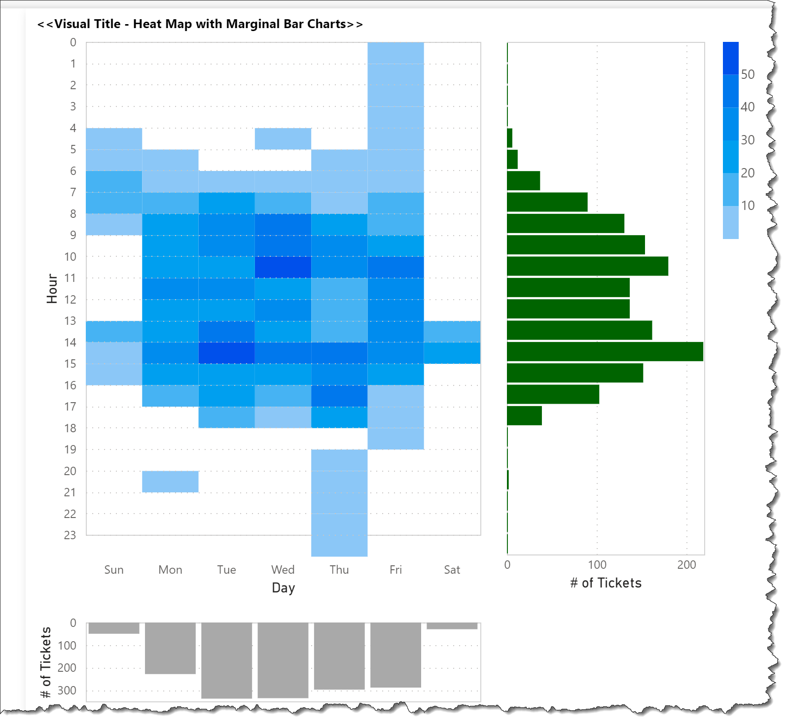
One of the available features built-in to the Vega-Lite language is the ability to combine a number of visuals into a “composite” visual that may expose additional insights. A heat map with marginal bar charts can be used to illustrate this feature, and I enclose a Deneb/Vega-Lite template for such a composite visual.
This template illustrates a number of Deneb/Vega-Lite features, including:
a horizontal concatenation of a heat map and a horizontal bar chart
a vertical concatenation of a vertical bar chart (or column chart) with the horizontal concatenation of the heat map and horizontal bar chart
individual transformation blocks in the 2 bar charts to aggregate the daily and hourly tickets
the heat map uses the “binning” feature available in Vega-Lite
the heat map colours are set using Deneb v1.1’s ability to access the current Power BI theme
Vega-Lite’s automatic generation of legends
Comments: This exploration is still at an early stage, and a number of issues warrant further development, but have not been pursued here as the goal was to showcase an example of composite visuals, including: (1) all 3 visuals (heat map, column chart, bar chart) should be updated to respond collectively to cross-highlighting selections, (2) the automatic legend, while proper for the heat map, is not reflective of the column chart and the bar chart, (3) the alignment of the 3 visuals (heat map, column chart, bar chart) was manually done and should be made automatic
It is expected that when further experience is gained with such a composite visual that these and other issues can be addressed, and an updated template will be created if and when that occurs.
The intent of this template is not to provide a finished visual, but rather to serve as a starting point for further custom visual development.
Also included is the sample PBIX using a mildly modified version of the JIRA tickets dataset released for Enterprise DNA Challenge #8 as a demo.
NOTE: This template is provided as-is for information purposes only, and its use is solely at the discretion of the end user; no responsibility is assumed by the author.
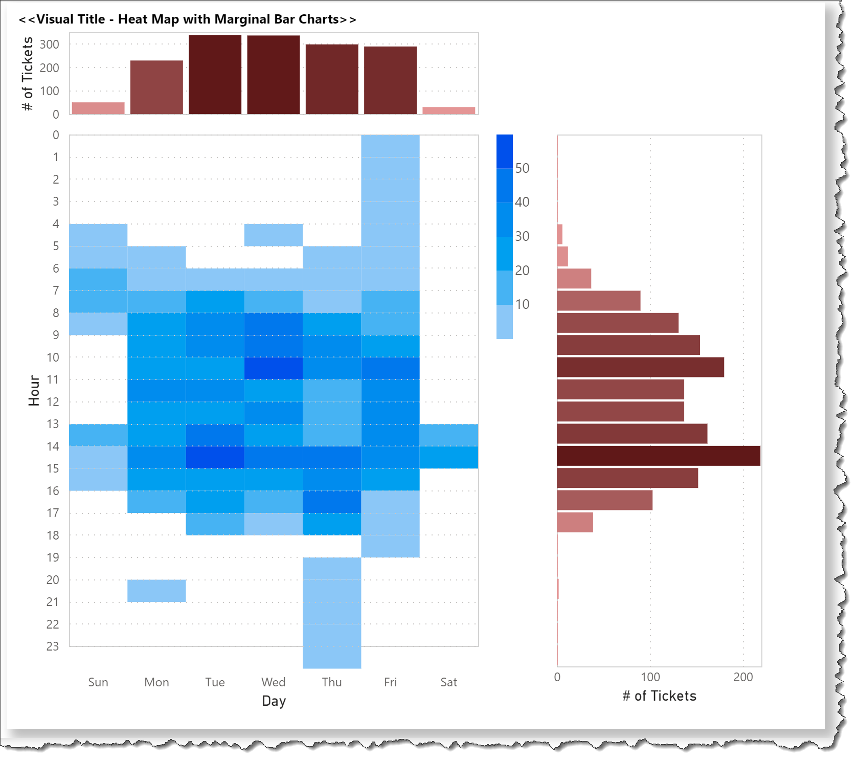
The heat map with marginal bar charts can also be presented with the inverse of the vertical bar chart (column chart) projecting downwards below the heat map.
One possible way to achieve this is with four small changes to the JSON code for the Deneb visual, namely:
1-reverse the order of the heat map block and column chart block in the vertical concatenation
2-add a transform to calculate the “negative_daily_tickets”
3-change field used for the y axis to the new “negative_daily_tickets” value
4-add an “axis” block to the “y” encoding and set the label expression for the y axis to use the negative of the field value
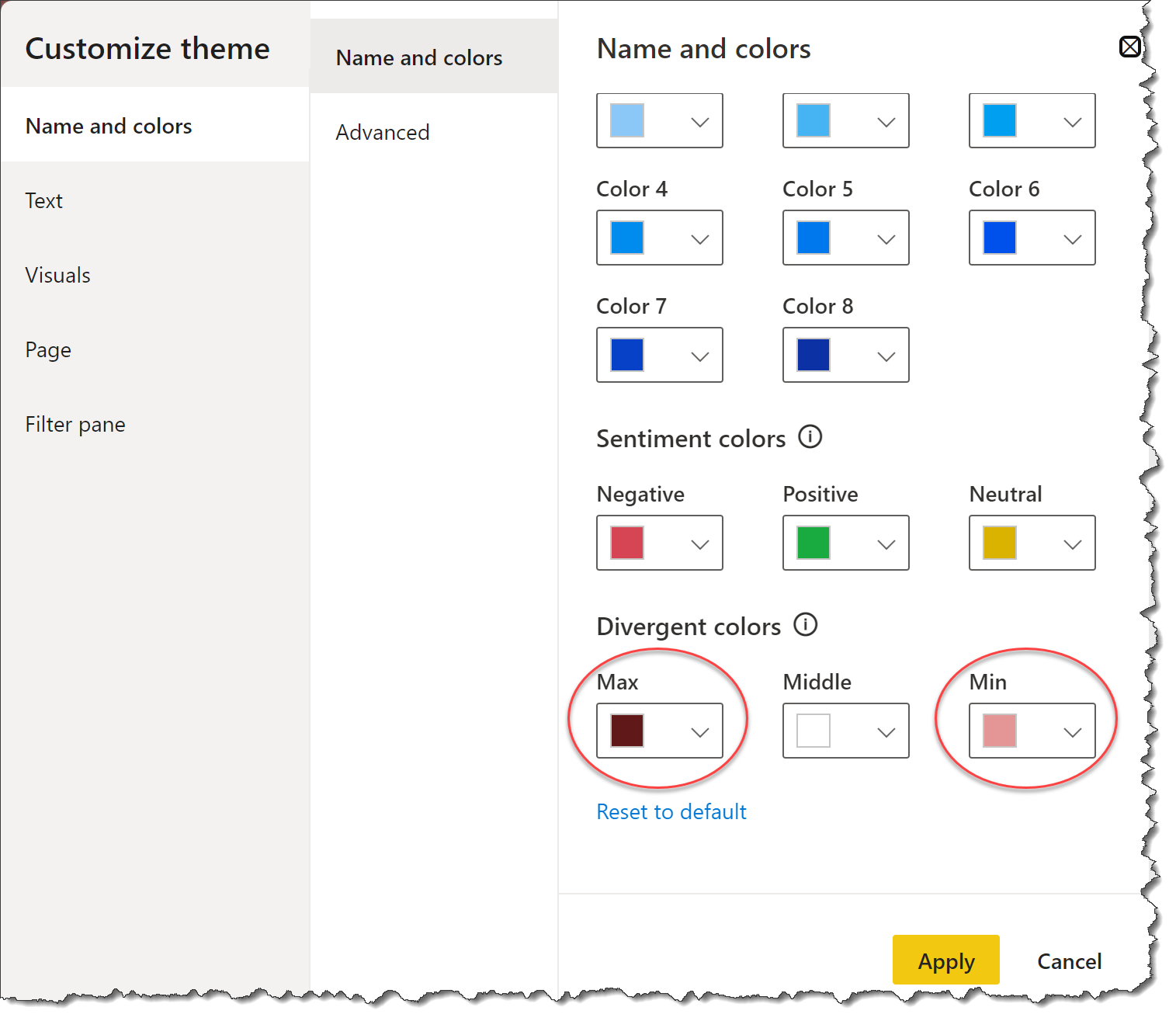
When the “pbiColorLinear” scheme made accessible by Deneb v1.1 is used, the maximum and minimum colours from the “Divergent” section of the colour theme are used.
To achieve this, two small changes only are required to the JSON code for the Deneb visual, namely:
1-replace the existing “color” code block for the first bar chart
Hi @Greg I really like pairing heatmap with bar chart together in just one visual.
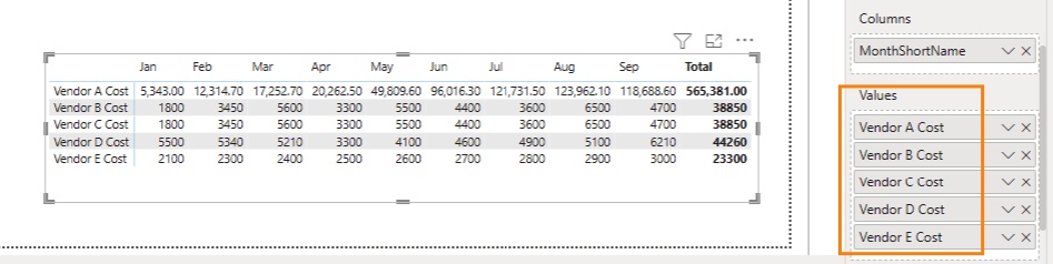
I have a question about the Y-axis of the heatmap. Can I use multiple DAX measures like the screenshot below? I also attached the PBIX to this message.
Hi @teresating886. I’m glad you like the heat map with marginal bar charts. I’m unsure from your description what your expected output is. Deneb is extremely flexible and has been able to do just about anything I’ve wanted, so being really specific about what you want to do is paramount. Please provide a screenshot mockup (or mockups) using whatever tool you like (Excel, PowerPoint, etc.) of your desired output. Greg
P.S. Rather than posting to an already-solved thread, please create a new thread with you question. @EnterpriseDNA, please split this post into a new thread.