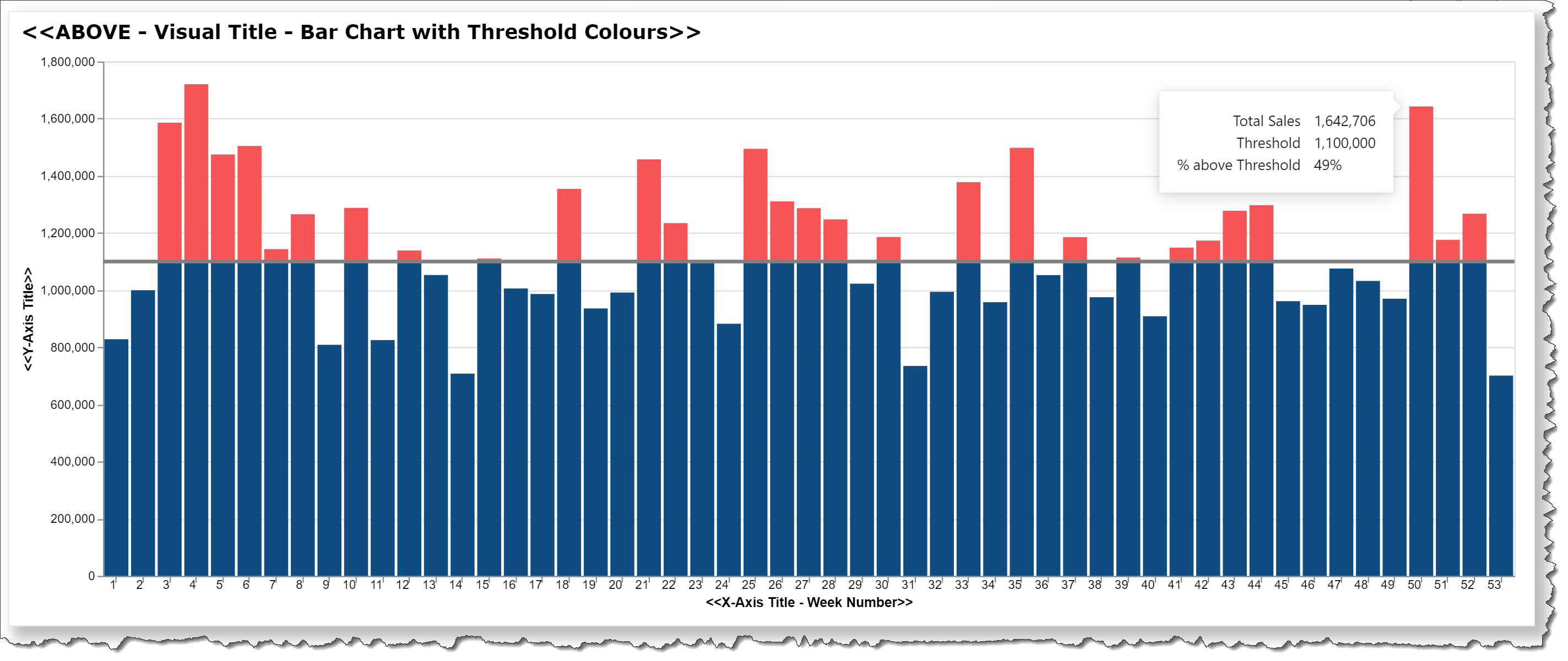
The standard stacked column chart in Power BI can be used to display a measure value for a set of categories, and if a field value (column or measure) is used for a threshold and separate above-and-below threshold measures are stacked, it can be used to display the above-and below portions (or stacks) in different colours. I wanted to see if Deneb/Vega-Lite could do the same thing with minimal effort, and included here is a Deneb template for a bar chart that breaks-down a single measure internally into above-and-below portions.
This template illustrates a number of Deneb/Vega-Lite features, including:
- a title block setting additional display properties
- a transform block extending the dataset by calculating above-and-below threshold portions of the measure
- 3 layers on top of one-another:
- value below threshold (bar; blue)
- value above threshold (bar; red)
- threshold (horizontal rule; grey)
- a custom tooltip showing the value, the threshold, and the percent difference
- the use of separate “y” and “y2” to create ranged bars
The intent of this template is not to provide a finished visual, but rather to serve as a starting point for further custom visual development.
Also included is the sample PBIX using the Enterprise DNA Practice Dataset as a demo.
NOTE: This template is provided as-is for information purposes only, and its use is solely at the discretion of the end user; no responsibility is assumed by the author.
Greg
deneb.bar_chart_with_threshold_colours.0.2.json (4.7 KB)
Deneb Templates - Bar Chart with Threshold Colours.pbix (1.7 MB)