Deneb Sales by Month by Year with overlayered Forecast

Hello,
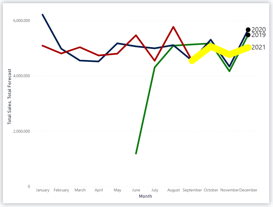
I am trying to use the hover line chart in Deneb for sales - as per attached template - to also show a forecast line.
In my business case, I have a measure that calls for “Spending + Forecast” and one with “Forecast” only. I plot today the “Spending + Forecast” but users would like to be able to see when the actuals become forecast, so I thought of adding a layer to the chart with the Forecast only, and put it on top of the other with a different color/strokewidth/… but it’s not working as intended, the line is not showing.

I tried to replicate the scenario in the original file by adding a “Forecast” table and measure and I worked on the chart in [Work 2]:

eDNA Forum - Deneb Sales by Month by Year with Forecast.pbix (1.7 MB)

Could you please let me know where I am going wrong?
Thanks!
Kind regards
Valeria

Hi @valeriabreveglieri.

I think your Deneb/Vega-Lite code is probably OK, but there was a data modelling issue: your Forecast[Order Date] column was of type “Text” where it should have been “Date” for the relationship to the [Dates] table to be effective. Once the datatype was changed, there was 1 point, and it was visibile on the Deneb visual.

I’d probably start with a known, made-up dataset that has representative data values for Sales and Forecast. Then, as always, I put all the fields (year, month, sales, forecast) in a table to make sure the data and relationships have been modelled correctly.

Hope this helps.
Greg
eDNA Forum - Deneb Sales by Month by Year with Forecast - V2.pbix (1.7 MB)

Hello @Greg oups sorry I made the mock-up data too quickly!
And I did not notice anything as this does not work in my “real” report, so I was not expecting it to work on the mock dataset.
Anyway attached the corrected dataset where I did put more data in the “forecast”, which is better to understand the problem.

What I get is that I see the points from the forecast (I made them yellow to stand out), but I don’t see any line, even though the mark is “line”.

My idea was to overwrite the “Sales” line (which in this case would represent “Sales + Forecast”) with the “Forecast” line for the corresponding period where “Forecast” is present.

eDNA Forum - Deneb Sales by Month by Year with Forecast - V3.pbix (1.7 MB)

Thanks!
Kind regards
Valeria

Hi @valeriabreveglieri.

Yeah, I see the issue … I tried to add a specific opacity (1) to the forecast line mark, but it didn’t help …

      "mark": {
        "type": "line",
        "tooltip": true,
        "strokeWidth": 20,
        "color": "yellow",
        "opacity": 1,
        "point": false
      },

I’m not sure why Vega-Lite is responding this way. I’ll keep thinking/trying and post if I come-up with something useful.
Greg

1 Like

Hi @valeriabreveglieri,

The issue is that you have rows where Total Forecast is null and Vega-Lite will have issues interpolating lines where the series contains null or invalid values).

You can fix this in two steps:

1. Filter null values

Add a transform to your layer that contains the forecast line that removes the null values, e.g.:

{
  ...
  "layer": [
    {...},
    {...},
    {...},
    {
      "transform": [
        {
          "filter": "datum['Total Forecast'] !== null"
        }
      ],
      ...
    }
  ]
}

Note that

2. Fix resulting axis resolution issues

A temporal axis would be better for x, but if you want to use nominal, you will need to use an aggregate other than sum, as this causes issues with domain union across layers (you will get a warning in the logs and your chart will look weird as it can no longer sort the axis). Technically your axis is ordinal rather than nominal, as there is an order to the sequence (month number). Not that it matters in terms of how things will render (you can keep nominal if you want, but I can’t leave it alone because I’m a huge pedant :slight_smile: ).

Using either min or max as the op will work fine though, e.g.:

{
  "data": {"name": "dataset"},
  "encoding": {
    "x": {
      "field": "Month Name",
      "type": "ordinal",
      "axis": {"labelAngle": 0},
      "sort": {
        "op": "min",
        "field": "MonthOfYear",
        "order": "ascending"
      },
      "title": "Month"
    },
    ...
  }
  ...
}

This will render your chart how I think you’re expecting it to look, e.g.:

I’ve attached an updated copy of your workbook for reference so you can see the complete recipe.

Cheers,

DM-P

eDNA Forum - Deneb Sales by Month by Year with Forecast - V3a.pbix (1.7 MB)

2 Likes

@dm-p Hi Daniel! This looks amazing, thank you!
And again I learned something today…:slight_smile:
I do disagree though on you being a “huge pedant” - I would rather use the words “great teacher”!!! :slight_smile:
My users are going to be so happy… I followed SQLBI’s approach where forecast and actuals should be together as one line, not to have the “drop” when the actuals stop, but then in doing that there is definitely a need to make sure that it is somehow clear what is what, and this chart with the additional layer does it perfectly.
Thanks again!!!

1 Like