Hi,
has anyone had any luck with creating a Marimekko chart with Deneb?
DJ
Hi,
has anyone had any luck with creating a Marimekko chart with Deneb?
DJ
Hi @DavieJoe. I’ve not heard of a Marimeko Chart before right now, but after a quick search it looks like a group of stacked bar charts with varying widths. I’d imagine the bar mark and facet view composition technique could be combined to create such a chart in Deneb/Vega-Lite. Do you have a sample dataset you can upload in a PBIX along with a mockup (Excel or PowerPoint?) we can use as a test case?
Greg
Hi Greg,
cool, that would be awesome to see one mocked up.
If you give me an hour or so I’ll get a sample data set and PBIX posted.
DJ
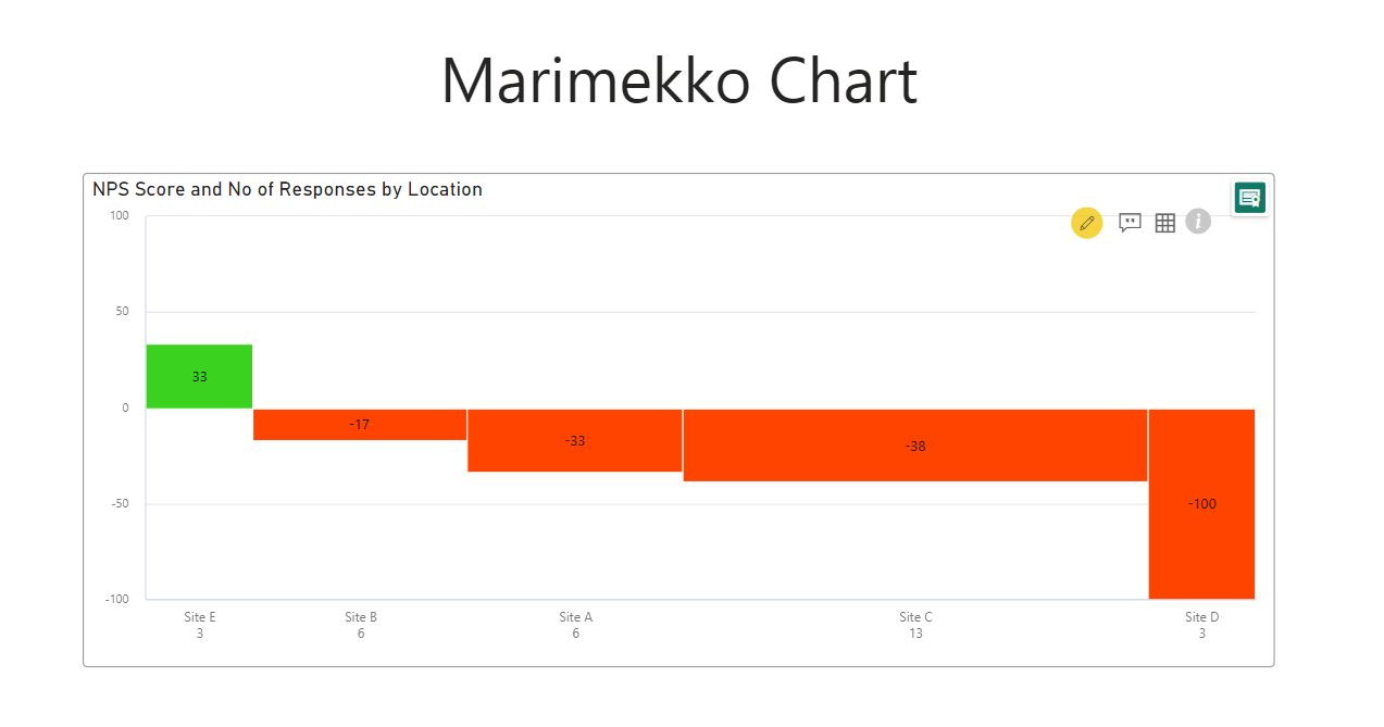
Hi Greg,
I’ve recreated the Marimekko Chart with the xViz Marimekko Chart Custom Visual with how I’d like to recreate in Deneb.
PBIX file included with example chart, raw data supplied also but already in PBIX file.
Marimekko Test.pbix (1.8 MB)
RawData.xlsx (9.6 KB)
Happy Deneb sleuthing!
DJ
p.s. please don’t judge me on my positive & negative colour choices, I was rushing ![]()
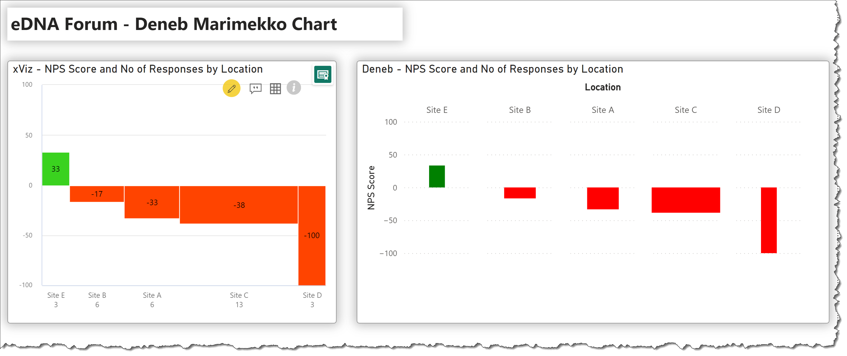
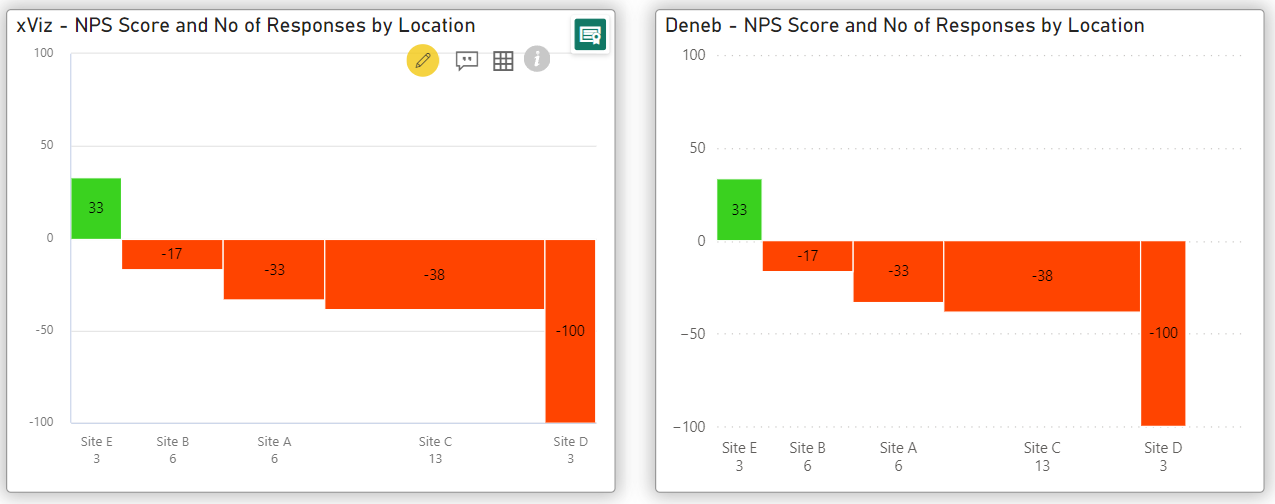
Hi @DavieJoe. Yes, Deneb can easily do something like this. Here’s a first cut at a partial solution:
Still many details to be worked-out (e.g., bar labels, bar spacing, etc.), but thought I would post now (meetings this morning, so will likely not get any more time for the next few hours).
Here’s the Deneb/Vega-Lite code:
{
  "data": {"name": "dataset"},
  "facet": {
    "column": {
      "field": "Location",
      "sort": {
        "op": "sum",
        "field": "NPS Score",
        "order": "descending"
      }
    }
  },
  "spec": {
    "width": 100,
    "mark": {
      "type": "bar",
      "tooltip": true,
      "width": {
        "expr": "datum['No of Responses'] * 8"
      }
    },
    "encoding": {
      "y": {
        "field": "NPS Score",
        "type": "quantitative",
        "scale": {
          "domain": [-100, 100]
        }
      },
      "color": {
        "condition": [
          {
            "test": "datum['NPS Score'] <= 0",
            "value": "red"
          }
        ],
        "value": "green"
      },
      "tooltip": [
        {
          "field": "Location",
          "type": "nominal"
        },
        {
          "field": "NPS Score",
          "type": "quantitative"
        },
        {
          "field": "No of Responses",
          "type": "quantitative"
        }
      ]
    }
  }
}
Hope this helps.
Greg
eDNA Forum - Deneb Marimekko Chart.pbix (3.1 MB)
Wow, that’s awesome. The code, for what you’ve produced, is a lot simpler than I first thought. I need to get cracking on your Deneb Workouts, had a week on holiday so I’m behind on them all. Also need to submit for your Data Modelling Workout too, really looking forward to seeing that stream develop, it’s an area I need to work on.
Let me know if you want to mark your post as a solution or wait until you come back to it.
Glad I was able to give you something original to work on, @BrianJ has mentioned you love new challenges with Deneb.
Hi @DavieJoe.
You can mark this thread as solved if it is … if you’d like me to continue with labels, spacing/padding, categories on bottom, etc., just let me know and I’ll have another go tomorrow morning (commitments today).
Greg
If you could add what you listed that would be amazing Greg, no rush.
Thanks again.
DJ
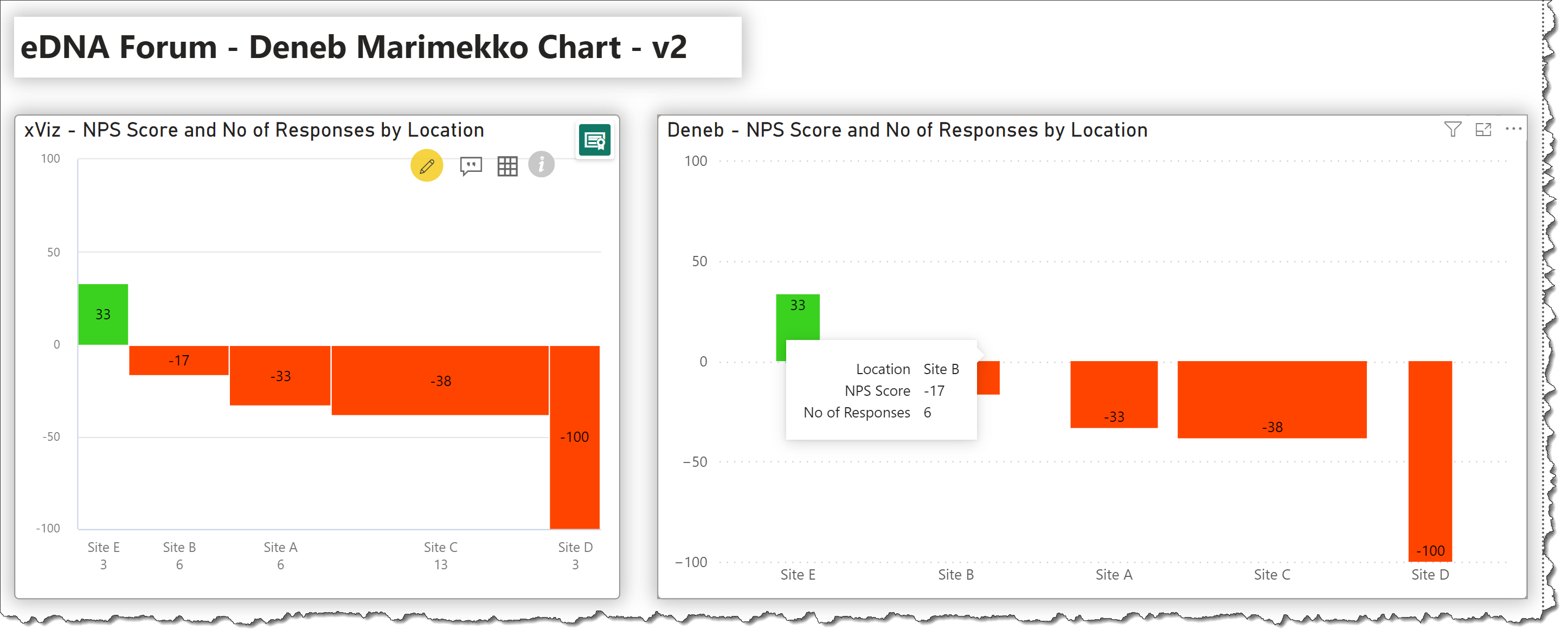
Hi @DavieJoe:
OK, I had another go … I added the labels, formatted the tooltips, and moved the column titles to the bottom.
I was unfortunately not able to find the syntax to eliminate the whitespace between columns … my guess is that Vega-Lite “picks” the width of the widest column and applies it to all. I tried an alternate syntax (even simpler) for a bar chart but unfortunately still have the same issue.
Here’s the new code:
{
  "data": {"name": "dataset"},
  "encoding": {
    "x": {
      "field": "Location",
      "type": "nominal",
      "axis": {
        "labelAngle": 0,
        "title": null
      },
      "sort": {
        "op": "sum",
        "field": "NPS Score",
        "order": "descending"
      }
    },
    "y": {
      "field": "NPS Score",
      "type": "quantitative",
      "axis": {"title": null},
      "scale": {"domain": [-100, 100]}
    }
  },
  "layer": [
    {
      "name": "BAR",
      "mark": {
        "type": "bar",
        "tooltip": true,
        "width": {
          "expr": "datum['No of Responses'] * 12"
        },
        "paddingOuter": 20
      },
      "encoding": {
        "color": {
          "condition": [
            {
              "test": "datum['NPS Score'] <= 0",
              "value": "#FF4400"
            }
          ],
          "value": "#3AD11F"
        },
        "tooltip": [
          {
            "field": "Location",
            "type": "nominal"
          },
          {
            "field": "NPS Score",
            "type": "quantitative",
            "formatType": "pbiFormat",
            "format": "#"
          },
          {
            "field": "No of Responses",
            "type": "quantitative"
          }
        ]
      }
    },
    {
      "name": "LABEL",
      "mark": {
        "type": "text",
        "color": "black",
        "yOffset": {
          "expr": "datum['NPS Score'] > 0 ? 4 : -2"
        },
        "baseline": {
          "expr": "datum['NPS Score'] > 0 ? 'top' : 'bottom'"
        }
      },
      "encoding": {
        "text": {
          "field": "NPS Score",
          "type": "quantitative",
          "formatType": "pbiFormat",
          "format": "#"
        },
        "y": {
          "field": "NPS Score",
          "type": "quantitative",
          "axis": {"title": null},
          "scale": {
            "domain": [-100, 100]
          }
        }
      }
    }
  ]
}
I’ll stay on-the-lookout for facet/bar padding for different bar widths and will update if I find anything.
Greg
eDNA Forum - Deneb Marimekko Chart - v2.pbix (3.1 MB)
Amazing stuff Greg, I really appreciate you tackling this again.
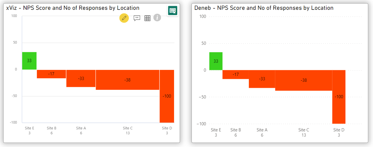
You can do this without facets and offsets with a stack transform on the measure you want on the x-axis and then have it scale quantitatively. You’ll also need to use text marks to simulate the x-axis labels.
Spec as follows (and a new workbook is attached also):
{
  "data": {"name": "dataset"},
  "transform": [
    {
      "stack": "No of Responses",
      "sort": [
        {
          "field": "NPS Score",
          "order": "descending"
        }
      ],
      "as": ["v1", "v2"],
      "groupby": []
    },
    {
      "calculate": "datum['v2'] - ((datum['v2'] - datum['v1']) / 2)",
      "as": "category_mid"
    }
  ],
  "encoding": {
    "x": {
      "type": "quantitative",
      "axis": null
    },
    "y": {
      "type": "quantitative",
      "axis": {"title": null},
      "scale": {
        "domain": [-100, 100],
        "range": [
          {"expr": "height - 40"},
          0
        ]
      }
    },
    "tooltip": [
      {
        "field": "Location",
        "type": "nominal"
      },
      {
        "field": "NPS Score",
        "type": "quantitative",
        "formatType": "pbiFormat",
        "format": "#"
      },
      {
        "field": "No of Responses",
        "type": "quantitative"
      }
    ]
  },
  "layer": [
    {
      "mark": {
        "type": "bar",
        "tooltip": true
      },
      "encoding": {
        "x": {"field": "v1"},
        "x2": {"field": "v2"},
        "y": {"field": "NPS Score"},
        "y2": {"datum": 0},
        "color": {
          "condition": [
            {
              "test": "datum['NPS Score'] <= 0",
              "value": "#FF4400"
            }
          ],
          "value": "#3AD11F"
        }
      }
    },
    {
      "mark": {"type": "text", "baseline": "bottom"},
      "encoding": {
        "x": {"field": "category_mid"},
        "y": {"value": {"expr": "height - 15"}},
        "text": {"field": "Location"}
      }
    },
    {
      "mark": {"type": "text", "baseline": "bottom"},
      "encoding": {
        "x": {"field": "category_mid"},
        "y": {"value": "height"},
        "text": {"field": "No of Responses"}
      }
    },
    {
      "transform": [
        {
          "calculate": "datum['NPS Score'] / 2",
          "as": "y_midpoint"
        }
      ],
      "mark": {
        "type": "text",
        "color": "black"
      },
      "encoding": {
        "text": {
          "field": "NPS Score",
          "formatType": "pbiFormat",
          "format": "#"
        },
        "x": {"field": "category_mid"},
        "y": {"field": "y_midpoint"}
      }
    }
  ]
}
Enjoy!
DM-P
eDNA Forum - Deneb Marimekko Chart - v3.pbix (3.1 MB)
P.S. if you want the effect of spacing with the bars, you can add a stroke to the bar mark, e.g.:
      "mark": {
        "type": "bar",
        "stroke": "white",
        "tooltip": true
      }
Amazing!
Double amazing! Thanks @dm-p
Hi @dm-p this is great! I was wondering if the following is also possible:
Highly appreciated!
Hi @jean.
Calling-out a specific forum member by name is discouraged, as is replying to a solved thread. Rather, please create a new thread for each new issue, and, if it refers to an earlier solved thread (as it does in this case), link to the solved thread. When you call-out a specific forum member, it discourages other forum members from pursuing your issue.
@EnterpriseDNA, please split this thread at the above post.
@jean, please provide a PBIX complete with a dataset that will allow the desired visualization to be created, and a detailed mock-up (e.g., marked-up screenshot, PowerPoint, etc.) to minimize the time required by the forum volunteers.
Greg
Thank you, my apologies.
to confirm where should I continue this conversation, if this is the correct location please see my attached files below, alternatively please let me know where I can continue this thread.
mekko charts clean.xlsx (16.9 KB)
test.pbix (6.3 MB)
Ideally I can get the blank spaces between my stacked bars removed so it looks more like the final example above
Hi @jean. The new thread that will be created by @EnterpriseDNA is the correct place to follow-up. Once they have done this, we can pursue.
Greg
Here is a simplified version using similar data to the thread above.
PBI:
eDNA Forum - Deneb Marimekko Chart.pbix (3.1 MB)
Excel:
Deneb - NPS Score and No of Responses by Location.xlsx (11.3 KB)
I would like to remove the blank spaces between the stacked bars