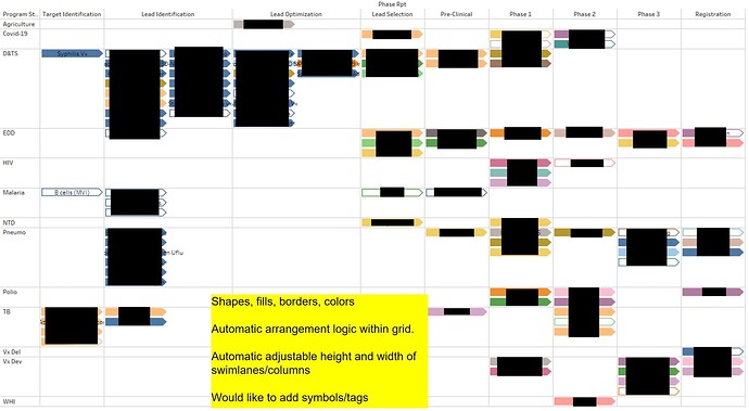
Please let me know if its possible to create a Gantt Chart like the attached in deneb?
Hi @manishchhipa98. I can’t see why not … pretty-much everything I’ve tried in Deneb has been successful. If you can upload an Excel file containing sample data (and a screenshot of your expected outcome if it differs from your earlier post), then I’ll have another look.
Greg
(P.S.: AFAIK, the bar mark can be configured with either square or rounded ends; I haven’t seen nor explored pointed ends, so have no insight into whether this is possible.)
Hi Greg , Thank you so much for responding , please find the excel.
swimlane_sample (1).xlsx (9.5 KB)
I would appreciate if you could please help me with small number of rows and columns, pointed ends not a concern to me. I am new to this and I was referring examples but didn’t find any which resembles to this.I was referring Gantt Chart but it seems a matrix to me. Also please let me know what is the best way to learn or resource to learn deneb in detail. I didn’t find any resource which explains what is the logic nehind the syntex of vega-lite we are using.
Hi @manishchhipa98. I haven’t forgotten about your request; rather, in fact, I’ve tried several things, and while making some progress, it’s not there yet. Regardless, I wanted to post what I have so far in case it’s of interest.
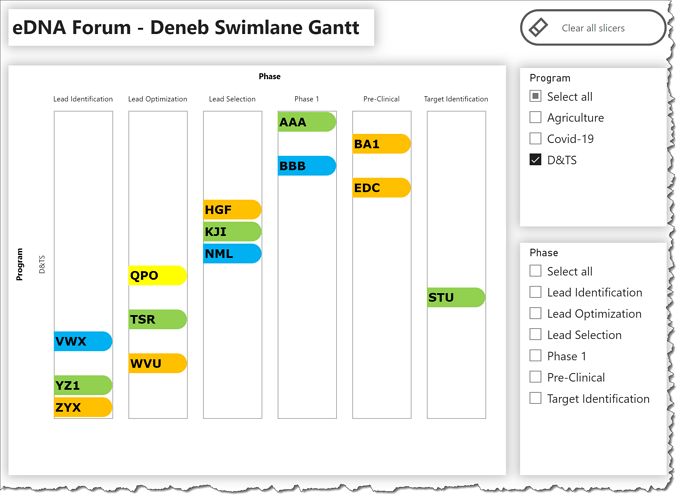
Here’s what I have to date:
For this work-to-date, here’s what I did/what I found:
- used the facet operator to create a matrix/trellis/small multiples with Program on rows and Phase on columns
- used a layer for each “cell” with a bar mark and a text mark
- I haven’t been able to find the syntax to make the bar/text marks always start from the top of each “cell”, so this solution is only partial
Here’s the code:
{

  "data": {"name": "dataset"},
  "facet": {
    "row": {
      "field": "Program",
      "type": "nominal"
    },
    "column": {
      "field": "Phase",
      "type": "nominal"
    }
  },
  "spec": {
    "encoding": {
      "y": {
        "field": "Project",
        "type": "nominal",
        "axis": null
      },
      "x": {"axis": null},
      "color": {
        "condition": [
          {
            "test": "datum['Priority'] == 'Low'",
            "value": "#92d050"
          },
          {
            "test": "datum['Priority'] == 'Medium'",
            "value": "#00b0f0"
          },
          {
            "test": "datum['Priority'] == 'High'",
            "value": "#ffc000"
          },
          {
            "test": "datum['Priority'] == 'Urgent'",
            "value": "#ffff00"
          }
        ],
        "value": "transparent"
      }
    },
    "layer": [
      {
        "name": "PROJECT_BAR",
        "height": {"step": 30},
        "width": 80,
        "mark": {
          "type": "bar",
          "cornerRadiusEnd": 20
        },
        "encoding": {"x": {"datum": 5}}
      },
      {
        "name": "PROJECT_LABEL",
        "mark": {
          "type": "text",
          "align": "left",
          "xOffset": 2,
          "yOffset": 1,
          "font": "Verdana",
          "fontSize": 16,
          "fontWeight": "bold"
        },
        "encoding": {
          "x": {"datum": 0},
          "text": {
            "field": "Project",
            "type": "nominal"
          },
          "color": {"value": "black"}
        }
      }
    ]
  }
}
I’ll keep my eyes open and post further if I find anything else.
Greg
eDNA Forum - Deneb Swimlane Gantt.pbix (1.3 MB)
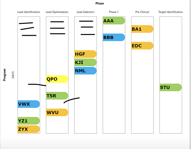
Hi @Greg Thank you so much for looking into it, it’s awesome. You are a gem to this community. All looks good but can you give me a hint like this chart on selection spreads to 3 -4 pages so if we could do something in which it automatically adjusts the size of the blocks in which these arrow heads are lying, so that it comes up in one page for now its taking too much unnecessary space. I am marking it as solution for now since this is what I wanted to see. But please try if you can help me with any logic to adjust those white blocks according to content. They can be parallel we don’t need to show spaces between arrowheads inside one rectangle.


