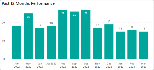
When I create a column chart in Power BI, the default setting for data label position is “Auto.” This places the data label inside the top of the tallest columns and above the top of shorter columns as shown in this screenshot:
Any ideas on how to accomplish this in Deneb? It seems like you would need to be able to adjust the yOffset or dy properties of the text mark based on the height of the bar mark, but I don’t know if it’s possible to access the values of mark properties within another mark. I’ve tried Google-ing, but to no avail.
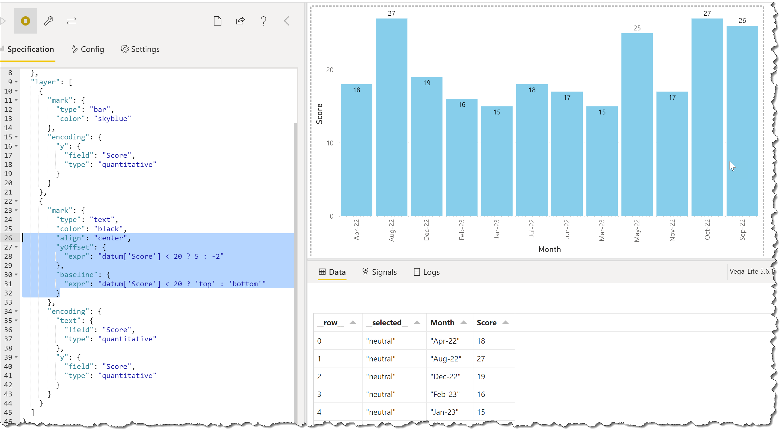
Hi @DaveC. AFAIK, there is no “auto-positioning” of text marks, but you can adjust their position as desired, in this example using expressions in the yOffset and baseline key-value pairs.
@Greg, this is exactly the logic that I had in mind. The issue I have in my situation is that depending on how the user filters the data on the page in my Power BI report, the maximum value for each bar could be anything from 2 or 3 all the way up to >100. So I can’t really use absolute values as criteria for modifying the position of the text. Instead I need to be able to identify something like the maximum value of all the “score” values to then calculate which values should be shown inside the bar.
Any idea how to do that?
I tried changing
datum['Score'] > 20
to something like
datum['Score'] <= max(datum['Score']) * 0.8
but that didn’t work because max(datum[‘Score’]) seems to be evaluated within the row context and always equals the value of Score for each row.
@Greg, I figured it out! I don’t know if it’s the ideal way, but it works. I added this to the specification to give me an additional column in the dataset containing the max of all Score values.