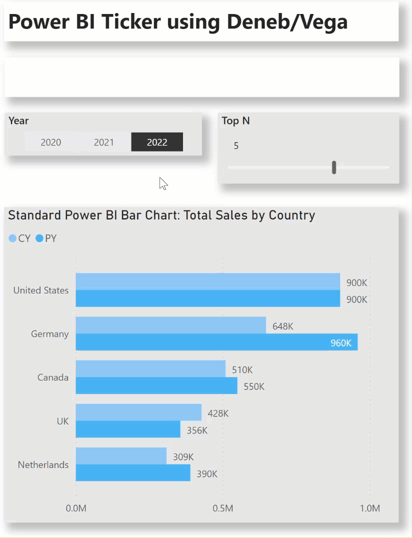
One of the automatic display features built-in to the Vega language and enabled in Power BI by the Deneb custom visual is the use of timers to adjust the display without user interaction. Here’s an example of a simple sales by country ticker:
This example uses a number of Deneb/Vega components, including:
- a filter transform to return only the “top n” records in the provided Power BI dataset (i.e., the “first” dataset)
- a second dataset filtered to only a single record from the “first” dataset
- in-visual formulae to calculate both the percent difference and direction between the current year (CY) and previous year (PY)
- an in-visual formula to concatenate the rank, country, CY sales, and PY percent difference
- a number of “signals” which define the intervals and use timers to control the display
- an “opacity” signal to permit a fade-out/fade-in of each ticker entry
- a “color” scale to define the positive and negative colours
- a single text mark to present the concatenated text in the appropriate colour and with variable opacity (transparency) to provide the face-out/fade-in effect
The intent of this exercise is not to provide a complete solution for finished visuals, but rather to serve as a starting point for further custom visual development.
Also included is a sample PBIX using a small simple Sales dataset as a demo.
This feature, along with many others, becomes accessible in Deneb when the lower-level Vega language is used (as opposed to the higher-level Vega-Lite language).
NOTE: This exercise is provided as-is for information purposes only, and its use is solely at the discretion of the end user; no responsibility is assumed by the author.
Greg
Deneb Examples - Ticker.pbix (1.5 MB)