I saw an interesting visual a while ago in a LinkedIn post by Alex Wang
on global temperature change through the years and wondered if Deneb/Vega-Lite could produce a similar type of graphic. Here’s what I came up with:
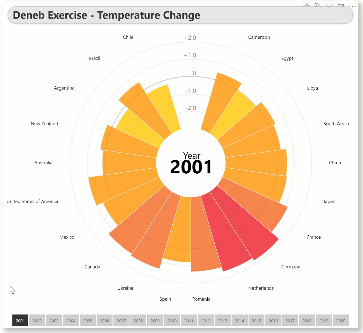
This example consists of 15 layers in 4 groups:
- temperature change scale (10 layers; 5 circle marks and 5 text marks)
- temperature change (1 layer; arc mark)
- country labels (1 layer; text mark)
- year label (3 layers; 1 circle mark and 2 text marks)
I utilized the conditional alignment of country labels (right-side labels left aligned, left-side labels right aligned).
I also used conditional colours for the temperature change ranges (e.g., >2 deep red, <-2 deep blue, etc.).
As well, I added 2 hidden “spacer” countries to the dataset to ensure a gap around the 0/up to ensure the radial scale axis was not overwritten (I didn’t find a built-in option for such an axis, so manually created my own).
(To ensure that all colours were correctly set, the Power BI theme was modified to show all colours as white.)
(Note: although the target visual had radial text for country labels and curved text for region labels, AFAIK there is not syntax in Vega-Lite to accomplish this (although I think there is in Vega, which I have not used to date, so …)
The intent of this exercise is not to provide a finished visual, but rather to serve as a starting point for further custom visual development.
Also included is the sample PBIX using a heavily-modified dataset of temperature change data obtained online as a demo.
NOTE: This exercise is provided as-is for information purposes only, and its use is solely at the discretion of the end user; no responsibility is assumed by the author.
Here is the link to the online publish-to-web version of the report:
Greg
Deneb Exercise - Temperature Change v8.pbix (2.0 MB)