I recently saw a post on LinkedIn comparing Deneb with Charticulator when producing a process automation visualization radial plot comparing step time vs. average step time.
Link to Evelyn Münster’s LinkedIn post:
It was mentioned that the calculation of theta values was beyond the original scope, and my understanding of circular charts in Vega-Lite was that they would internally produce all required theta and radius values, so I wanted to see if the example Radial Plot example on the Vega-Lite website could be leveraged to produce something close.
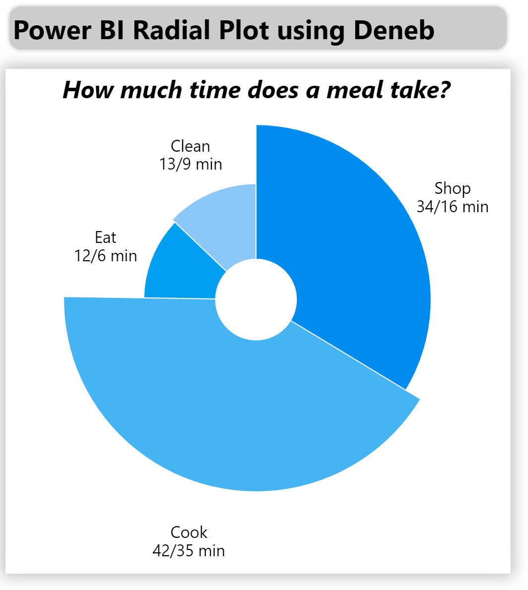
With minimal extra work taking only about a 1/2 hour, here’s what I came up with:
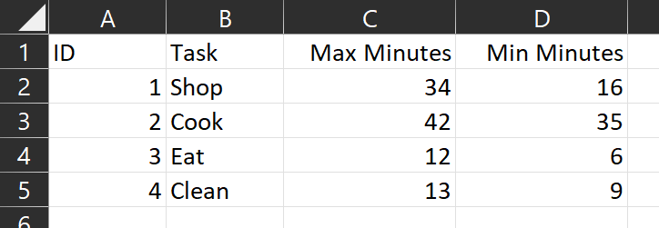
This example uses only pure data (i.e., no DAX measures or calculated columns) from a simple dataset:
This example uses a number of optional Deneb/Vega-Lite components, including:
- a formatted and centred “title” block
- a transformation to generate a custom label (task, linebreak character, max minutes, min minutes)
- the assignment of the max minutes value to both the “theta” (linear) and “radius” (square root)
- an “order” block in the “encoding” block to allow custom sorting of the slices (in this case, by ID)
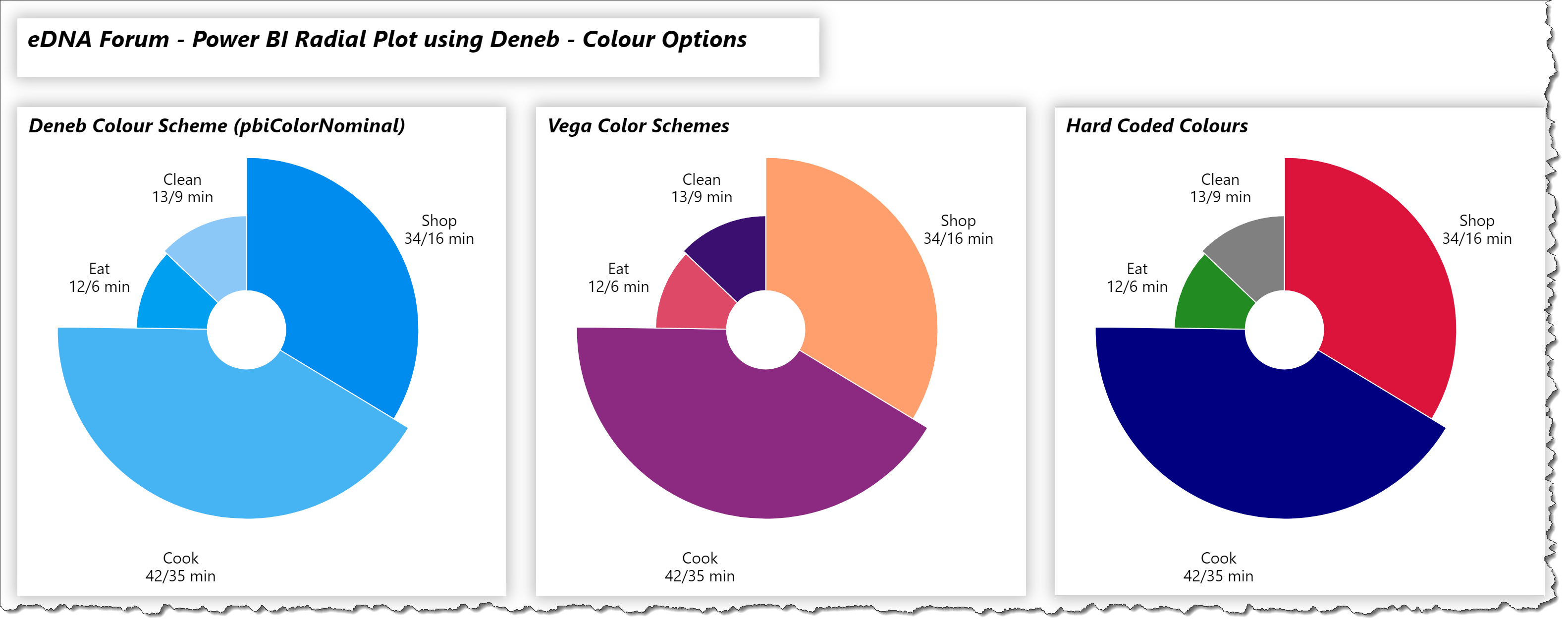
- a mapping of the colour scale to the current Power BI theme (i.e., “scale”: { “scheme”: “pbiColorNominal” })
- a custom tooltip on the single “arc” mark showing id, task, max minutes, and min minutes
- a “lineBreak” property on the single “text” mark to display the custom label on two lines
The intent of this exercise is not to provide a complete solution for finished visuals, but rather to serve as a starting point for further custom visual development.
Also included is a sample PBIX using the simple dataset described above as a demo.
NOTE: This exercise is provided as-is for information purposes only, and its use is solely at the discretion of the end user; no responsibility is assumed by the author.
Greg
Deneb Radial Plot.pbix (1.7 MB)