One of the display features built-in to the Vega language and enabled in Power BI by the Deneb custom visual is the choice of several colour palettes and palette inversion. Here’s an example of a flight data heatmap:
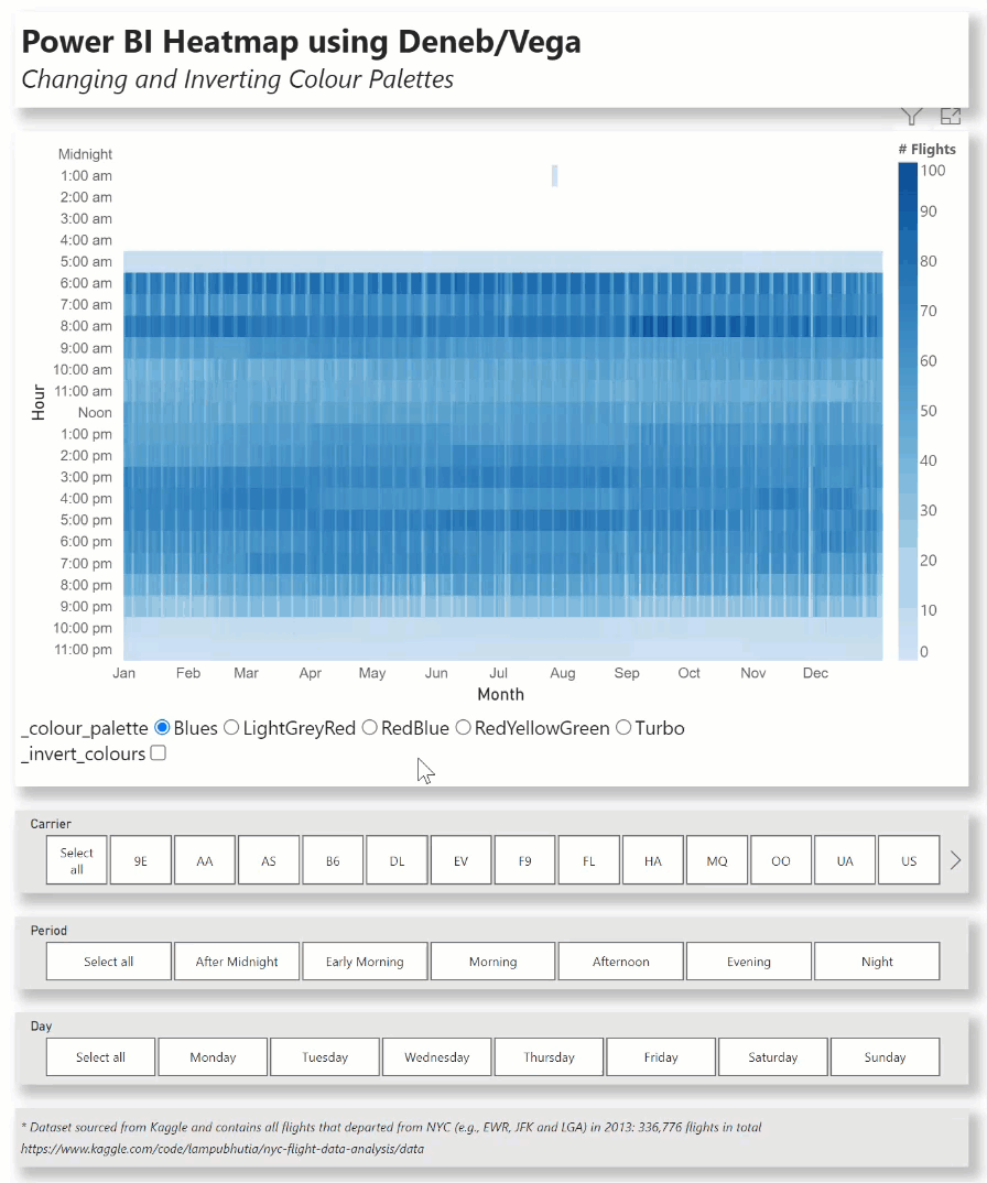
This example uses a number of Deneb/Vega components, including:
- conditional Y-axis labels to add “:00 am” or “:00 pm” suffix or use “Noon” or “Midnight” as necessary
- a vertical gradient legend at right
- a “colour palette” signal bound to a radio-button list with 5 palettes (there are over 50 built-in palettes available)
- an “invert colours” signal bound to a checkbox to reverse the selected colour palette
- a custom tooltip to display date and time band of scheduled departure and the number of flights
For further utility, standard Power BI slicers for carrier, period of day, and week day are also included.
The intent of this exercise is not to provide a complete solution for finished visuals, but rather to serve as a starting point for further custom visual development.
Also included is a sample PBIX using a flight dataset for New York City airports in 2013 sourced from Kaggle as a demo (dataset contains all flights that departed from NYC [e.g., EWR, JFK and LGA] in 2013: 336,776 flights in total).
https://www.kaggle.com/code/lampubhutia/nyc-flight-data-analysis/data)
NOTE: This exercise is provided as-is for information purposes only, and its use is solely at the discretion of the end user; no responsibility is assumed by the author.
Greg
Deneb - Vega Heatmap.pbix (7.6 MB)