The Vega-Lite “trail” mark can be used to compare a pair of data occurrences, both with colour and size, thus creating a “comet chart”. Here’s an example of such a chart in Power BI/Deneb/Vega-Lite:
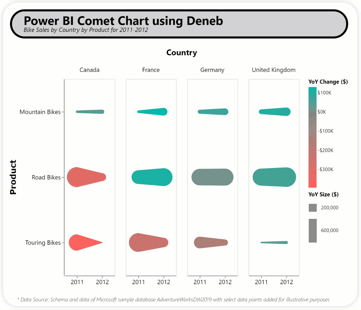
This example uses a number of optional Deneb/Vega-Lite components, including:
- a bar chart for a title composed of:
- 1 “bar” mark (light grey fill, black border, rounded corners)
- 2 “text” marks (title, subtitle, each with different placements and font properties)
- a transform block for in-visual calculations:
- pivot the sales data, grouping by product and country
- fold the sales data by year
- calculate the YoY sales change
- a “trail” mark for annual sales with:
- year on x-axis
- product on y-axis
- country on column
- colour based on the sales change between years, using the Deneb “pbiColorLinear” scheme to access the min and max divergent colours of the current Power BI theme
- head size based on 2011 sales and tail size based on 2012 sales
- 2 legends, 1 for colour and 1 for size
- a custom tooltip showing year, country, product, and using Deneb’s exposure of Power BI formatting to present the sales amount
The intent of this exercise is not to provide a complete solution for finished visuals, but rather to serve as a starting point for further custom visual development.
This exercise heavily leveraged the comet chart example shown on the Vega-Lite website:
Also included is a sample PBIX using a slightly-modified version of the Microsoft AdventureWorksDW2019 SQL database as a demo (schema unchanged, several data point added for illustrative purposes).
NOTE: This exercise is provided as-is for information purposes only, and its use is solely at the discretion of the end user; no responsibility is assumed by the author.
Greg
Deneb Examples - Comet Chart.pbix (1.9 MB)