Deneb/Vega-Lite can be used to create an enhanced Gantt Chart, displaying additional information beyond a more standard Gantt Chart. The example presented herein is an attempt to include some IBCS-inspired features and includes:
- a Gantt table/matrix with planned, actual (or estimated), and variance duration and percent calculations
- a Gantt bar chart with both planned and actual (or estimated) bars
- a “today” gridline
- project performance metrics
The simple dataset contains planned and actual start and end dates and planned, actual, and remaining days. Power BI is leveraged to create simple calculated columns for estimated start and end dates and days late. All phase calculations are done in Vega-Lite.
TLDR: Dataset
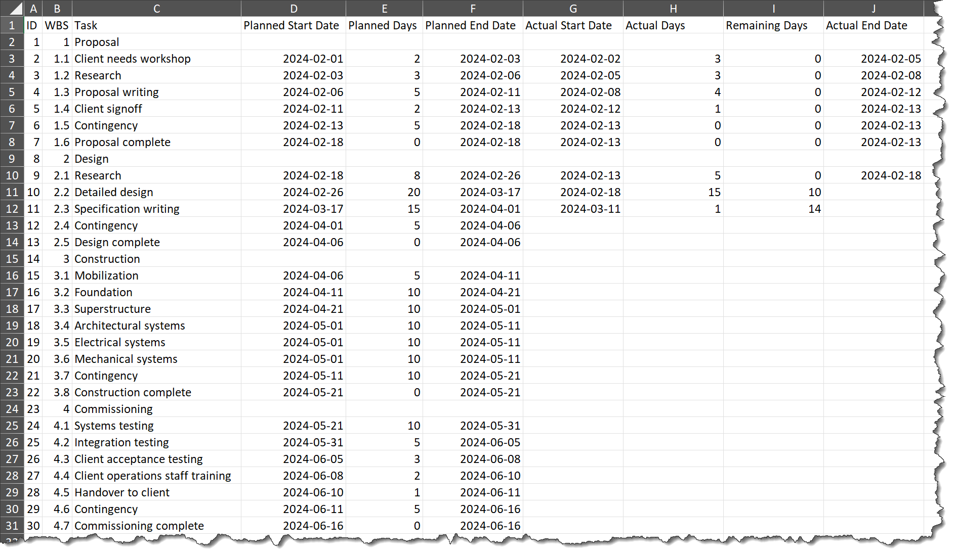
Two sample projects were used: a construction project, and a software development project. Here’s the source file for the construction project:
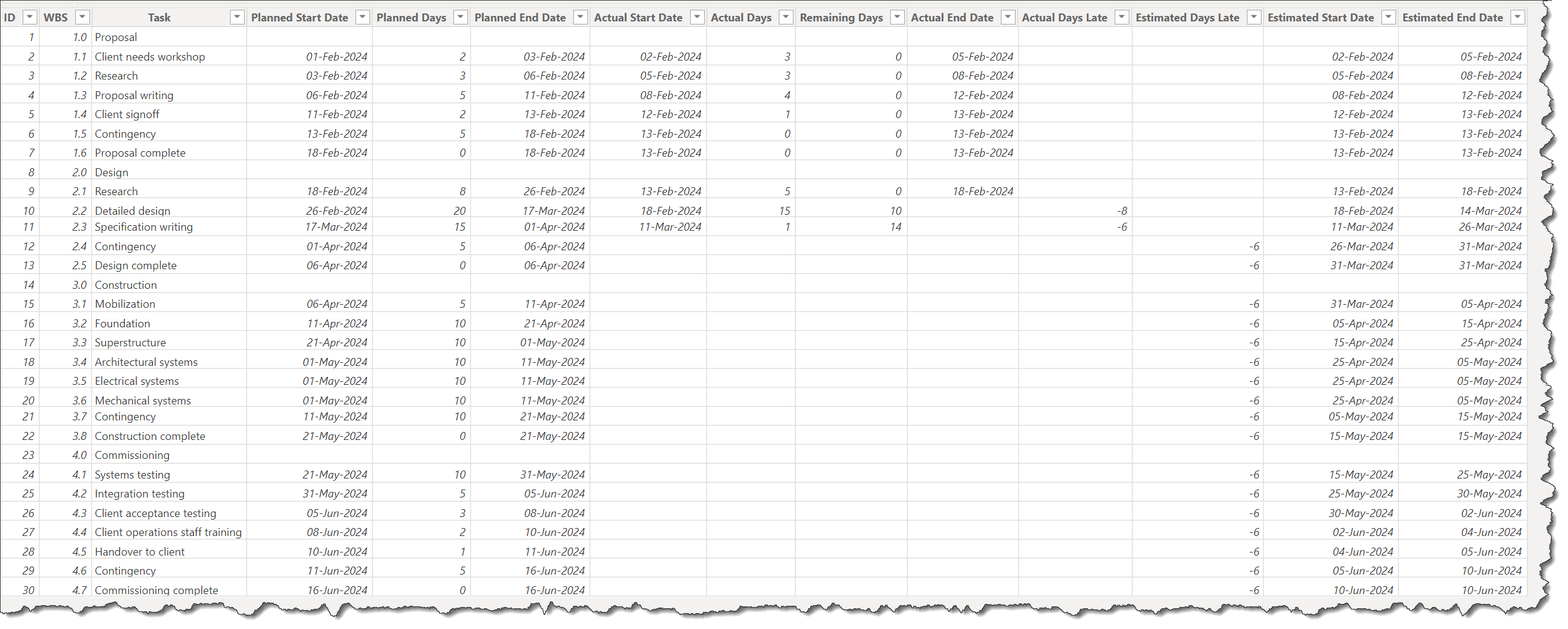
Here’s the source data extended with Power BI calculated columns:
Here’s the DAX code used to generate the additional calculated columns in Power BI:
Actual Days Late =
IF( 'Construction Project'[Actual Start Date] <> BLANK() &&
	'Construction Project'[Actual End Date] = BLANK(),
    INT( 'Construction Project'[Actual Start Date] - 'Construction Project'[Planned Start Date] ) )

Estimated Days Late =
IF( 'Construction Project'[WBS] <> INT( 'Construction Project'[WBS] ) &&
	'Construction Project'[Actual Start Date] = BLANK(),
    MAX( 'Construction Project'[Actual Days Late] ) )

Estimated Start Date =
IF( 'Construction Project'[Actual Start Date] <> BLANK(),
	'Construction Project'[Actual Start Date],
    'Construction Project'[Planned Start Date] + 'Construction Project'[Estimated Days Late]
)

Estimated End Date =
SWITCH( TRUE(),
    'Construction Project'[Actual Start Date] <> BLANK(),
        'Construction Project'[Actual Start Date] + 'Construction Project'[Actual Days] + 'Construction Project'[Remaining Days],
    'Construction Project'[Estimated Start Date] <> BLANK(),
        [Estimated Start Date] + 'Construction Project'[Planned Days]
)
This example illustrates a number of Deneb/Vega-Lite features, including:
0 - General:
- a “title” block with subtitle
- a “transform” block to extend the dataset in-visual with:
- 3x “calculate” transforms to determine if the task is a milestone and to parse the WBS to determine the phase
- a series of 18 “calculate” and “joinaggregate” transforms to determine the phase planned and actual start dates, end dates, and duration (days)
- 2x “calculate” transforms to determine the variance duration (days) and percent
- 2x “calculate” transforms to determine the phase and task estimated progress dates
- 3x “calculate” transforms to determine the phase, task, and milestone completion percentages
- a “params” block with:
- a checkbox to interactively get the user choice to display or hide the planned bars in the Gantt Chart
- an “hconcat” block to display the table and Gantt Chart side-by-side
1 - Table:
- a nested “hconcat” block to display six columns side-by-side (WBS, Phase/Task, start date, PL and AC durations, variance duration and percent):
- all columns use specific titles
- all columns use conditional formatting to display:
- phases in larger font bold black
- tasks with negative variances in bold and the “negative” sentiment colour of the current Power BI theme
- tasks with non-negative variances in standard font (black and normal weight)
2 - Gantt:
- a “layer” block with sections for the today gridline, the planned bars, the actual bars, and the project metrics
3 - Today:
- a nested “transform” block with:
- a “filter” transform to reduce the dataset to a single row
- 2x “calculate” transforms to determine the value and formatted value for today’s date
- a nested “layer” block with:
- a “rule” mark to display a dashed vertical gridline at the “today” value using the “negative” sentiment colour of the current Power BI theme
- a “text” mark to display the “today” label at the bottom of the gridline, again using the “negative” sentiment colour of the current Power BI theme
4 - Planned:
- a nested “layer” block with:
- a thin “bar” mark for the planned phase
- x-axis date labels are formatted using the axis “labelExpr” with a 2-value array (month abbreviation, day number)
- 2x thick “tick” marks for the phase planned start date and end date symbols (whiskers)
- a ranged “bar” mark with rounded corners for the tasks using the “min” divergent colour of the current Power BI theme
- the bar is “hidden” (actually the colour is set to ‘transparent’) when the “Show Planned” checkbox is selected
- a “square” mark rotated by 45 degrees for the planned milestones using the “min” divergent colour of the current Power BI theme
- the mark is “hidden” (actually the colour is set to ‘transparent’) when the “Show Planned” checkbox is selected
- a thin “bar” mark for the planned phase
5 - Actual:
- a nested “layer” block with:
- 2x thick “tick” marks for the phase actual (or estimated) start date and end date symbols (whiskers)
- uses a black border to increase legibility when the plan is visible
- a 40% height “bar” mark for the actual (or estimated) phase using the first colour of the current Power BI theme
- uses a black border to increase legibility when the plan is visible
- a 40% height “bar” mark for the actual (or estimated) progress of the phase in black
- a 70% height “bar” mark for the actual (or estimated) task using the first colour of the current Power BI theme
- uses a black border to increase legibility when the plan is visible
- a 20% height “bar” mark for the actual (or estimated) progress of the task in black
- a “square” mark rotated by 45 degrees for the actual (or estimated) milestones using the first colour of the current Power BI theme
- uses a black fill when the milestone is complete
- uses a black border to increase legibility when the plan is visible
- the mark is “hidden” (actually the colour is set to ‘transparent’) when the “Show Planned” checkbox is selected
- 3x “text” marks for the phase, task, and milestone percent completion labels
- phase % labels are hidden (made transparent) if the phase has not started
- task % labels are hidden (made transparent) if the task has not started
- milestone % labels are hidden (made transparent) if the milestone has not been reached
- 2x thick “tick” marks for the phase actual (or estimated) start date and end date symbols (whiskers)
6 - Project Metrics:
- a nested “transform” block with:
- a series of 6 “calculate” and “joinaggregate” transforms to determine the project planned and actual start dates, end dates, and duration (days)
- 2x “calculate” transforms to determine the project variance duration (days) and percent
- a “calculate” transform to determine the overall project schedule status (ahead, behind, or on)
- a “filter” transform to reduce the dataset to a 4 rows
- 3x “calculate” transforms to set values for the metric y coordinate offset, metric label, and metric value
- a nested “layer” block with:
- a “rect” mark with hard-coded range coordinates to create a background box for the metrics
- the box border is coloured according to the project schedule status (ahead=the “positive” sentiment colour of the current Power BI theme, or behind=the “negative” sentiment colour of the current Power BI theme, on=black)
- 3x “text” marks for the title, metric label, and metric value
- a “rect” mark with hard-coded range coordinates to create a background box for the metrics
NOTE:
This example was not delivered as a template, as different values are used for the x-axis label expressions for each of the sample projects; some small manual adjustments were required.
The intent of this example is not to provide a finished visual, but rather to serve as a starting point for further development.
Also included is the development PBIX using made-up data for two project types (construction, software development).
This example is provided as-is for information purposes only, and its use is solely at the discretion of the end user; no responsibility is assumed by the author.
Greg
Deneb Examples - Enhanced Gantt Chart - V10.pbix (1.6 MB)