I am just starting with Deneb (Vega Light) as I find It really useful in BI reports however I struggle a lot with some basics I guess.
I am trying to create some simple bullet chart with 2 measures at the beginning.
Experimenting a bit.
1/ Could someone explain me why I cannot define color based on condition directly under mark section but I can in encoding section under mark? It seems illogical. If I define color like “red” under mark - it works. But if I define it with condition - it does not. Same condition moved to encoding section works. No idea why as as far as I understand encoding is just mapping measures or/and dimensions on axes etc so I don’t even understand why there is color definition.
2/ A bit same situation - I tried to define the bar corner radius but also under condition so if a measure is ie. > 0 the end of a bar should radius, otherwise the start of the bar should have radius in order to show a direction. Setting corner radius and end corner radius under condition in mark section does not work and this part of code is underlined as error.
I’ve never been a language designer … you’d have to ask the developers of the Vega-Lite language. I can only speculate at the reason for different syntaxes working in different blocks of the code. Here’s my thoughts and experience:
In the mark block, you are setting the properties for all rows. In the “encoding” section, you are setting the properties for each single row. (This is shown as option “1” in the example PBIX.)
e.g.,
"color": "blue"
To implement conditional colour in the encoding block, the code already has-the-handle on each single row so can directly reference a field value. (This is shown as options “2” and “4” in the example PBIX.)
e.g.,
To implement conditional colour in the mark section, you need to get-the-handle on each single row so can indirectly reference a field value using an expression. (This is shown as option “3” in the example PBIX.)
e.g.,
Thank You a lot, it explains a lot and the behind it which now makes much more sense. This is my first contact with this amazing tool so a bit of frustration occurs.
My goal is pretty simple but I struggle a bit and If You don’t mind I will ask another question:
My planned visual is a 2 bullet charts , each should compare 2 measures in a single bullet chart (means 2 bullet chart per Deneb visual). I pass 4 measures to Deneb (no dimensions) so the data is 1 row with all 4 measures . Every single example I saw is a set of dimension and measure.
I guess I should use a facet view composition to achieve my goal but as I guess it will not work with one row of data. The original data mapping for PBI is:
“data”: {“name”: “dataset”}, I tried to map it differently but nothing worked. I read that these key/value pairs cannot reference measure. I tried something like this (following example in documentation):
“data”: {
“values”: [
{“title”:“xxx”, “measure”:“MyMeasureName1*”,“Target”:“My target1*”},
{“title”:“yyy”, “measure”:“MyMeasureName2*”,“Target”:“My target2*”}
]} but it does not work.
*These are my measure names
Hi @Marcin. It’s not clear to me what you’re trying to do, so an example would be in order. Please prepare a small sample dataset, load it into a Power BI table, and use another tool (Paint, PowerPoint, Excel, etc.) to create a mockup of what is your desired outcome. I have commitments for the rest of the day but will try to take a further look tomorrow. Greg
To facilitate searching on this forum, it is recommended to keep a thread to one question only and mark it as solved once resolved. Then, if you had additional questions, please start a new thread for each new question.
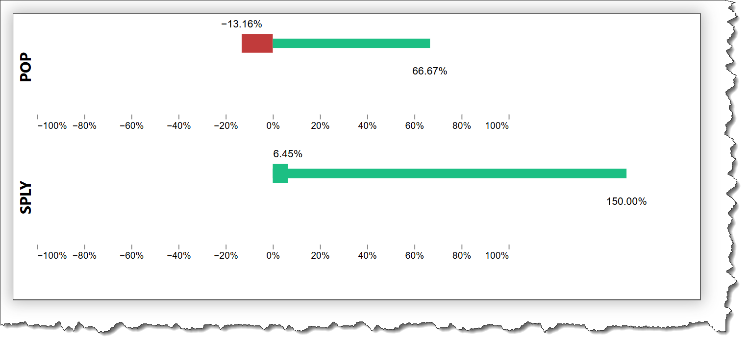
Yes, it works with 1 row of data. Yes, a composite view is needed, in this case a vertical concatenation (vconcat) block with the 2 POP measures used in the first block and the 2 SPLY measures used in the second block.
(I found it easier to create a new Deneb visual, so elected to not use your code [aside from the colour block]). This is not formatted at all, but should illustrate the overall layout of blocks.
You can only use the data provided by Power BI, so the syntax will always be: "data": {"name": "dataset"},
I’m stretching my memory a bit here, but seem to recall there is an issue with corner rounding in Vega-Lite with both positive and negative numbers on the same chart … from what I remember I think it was that positive values show correctly while negative numbers do not.