Hello community!
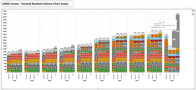
I have - with great help of Claude 3.5 LLM - designed a quite advanced Deneb visual to showcase how some shopfloor equipment are expected to perform over a series of years and versions.
I’m very close to being finished with my visual but I have hit a wall, and thus seeking guidance/assistance finalising the visual.
I’m seeking help to figure out the following:
-
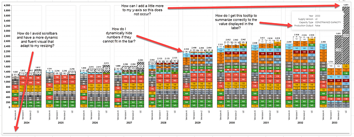
I have a tooltip where I get a false error, despite the label on the visual being able to actually calculate this properly. I don’t understand why it cannot show the value in the tooltip itself - remark for other years, it seems to be working just thing, it’s in the outer years.
-
How can I add auto adjust my y-axis to add a little extra so that all my stacked bar layers are able to be displayed without exceeding the y-axis borders?
-
I cannot figure out how to auto hide/show data labels if they are too large to be displayed within the stacked bars; some bars are so small that it does not make sense to use label space (and it clutters the visual overall). This is something that works out of the box in standard PBI visuals, but not something I have managed to fix here.
-
My visual is in general very fixed in height / width - but a big bonus would be if I can somehow make this more dynamic pending on how I size my visual container. I am looking for something similar to what is being done behind the scenes of out of the box standard visuals in Power BI.
Attached is an example of my PBIX file:
Deneb sample.pbix (2.7 MB)
Dataset (if needed again):
deneb_sample_data_shared.csv (120.8 KB)
Appreciate all the help and support!
Best Regards,
Casper

