Hi,
my first ever submission to a workout here on EDNA. 
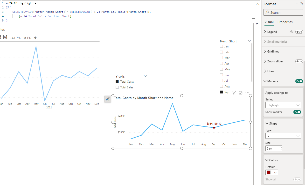
The trick that I used is was to control the transparency of the data labels as well as the markers with a measure (the markers being the result of a column-chart-turned-line-chart with conditionally formatted column colors).
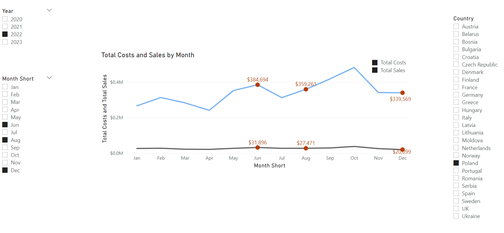
For me it all came down to the “Selected Month Highlight” measure, capturing the user’s month selection in an independent slicer. This was the hardest part since I wanted this to work with multiple month and parameter selections.
I’d be really interested to learn other ways to achieve this, but for me this is what worked:
Selected Month Highlight measure
VAR _Slicer = ALLSELECTED( ‘Month Short’[Month Short] )
RETURN
IF(
ISCROSSFILTERED( ‘Month Short’[Month Short] ),
IF(
MAX( ‘Date’[Month Short] ) IN _Slicer,
1,
0
),
0
)
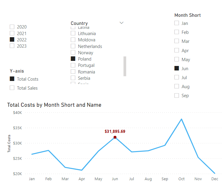
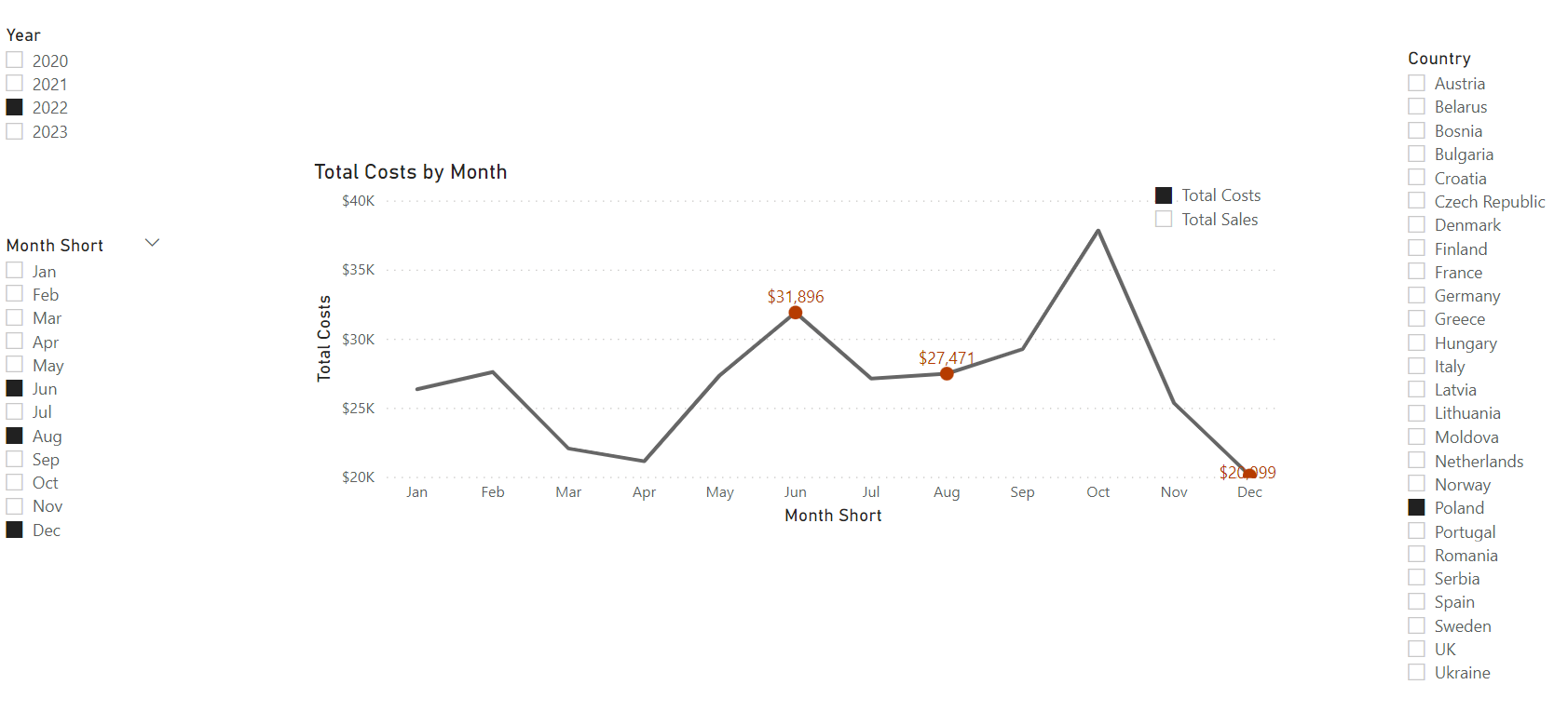
I then used the output of this measure (0 for unselected, 1 for selected months) for conditional formatting with HSLA alpha values (0 for 0, and 1 for 1). The 0 alpha value ensures that the data label and marker for unselected months are invisible.
SWITCH logic for color transparency control via HSLA
SWITCH(
TRUE(),
[Selected Month Highlight] = 1, “hsla( 16 , 100% , 42% , 1 )”,
“hsla( 16 , 100% , 42% , 0 )”
)
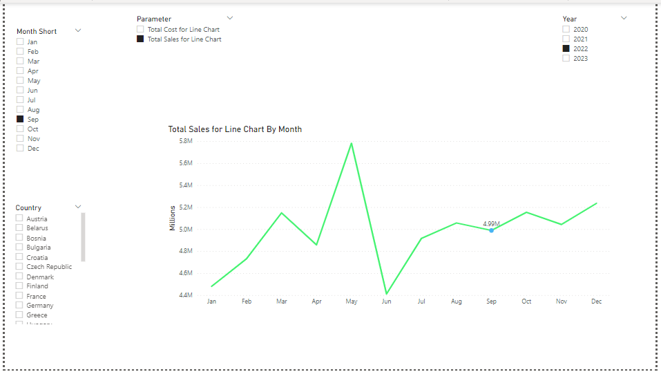
For the chart title I used an additional text column named Title Helper in the parameters table which was essential to make SELECTEDVALUE work. (This was also a big lesson.)
"Title Helper" column
Parameter = {
(“Total Costs”, NAMEOF(‘Measures’[Total Costs]), 0,“Total Costs”),
(“Total Sales”, NAMEOF(‘Measures’[Total Sales]), 1, “Total Sales”)
}
…then changed the name of the fourth column to “Title Helper”
Chart title measure
CONCATENATE(SELECTEDVALUE(Parameter[Title Helper] ,“Total Costs and Sales”)," by Month")
Thank you @Paul.Gerber for the exercise, I learnt a lot from this!