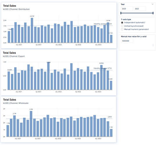
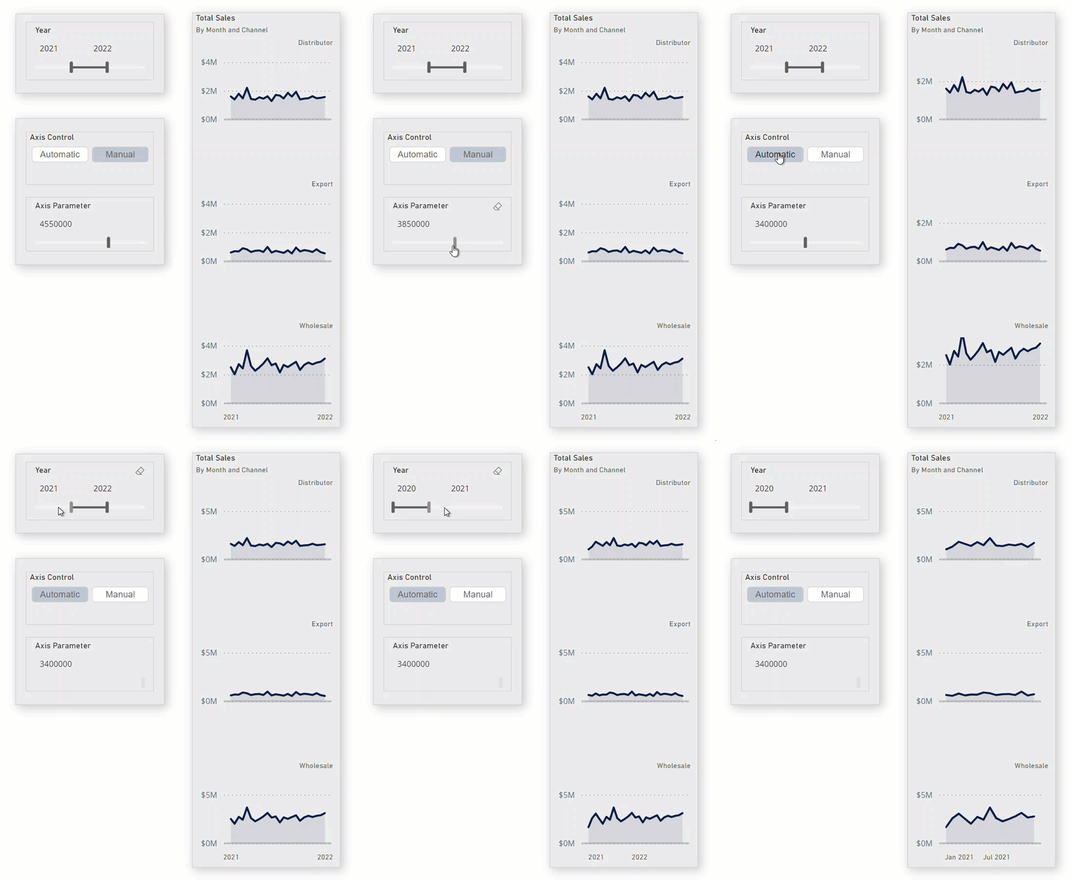
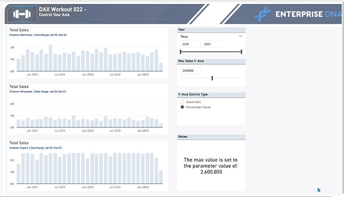
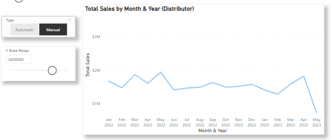
In this workout, you are to show how to gain full control over the y-axis in your visualizations. Demonstrate how to create manual control buttons and synchronize the y-axis across different visualizations with the help of a parameter. Also showcase the creation of a slicer to switch between automatic and manual axis control, and update the axis max and min accordingly.
You will need to create a disconnected table with options for automatic and manual axis control and make a slicer to switch between them. Then update the axis max and min based on the selected option, using an if statement in a measure, and disable the range slicer when the automatic option is selected. This allows for a synchronized axis when the manual option is selected and automatic scaling based on visible values when the automatic option is selected, with the range slicer enabled only for the manual option.
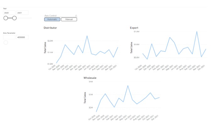
Submission
Load the supplied data file into a new Power BI file, create your solution, and reply to this post. Upload a screenshot of your solution along with the DAX measure. Please format your DAX code and blur it or place it in a hidden section.
Period
This workout will be released on Thursday, June 1, 2023, and will end on Sunday, June 4, 2023. But you can always come back to any of the workouts and solve them.
Practice Dataset.xlsx (815.3 KB)
DAX _22 - ControlYourAxis.pbix (890.1 KB)
