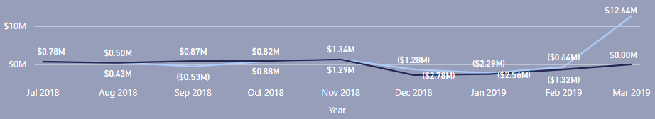
I have my date from my date table and in my visual, it’s used in the X-axis as in date hierarchy. I have expanded to the Year-Month level to visualize the trend in the fiscal year, quarters etc. It looks all good for entire fiscal year, Q1 and Q2. But when I sliced to Q3, the axis throw me off by not displaying Mon-Year format but instead showing specific date ( a few days before the correct month, like. for example, for march 2019, the date position showing up in the visual is Feb 24th while the actual march point is still correct and tooltips correct too)
If I change the x-axis type from continuous to categorical, it’s fixed. But I’m not sure if I should do that given that it’s date. I’m not sure if changing it to categorical will affect my measures.
Why is this happening and how do I fix it?