Data visualization is the art of representing data in a visual context. Grasp the basics of effective data visualization techniques and the principles behind creating insightful plots in this workout.
Scenario:
You’re given a series of data visualization plots, along with datasets. Your task is to match them correctly, understand the stories they tell, and suggest improvements.
Objectives:
By the end of this workout, you should be able to:
Identify different types of data visualizations and their best use cases.
Critically analyze plots for their effectiveness and clarity.
Interactive Task:
Given the following datasets and plots, match them correctly:
Dataset: Monthly sales data for 5 years.
Plot Options:
i) Pie chart
ii) Line chart
iii) Scatter plot
iv) Bar chart
Dataset: Distribution of student grades in a class.
Plot Options:
i) Histogram
ii) Donut chart
iii) Radar chart
iv) Heatmap
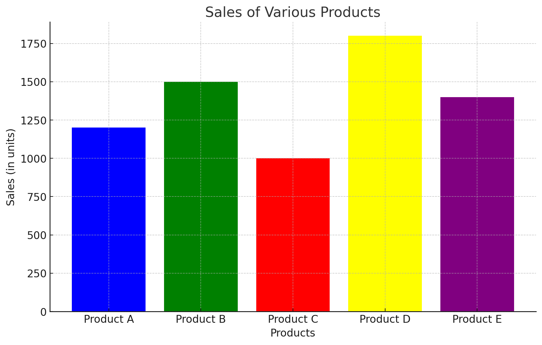
Given the following plot (a hypothetical bar chart showing sales of various products), suggest one improvement to make the visualization clearer:
Which type of visualization is best suited for showing the relationship between two continuous variables?
i) Pie chart
ii) Scatter plot
iii) Bar chart
iv) Line chart
What is a common pitfall to avoid when designing data visualizations for a broad audience?
i) Using too many colors.
ii) Making the visualization interactive.
iii) Using a legend.
iv) Keeping the design simple and clear.
Duration: 25 minutes
Difficulty: Beginner to Intermediate
Period
This workout will be released on Tuesday, September 5, 2023, and will end on Thursday, September 28, 2023. But you can always come back to any of the workouts and solve them.
Which type of visualization is best suited for showing the relationship between two continuous variables?
Answer:
ii) Scatter plot
What is a common pitfall to avoid when designing data visualizations for a broad audience?
Answer:
i) Using too many colors.
Interactive Task:
Dataset: Monthly sales data for 5 years.
Plot Options:
Answer:
ii) Line chart
Dataset: Distribution of student grades in a class.
Plot Options:
Answer:
i) Histogram
Given the following plot (a hypothetical bar chart showing sales of various products), suggest one improvement to make the visualization clearer:
Answer:
Remove the Label “Products”
Remove the label Sales (in units)
Change Title to Product Sales (units)
Apply the units on each Bar (delete the units for the axis)
Change the colour of the bar to one colour
Change the Order Product bars for Highest units to Lowest units