Data Visualization Workout 011 - Cost Analysis - Scenario comparision

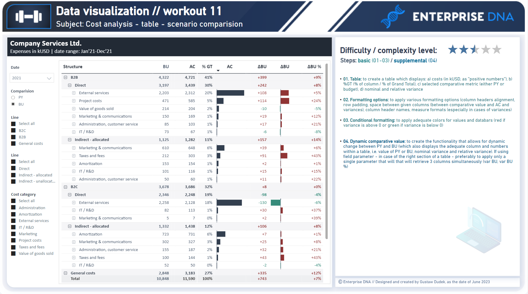
Workout 011 – Cost Analysis (Scenario comparision, table)
Difficulty rating: 2.5 out of 5

Intro note
This workout combines various visualization techniques. The most important part of the workout is practice - entries does not have to include every element or functionality to be still considered as great . Please pay attention to the list of functionalities (provided in the screenshoot and in published-to-web report), which includes ‘basic’ elements (1st-3rd point), supplemental (4th point). I would kindly recommend to review blue section before executing orange section to provide proper flow of your work.

A good starting point is to implement first 3 basic points by creating a tabl, applying various formatting options and displaying variances (basing on a single comparative metric). Realizing further point (blue) will provide additional technical practice.

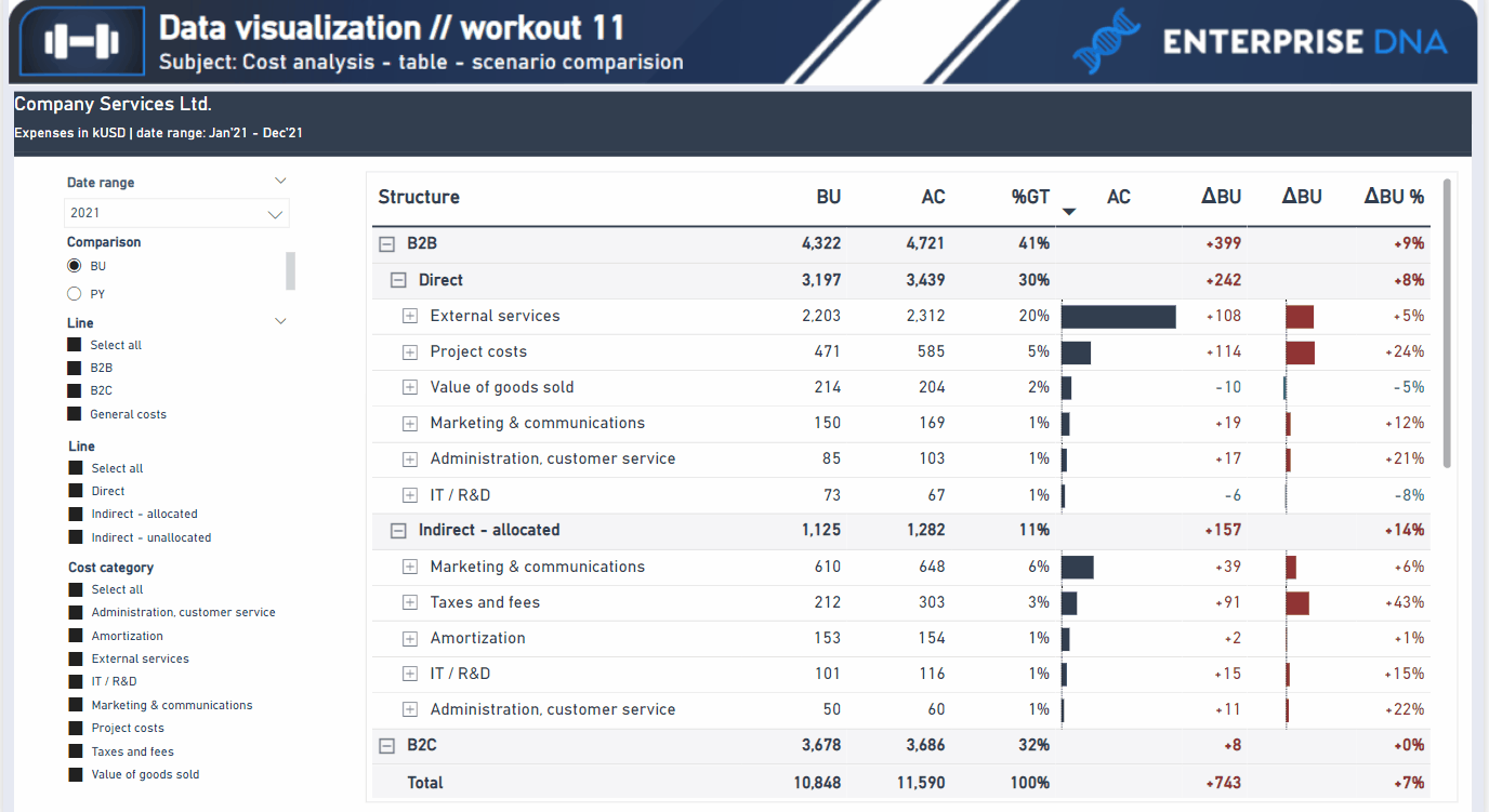
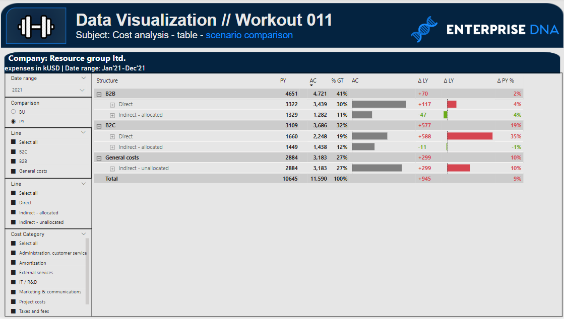
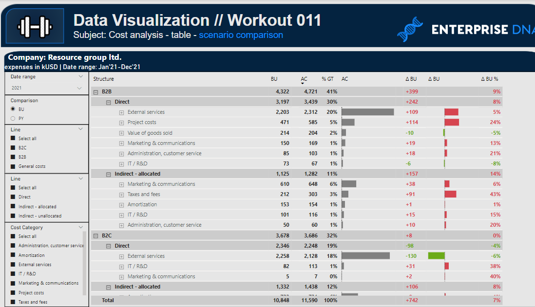
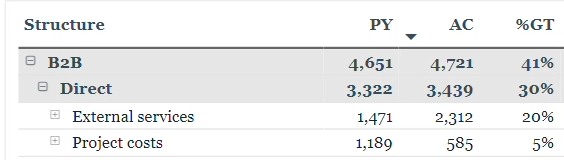
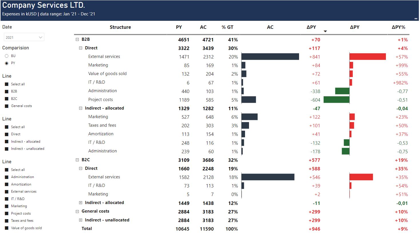
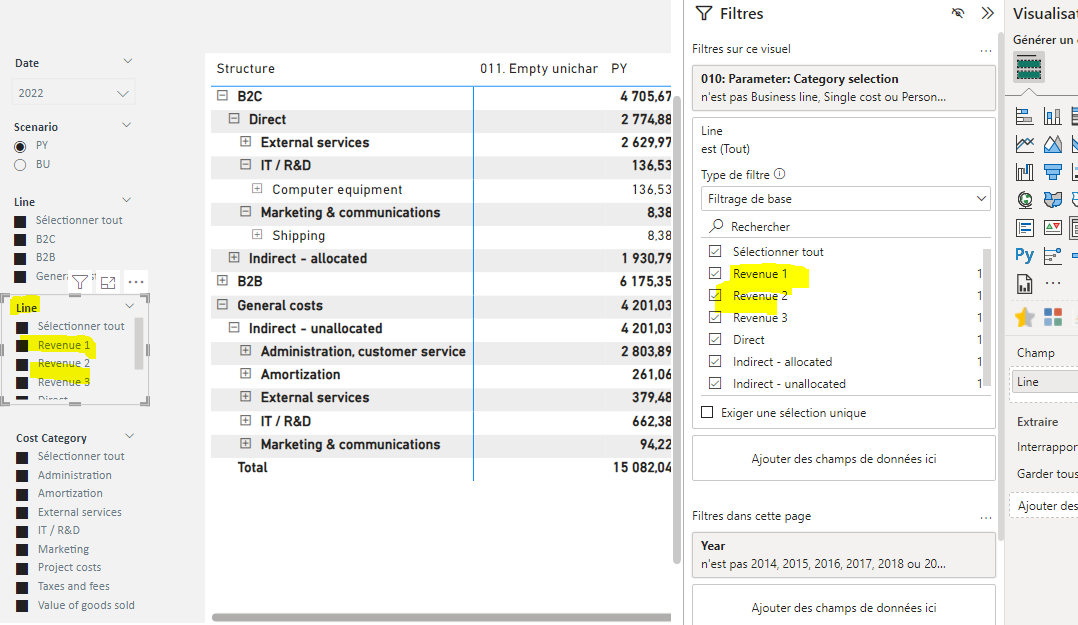
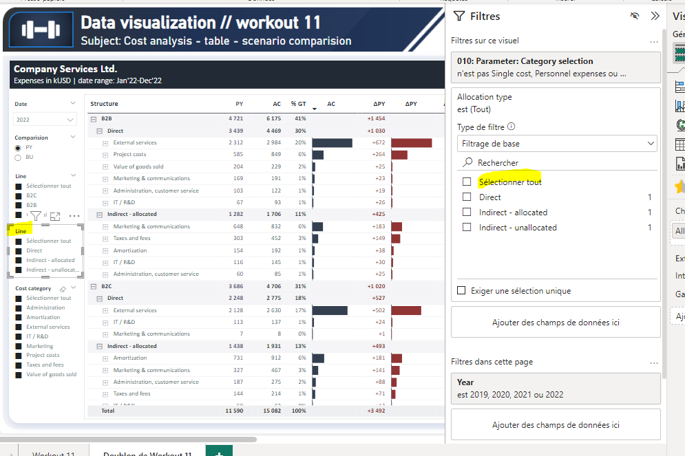
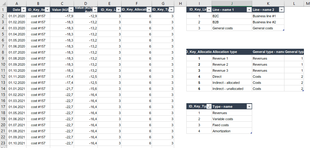
Following workout bases on the dataset that was provided during the workout 010 - but with slight changes in names of items and with added columns (budget values). If you have participated in workout 010 - you can still use your already imported and fransformed database - but please, pay attention to one added column in FCT table (budget values) and changed items within dim tables (you can easily replace the data-source to the current one though). Not all columns provided in the dataset have to be used in that particular workout but feel free to use other additional columns / categories if you’ll find it useful.

**Also, feel free to use your entries as a part of your project portfolio, if it’s instrumental in realizing your goals.

Additional notes

Data source:
5 separate tables:
1 fact table (date / value as negatives - to be inverted to positive / key IDs)
4 dim tables (business line / allocation type / type / structure by kind)
Feel free to ask if you have any additional questions regarding the data-source.


Goals

In this workout, using the supplied dataset and reviewing the provided interactive report (link below) we are going to replicate the set of visualizations (matrix table and slicers). Also, please feel free to add any extra visual if you would like to (provided that core visualizations are included in the first place).

011 - Workout - Business line - Cost analysis - table.xlsx (322.2 KB)

Core actions (practice) :

    • Getting familiar with various formatting options related with tables
    • Using conditional formatting (either by rules, or preferably - by field value)
    • Incorporating field parameters to simplify the scenario comparision (PY/BUD)

Submission

Please load the supplied data (xls file) into a Power BI file, replicate visualizations (considerating list of points in the introductory report screenshot and the general design and functionality provided through interactive published-to-web report), and reply to this post including the screenshot (or a gif) of your solution along with the pbix file (please, include name or EDNA forum nick in the pbix name).

Period

This workout is released on Tuesday June 05, 2023, and the author’s solution will be posted on /Tuesday - Wednesday 13-14 June, 2023.

Additional materials

Link to the interactive dashboard:

Have a great fun!

Best regards!

3 Likes

Awesome One

2 Likes

Looks awesome & fun as always @Gustaw

2 Likes

Hi, here is my entry.
The difficulty level is harder than I expected.
I tried to make a table using the SWITCH function, almost succeeded, except for the data bar conditional formatting. It was the wrong way, but I learned some tricks nonetheless :). Finally I found another solution to reflect all points. Thank you very much for this challenge.
Workout 011_EDNA_AngelinaMihejenkova
Workout 011_EDNA_AngelinaMihejenkova.pbix (739.3 KB)

4 Likes

Thanks @DavieJoe !
I believe it’s also quite functional in day-to-day work projects.
Have a great fun with this one!

2 Likes

Bravo @AngelinaMihejenkova
Your entry looks incredible, as always. Thank you for your effort and glad to hear that you have found the satysfying solution! Keep up the amazing work!

btw, that’s an ultra small detail, but with field parameters - the changeable columns unfortunately might be displayed with different widths, so we can pay extra attention if our PY/BU are placed in similar (or exact) same places in a table when switching to other scenario (and to e.g. ensure that our data bars has similar width then displaying PY or variances). It’s a minor thing. The entry is phenomenal.

1 Like

Hi @Gustaw,

Here is my finished workout. I love the changing headers and will be using this in future for work.
Thanks for another great workout.

Workout #11 Cost Analysis Scenario Kim Cook.pbix (739.3 KB)

4 Likes

hi,
nice workout !
please find attached my solution.
ciao !


Workout 011 - cost scenario comparison - Roberto Ravani OK.pbix (536.8 KB)

2 Likes

Roberto, excellent result!
Colors scheme is awesome - it looks really nice. Superb work as always!
What do you think if we would use the same scenario names for corresponding metrics / columns (e.g. PY and ΔPY or LY and ΔLY, without mixing PY and LY phrases) ?

Thank you for participation!

1 Like

Wow, Kim, it looks really incredible (both color scheme and general layout).
So much of great work here!

What I would genuinely recommend is to consider using mono-space type of fonts.
Otherwise, bolded texts/values will be “wider” than values for deeper hierarchy categories (“non bolded”) and they will not be aligned vertically (for example: even if subtotals and values might contain the same number of digits, they length might not be the same). Whad to you think, Kim?

image

Excellent work! Thank you for participation!

ooops, you are right… I didn’t notice :wink:
thanks !

1 Like

Hello,
Financial reports - that is what I like
A very clear and useful structure. As @KimC, I love changing headers tricks - Wow :slight_smile:
It looks like I’m back from holiday just in time.
Now it’s time to go back to the previous workout and wait for the next one
Thank you


Workout 011.pbix (186.3 KB)

3 Likes

Looks incredible, Renata!
Congratulations for taking time and effort to make it sharp!

Thank you for participation!

again with corrected colors, so as not to confuse others :slight_smile:

Workout 011.pbix (186.3 KB)

3 Likes

Thank you for the feedback @Gustaw, I have never heard of mono-space type fonts before. I have been trying different fonts for fun and will keep your suggestion in mind for next time.

Hi, Gustaw, Thanks for this remark. You are right. I tried to make them match, but it didn’t quite work out.
I will try.

1 Like

Hello Friends!

Find below my origin visualization set (PBI file may include some additional tables / measures that was not used to create this particular set of visualization).
Workout 011 - Gustaw Dudek.pbix (1.6 MB)

Have a great day!

1 Like

Hello @Gustaw ,


How do you filter the report only for costs?

As you can see, I have revenue in my filter.

Thank you.
Remi

1 Like

Hello Remi,
We have a few options:
I used additional slicer that contains general category: revenues / expenses (I filtered only expenses and hid the slicer in “selection” pane) so it’s not visible for end user.
We could also use page filters (as you have shown in the print screen) or PQ as the very initial step.

1 Like

Thank you, I will try your method with the slicer.

A beautiful day of learning begins.

1 Like