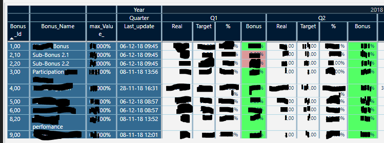
I have a table to show that has the below format (sorry for the black stripes) and to give you a bit of background, this data is used as a part of a bonus system to reward the different sellers according to certain parameters:
and i have the following questions if it’s possible to do with Power BI:
1.Can a thicker line be done to delimitate quarters and the basic columns that are on left (light blue ones)? I saw that the thickness of the vertical grid lines can be adjusted but i dont know if this it’s possible per group of columns?
2. Can a filter be added that put all values in the table as zeros? with which formula could I do this?
3.As you can see, I have 2 colors in the bonus column (conditional formatting), can a third color be added based on a condition that is not numerical like modified value=1?
4.Can totals be added only for specific columns? in this case for “max_value” and each “Bonus” column per quarter? If I add subtotal, it adds a sub total per each row and grand total I cant add the grand total.
Unfortunately no I don’t believe this is possible right now. There’s is no way to isolate certain lines in tables of matrixs. Personally I use colors as best I can to showcase different areas of tables.
You want to make every value zeros? Seems odd, but if you do then you would do this within formula.
IF( SomethingisSelected = TRUE, 0, Measure)
Some sort of logic like this.
Conditional formatting is still a little limited. You can’t really isolate certain values specifically at the moment. I’m sure it’s not far away though. This is a constant ask from Power BI users
For any change to totals this all have to be completed in formula. You need to use logic like the below to change anything in a total.
I have a related small question. I have a text column that has “Yes” and “No” and values like 0,0180565. I have tried everything to show the values with 2 decimals or like a percentage but nothing make those values change to the desired format. I even have used switch:
Hi,
Not quite what you are looking for maybe, but a hint in a direction.
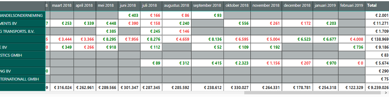
Concerning Conditional formatting, you can use a measure to show different font colors.
In this example grey background is no sales, green value is higher than previous month.