I’m relatively new to Power BI and currently following a beginner course. So far, I’ve been able to keep up and replicate the exercises covered in the course. However, I’m encountering challenges with structuring my data model effectively. I have several fact tables and dimensions, but I’m not confident that they adhere to best practices in data modeling.
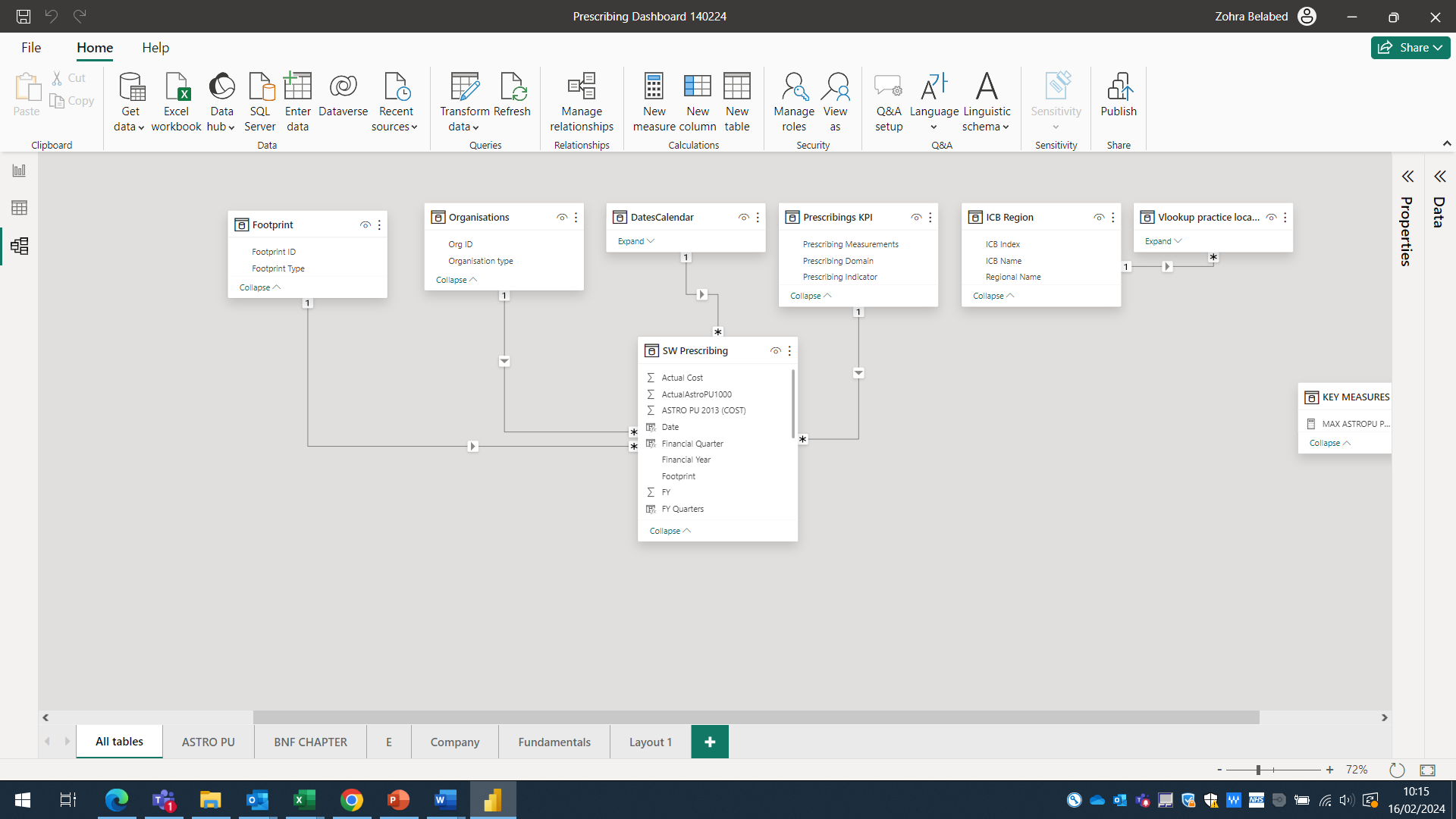
I’m looking for a course or resources that can help me improve my understanding of data modeling. While my current dashboards are functional, I anticipate needing to incorporate additional fact tables in the future. The PBIX file I’ve provided demonstrates my current layout. To simplify relationships, I’ve introduced a bridge table, as I found myself dealing with too many relationships, particularly with regional ICB for Practice Astro table.
My fact tables contain granular data for England, regions, and local entities. However, due to variations in population size and demographics, the total figures across these levels may not reconcile perfectly. For instance, the practice Astro involves a regional ICB relationship (South West Region). Although I’ve implemented a bridge between them, it doesn’t seem to filter the totals accurately unless I establish a relationship with the date dimension. Thereby is there a course that i can follow and get support with this type of issue
Recommendation is to have Facts and Lookup (share dimension) tables
.
When you use multi-fact table - you need to keep attention which lookup / share dimension you will use - recommendation : use from Lookup table and hide from facts that will not be confusing.
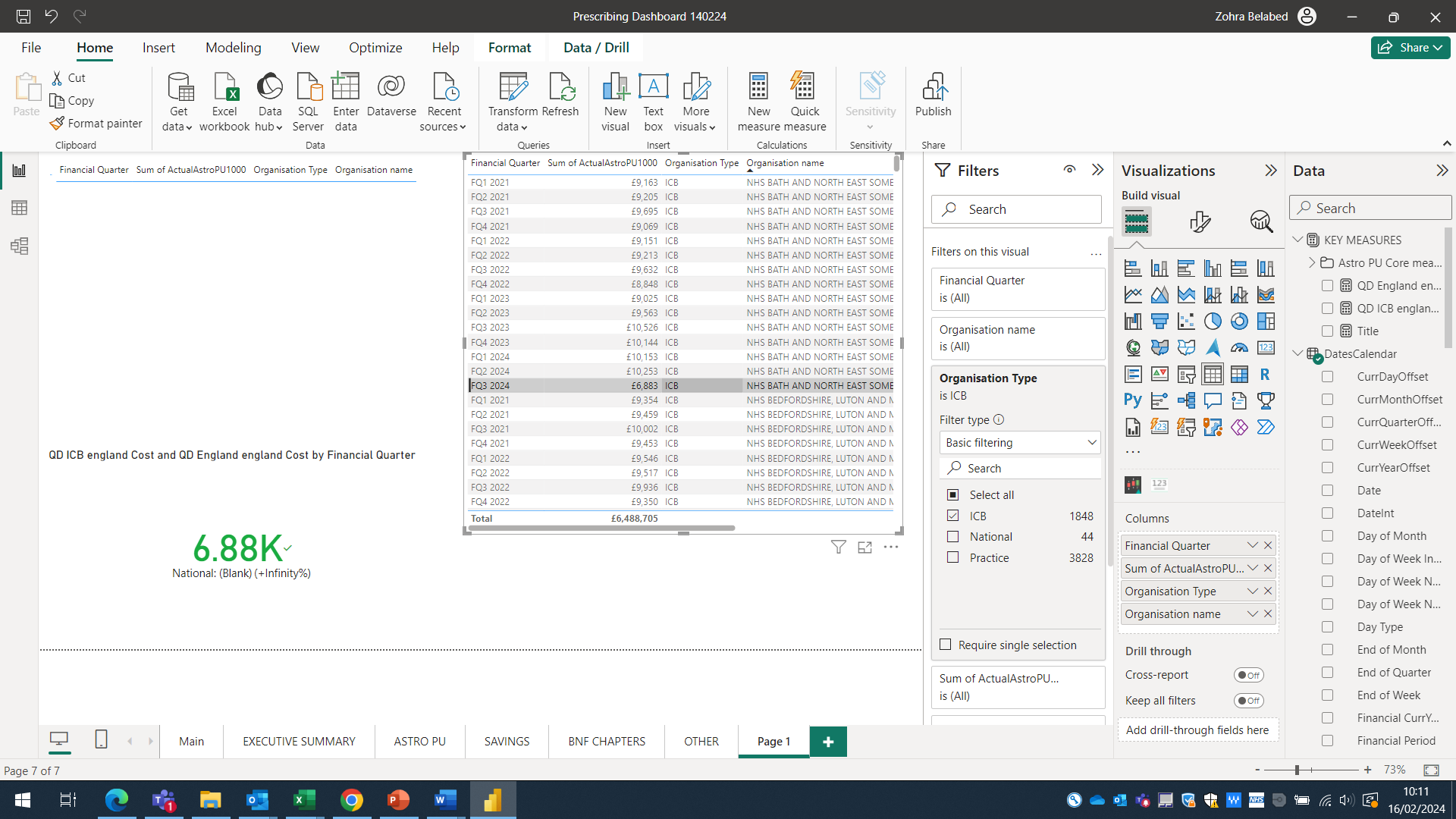
I have managed to realign my tables by merging into one table and created a star layout as per Sam’s courses so insightful to follow. Now is just question on how to write individual measurements by organisation name (all are stated into one column) and by calendar year. However i am testing my filter and relationship i am trying to create a visual with two value by organisation type, one is related to icb and the target National. It does seems the measure used bring the correct answer. For instance if i filter to ICB nhs bath and North East for FQ3 20234 i should see £6,883/national £7,671 instead of £318k on the visual card.
The measurements used are QD ICB england Cost =
CALCULATE(
SUM(‘SW Prescribing’[ActualAstroPU1000]),
‘SW Prescribing’[Organisation Type] = “ICB”,
DatesCalendar[FQuarternYear])
QD England england Cost =
CALCULATE(
SUM(‘SW Prescribing’[ActualAstroPU1000]),
‘SW Prescribing’[Organisation Type] = “National”,
DatesCalendar[FQuarternYear])
and if i click on NHS Bath right column of course i will not see the national table but the correct value will be stated while national is blank on the visual card
So my query is do i need to denormalised the fact table by creating a separate table for national data and or my measurements are completely crazy and need some rethinking. Between us i am glad this is not my profession
Just a reminder that only one question should be asked per topic. As you already a solution provided and has been solved you need to start a new topic.
Did you go through any of the courses within the EDNA portal that will also help you too.
You will also get better results if you start a new topic with a new question.
Note that people in the forum only review questions that is not solved.