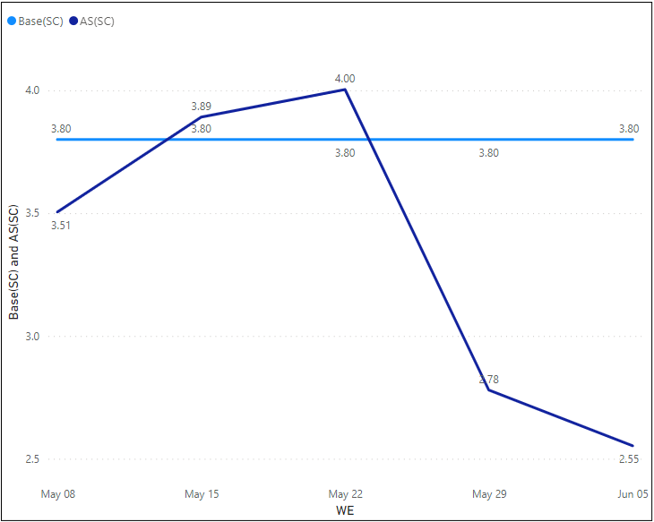
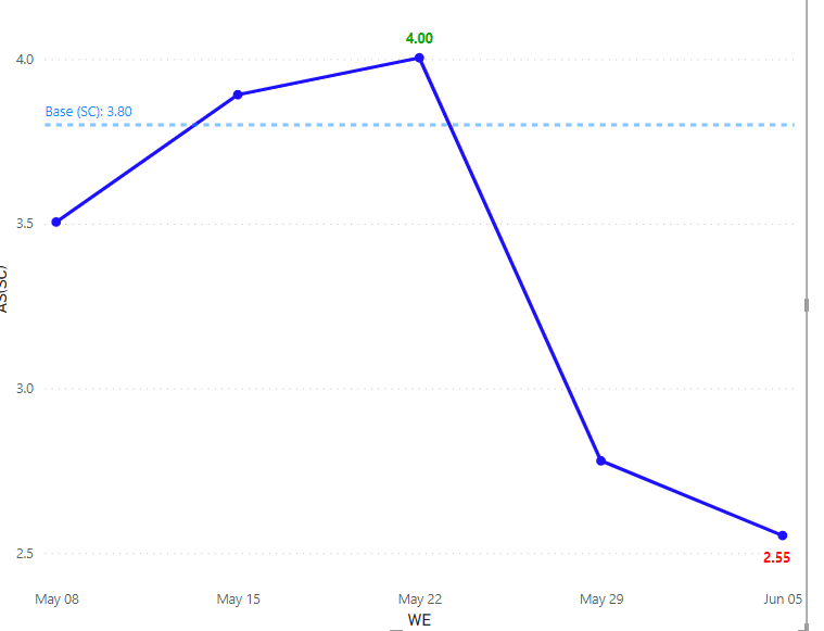
Need first and last non-blank data label to appear for my base, although in this pic I only show two different lines. I will typically have four to six, for 13 weeks…it can look harry.
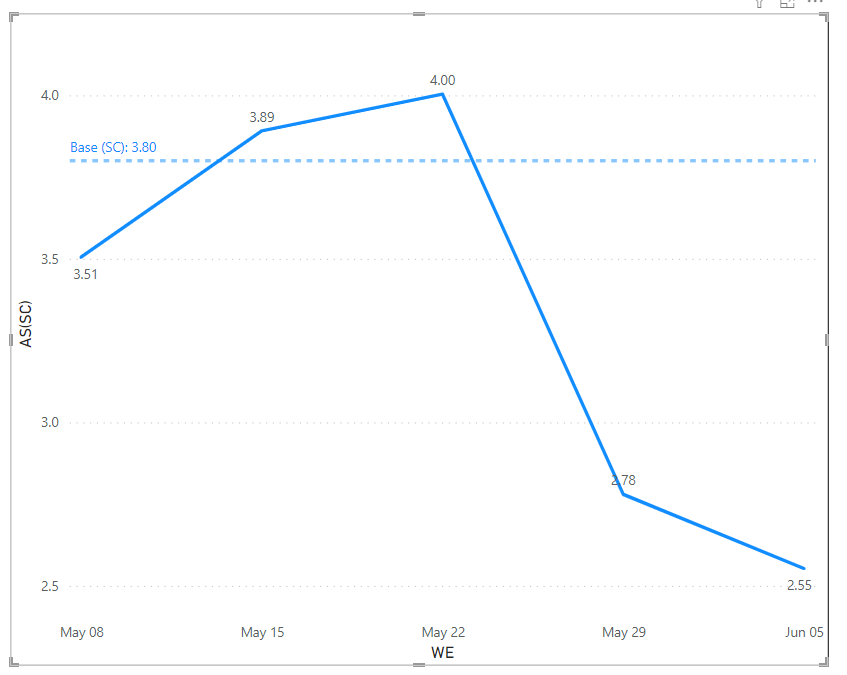
I would like the base, because it’s a constant line, to only who up @ the start and the end of what ever range I select in the date slicer. Please see screen shot and attachment.
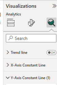
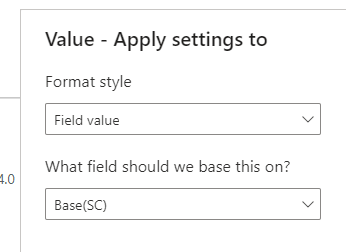
this uses the “Y-Axis Constant Line” under the Analytics section of the visualization (3rd button in the visual pane):
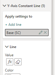
select the appropriate Constant Line (y axis), and click add line. You can rename the line (the default name is useless in most reports), and set the value using the fx button on the Line section:
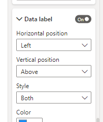
to display the name and value, just select “Both” in the Style section of the Data Lable:
@Heather - Reviewing now. looks like it will work.
I was than hoping to turnaround and show on the 2nd line (min) and (max) number of what is currently shown. in this case 4.0 would be the high and the low would be 2.6.